
You are using an out of date browser. It may not display this or other websites correctly.
You should upgrade or use an alternative browser.
You should upgrade or use an alternative browser.
The Screenshot Thread
- Thread starter Ellie
- Start date
- Status
- Not open for further replies.
Brendan_PR
Member
Nice Trix I like that very much :biggrin:.
Here are some screen shots of a project I am working on:


Here are some screen shots of a project I am working on:


Hello! I'm not all that active, but I am trying to get more involved. Also, starting a new game, but I'd thought I would get some input about my mapping. I don't think I"m all that bad, but I know I can get better.

*I personally don't mind fogs, as long as the maps are good, but people are right. Fogs won't make a bad map good, but can make a really good map, even better.* I like the use of the futuristic tilesets, not many of them out there. So many people want them, though.

*I personally don't mind fogs, as long as the maps are good, but people are right. Fogs won't make a bad map good, but can make a really good map, even better.* I like the use of the futuristic tilesets, not many of them out there. So many people want them, though.
@Cait:. Could use some improvement. I'm not good with RMXP though, so wait for some one else to critique.
@Brendan:. !This looks pretty cool! Except they kind of look like legos? O_O?
Okay. Now then.
I am working on a game called "F0X: [Insert Here]" and I would like to know what you think.
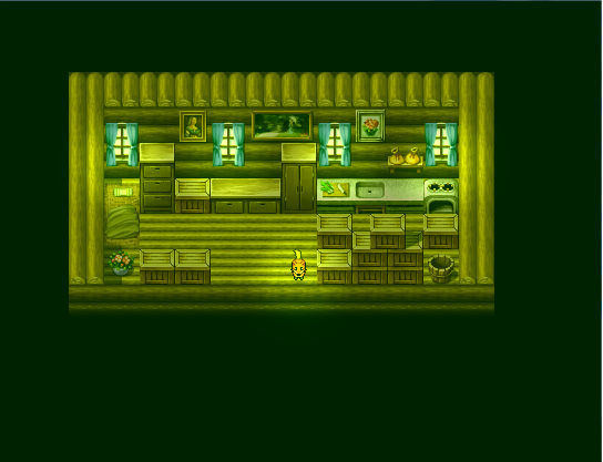
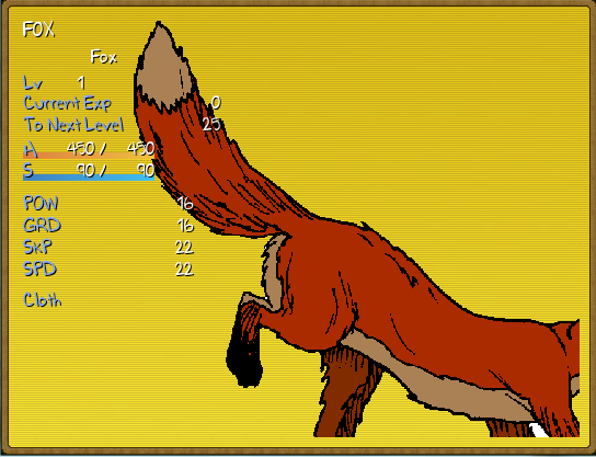
@Brendan:. !This looks pretty cool! Except they kind of look like legos? O_O?
Okay. Now then.
I am working on a game called "F0X: [Insert Here]" and I would like to know what you think.


ultimaodin
Member
@Cait- try smooshing the map down a bit so the areas aren't so open. While mansions in real life tend to have wide-open-spaces the aren't to interesting when it comes to game play.
Your graphics clash slightly which kind of ruins the feel of the map.
First of the small grass is very bright and saturated. tone it down just a tad.
The hedge graphic looks appalling to be frank. It's appearance is flat compared to the rest of the tileset and are made of multiple little squares.
Also try not to stick things on top of long grass as it looks exactly like that, as if it's just sitting on top.
On a positive note that fence is awesome!
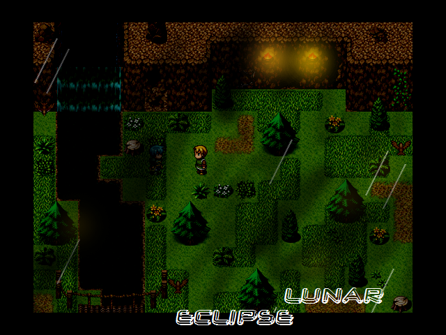
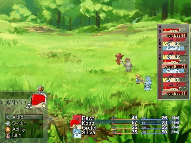
@Lunar- The green is a tad over-powering, yet again dull it down.
The tileset looks quite appealing and I think the fox actually fits in quite nicely.
My issue with it is that the door does scream noticeable at me. Extend the light down in a rectangle to mimic a door and I think it will become relatively noticeable.
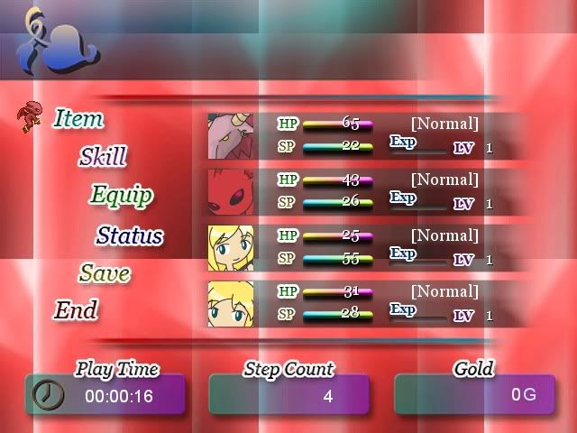
The menu is simple yet gorgeous however try fitting the image in so the wolf goes all the way to the border.
@Brendan- looks interesting and tasteful! The disco flower are actually intriguing me and I wonder what their purpose is.
Thanks for the comment, but the map isn't really all that big. I tried to give it the impression that it was, but that's the whole map. I can't really do anything about the bushes, as this is Mack's tileset, and I can only do minor edits on tilesets. Here's the updated map, with another grass, hopefully that solves the problem.


I think you didn't read what I posted, I would change the bushes, but I can only do minor edits. Nothing major, as I am not really good with pixel art. I can change colors through various means, but editing bushes is beyond my minor talent. However, I have looked around for a better one, to no avail.
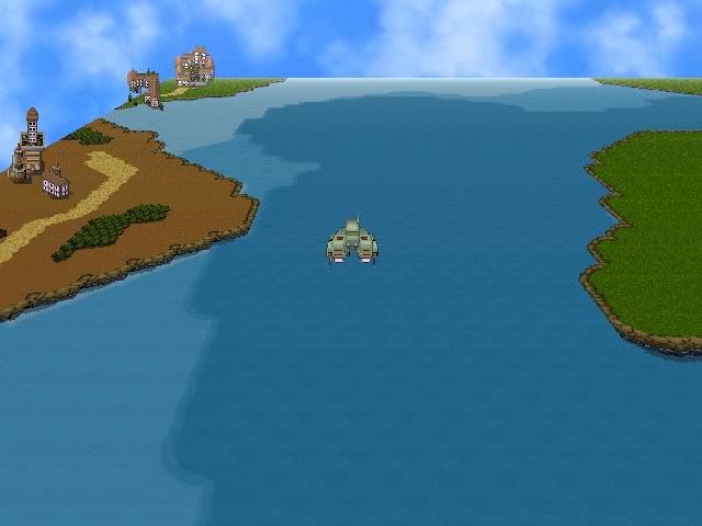
First thing, I like your screens and the atmosphere. Good use of mack's tile set. Is there any kind of path in the first picture? I noticed the bridge and I think the last screen is a tad bit dark.
As for what's wrong with the bushes, that's what I was talking about in my post. Not really about the tileset in total, but I did change the grass.
 See how the bushes are like squares, rather than a continuous bushes.
As for what's wrong with the bushes, that's what I was talking about in my post. Not really about the tileset in total, but I did change the grass.
They aren't the best that they can be.I can't really do anything about the bushes, as this is Mack's tileset, and I can only do minor edits on tilesets.

ultimaodin
Member
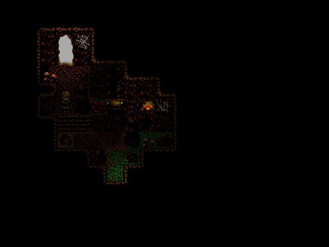
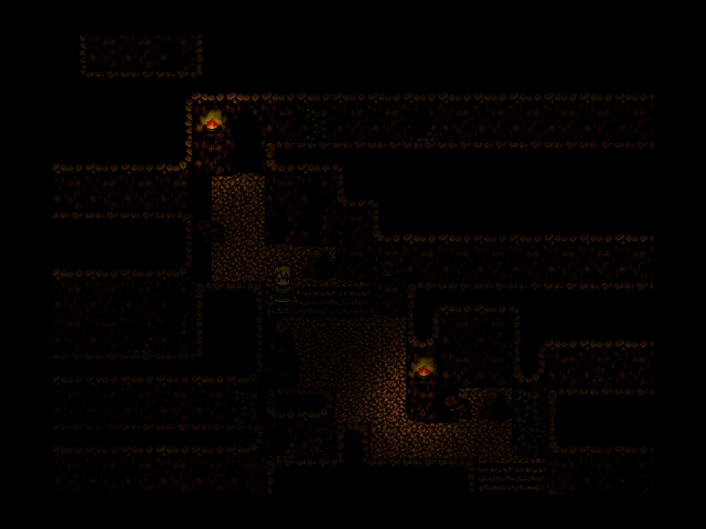
@Lunar- Those cliffs curve at the top but are square at the bottom. It's shouting at my eyes. Two lights on the first one are too blatant and make it near impossible to see the cave between them.
Your second cave is neat and good however that mushroom stands out like mad to me.
The third map confuses me, can you go down all those corridors? It looks like you 'should' be able to go down them but appears like you can't.
@cait- It's hard to tell from far out. I can see if I can make a hedge for you if you like.
ultimaodin
Member
Is it cool if the hedge is a little larger as I already started making it?^_^
I like the water center piece (fills in the empty space nicely) however if you could add a fountain to it I think it would make the place look more.. wealthy...
I like the water center piece (fills in the empty space nicely) however if you could add a fountain to it I think it would make the place look more.. wealthy...
@Ultimdodin: Yeah, go ahead. Those bushes are not exactly to scale, I realize now, and could use to be bigger. I tried to take the vx one, but not only didn't it not work. Wrong coloring.
@fbu: Nicely done editing on the tileset. I can never do that without a bunch of cursing and a lot of work. In the end, it never worked out, though.
@fbu: Nicely done editing on the tileset. I can never do that without a bunch of cursing and a lot of work. In the end, it never worked out, though.
rey meustrus
Sponsor
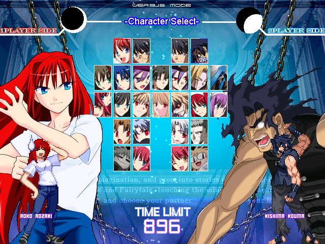
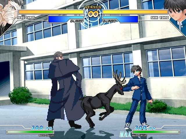
That's nice and all, but will you have the awesomeness of this guy?


- Status
- Not open for further replies.
Thank you for viewing
HBGames is a leading amateur video game development forum and Discord server open to all ability levels. Feel free to have a nosey around!
Discord
Join our growing and active Discord server to discuss all aspects of game making in a relaxed environment.
Join Us

