Envision, Create, Share

Welcome to HBGames, a leading amateur game development forum and Discord server. All are welcome, and amongst our ranks you will find experts in their field from all aspects of video game design and development.

Pixel Art WIPs/Small Things Thread

Twirly

Sponsor

Jbrist":34di0vyu said:
16mockup.PNG

What do you think, could it work somehow?
It could work but there's some issues with your stuff, i'll show you with this quick and dirty edit

-more contrast(overdid it in my edit a bit ;x) this goes for the whole thing, esp. the tiny characters need a lot of contrast since that will make them more readable
-get your texture right: dont use tons of colours just to end up making some weird texture. try to find out which parts would make a tile what it is.
for example to make a simple but effective grass tile, you could make a plain green field with some blades of gras which stand out, the blades of grass show that it is a grass tile, use this concept to make other tiles too.
-idk if you want to keep those blocky tiles but i wouldnt, its up to you

still working a bit on this 16 colour palette shit, very tricky
16colourpalette3.png
 

Jason

Awesome Bro

Lol my tree was actually following a shape, I basically made two circles and did a light to dark transition on them, stuck them ontop of each other, and made them look like how they are now. And what do you mean tons of colours? Each thing has 3 colours o.O

Also, I know the tiny dude doesn't have much contrast, he's an old template I made AGES ago for another failed attempt at a game, so I thought "Hmm, it sort of fits, I'll just slap him there", didn't change him or anything, except the outline to make him stand out.
 

Twirly

Sponsor

Jbrist":1t1jbvtm said:
And what do you mean tons of colours? Each thing has 3 colours o.O
I see :x it looked to me like a mish mash and i really thought those tiles have a lot of coulours b/c they look sortof like a mess ;x (sorry i was in a hurry while looking at it). but you could still look at my advice...
btw if you know he doesnt have enough contrast change that :x
 

Jason

Awesome Bro

"so I thought "Hmm, it sort of fits, I'll just slap him there""

That's why I didn't change it lol, just slapped him there as an example.
 
If you're not familiar with the game Mass Effect (1 or 2) the following won't be familiar. Regardless, I would love some input on these. Most of my trouble came with the backsides (backs should be easy, but it just wasn't clicking for me.)

Also, these are all layered, so I can change hairstyles, clothing, etc.

quarian4.png


asari.png


humanfmed.png


EDIT :

Here's the template I made in-case anyone wants to use it.

humanfemaletemp.png
 

MicKo

Member

Well I'm not familier with Mass Effect at all, but I wanted to make an edit of the first guy, front view.


Left : Your version, 48 colors
Middle : My first edit, 16 colors, minor changes on the shading, using your colors
Right : My last edit, 13 colors, minor changes on the shading, more contrast

So yeah, first thing I don't get is why so many colors? You have 7 sorts of black that look exactly the same, even zoomed in. Same for the dark purple. You really don't need this many colors. There's almost no noticeable difference between the left version and the middle one (colors wise), yet I deleted 32 colors. Then you need to add contrast to your colors. Even with those 16 colors I picked, there's not enough contrast at all, I can barely see the difference between some colors. For example, can you notice without zooming that I used a different color for the shoes and the legs? Well I can't, and it's generally not a good thing in pixel art. So yeah, add contrast, really.

I didn't really edit the shading and all, but you should also be careful with the banding (especially on the head, it's really easy to notice).

'Hope this helps!

EDIT : Oh, btw:

Not yet satisfied with the hair, but I think he's cute. :O
 
If only I could apply those colors to my sprite sheet with a click of a button... :(

Great edit btw! I tend to go overboard with colors sometimes... when I'm looking at it at 8x zoom those other shades seemed to make more sense. :P


Also... He's so freaking tiny!!! I love it! Is there a way to make his eyes appear in the left/right views?
 
espseed.png
espleaf.png
esptwig.png
espbranch.png
espis.png
espisjuice.png
espisextract.png


Some stuff I redid (1,2,4) and hand crafted (3,5,6,7)
Would love some critic.. For I like em, but i dont love em, you know ;D
(exept the fruit thingy (5th) and the seed (1st), but thats me)
 

moxie

Sponsor

@Norton

I think the base template's side-views look more isometric than anything, and I can't help but feel they'd look odd walking sideways, so I would recommend maybe making the body and head face forward (and by that I mean to the side) more

also the way you've done the human lady's hair makes it look like a big lump of clay or something. try using way more contrast and shade strands & clumps of hair to make it pop

Venetia did a hair tutorial here that should get you started. the BBcode in the post is broken so you have to click on the images individually, but if you can slog through that it gives a lot of tips that help you understand how to make hair look more, well, hairlike
 
I think the wheels are at a complete sideview angle, while the rest of the car is at more of a 45 degree angle, but I'm not exactly sure about how you'd go about fixing that.

I got more of the template that I've been working on done. I kind of took the animation from Perihelion's Paradigm template though.
 
Some WIP tiles, a floor and wall tile. If they look familiar, I'm trying to make the floor/wall tiles in the Chao Race Stadium n SA2B.

Floor
crsfloortilewip.png


Wall
walltile.png
 

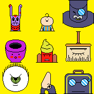
A sample of the facesets I've been working on.

A dog, a baby, a tophat with a monocle, a stylized eye socket, a hotdog with mustard, a broom, an eyeball, a stunning disguise and a suitcase.
 
D= I am seriously nowhere near active enough on these forums. -feels bad-
But I have a project I fiddle around with on my free time!

And that is weapon graphics for someone on Deviantart's IPAD GAME XD.

A project I will admit far out of my spriting ability but if I don't shoot far I wont make it home in time for dinner.


Its just the beginning, the colors do not(well probably don't) show the final product.

<3 Tell me what its like.
 

Thank you for viewing

HBGames is a leading amateur video game development forum and Discord server open to all ability levels. Feel free to have a nosey around!

Discord

Join our growing and active Discord server to discuss all aspects of game making in a relaxed environment. Join Us

Content

  • Our Games
  • Games in Development
  • Emoji by Twemoji.
    Top