J. D.: Nice line work. They look somehow cartoony; the low-contrast palettes make them flat, but it looks more like a stylistic choice than an error. Gives off a
Paper Mario vibe, although I don't know if you were going for that (if not, might wanna revisit it). I don't like the way you've shaded Hayato's hair, though. I'd break the highlights up more if I were you and bring out individual clumps of hair.
VexedEnigma: Those are some really slick sprites! I'm very impressed, and I actually cannot think of anything bad to say--the style, palettes, texturing, everything looks stellar.
Ynlraey: Looking nice! Your rocks need more variation, though. They're pretty, but the big, unevenly distributed chunks make them tile really obviously. I'd say make at least 3-4 tiles altogether and alternate them so it looks less samey. You might be working on that, though. The texture is very nice, by the way.
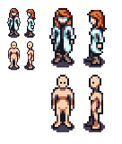
Okay, now I'm gonna leave something. I'm playing around with a new template and want some feedback. The front pose bears some vague relation to
7th Saga's sprites, minus the wonderful perspective, which I cannot do to save my life.

Man, my sprites are really getting more utilitarian with color counts and such. I'm not sure if it's a good thing. Paradigm is certainly flashier.


