
You are using an out of date browser. It may not display this or other websites correctly.
You should upgrade or use an alternative browser.
You should upgrade or use an alternative browser.
Pixel Art WIPs/Small Things Thread
- Thread starter Perihelion
- Start date

Twirly - I basically changed to position of the pose, to make it more natural. I changed his left arm to make it look better, and more practical. I changed the feet so the won't kill when he walks. When somebody stands like that, their right foot doesn't face east, it faces south. I also prevented to shade the torso like my last edit, because it made him look fat. The shading you've got makes it look very flat, and too much contrast. If this is a game sprite, don't care about colour limit. The shading on the legs was weird too, so I changed it a bit. Hope this helps, looking forward to your next improvement.
Note:I stuffed up the width of the right foot. And looking at it again, probably should have done something about the right arm.
DigitizedGamer
Member
*sigh* Well, I guess I'm just practicing my spriting. Nothing special I suppose. Just an evil clown.


Heinze":a664usyp said:Again '-' ... Being ignored since August 6th ... Okay so.. What do you think '-'
You'll probably get more feedback if you make your own thread, since this one is just for small stuff and gets a lot of stuff posted in it.
That said I think your edits look great, they match the style of the original sprite and I don't see anything that jumps out as looking wrong.

imgzoom in case it's necessary. I compulsively scale these things up anyway. this is the prospective size ingame, so it fits.
yeah, trying something different. gameboy color palette, and a loose understanding of the palette/tile restrictions. I most likely break them in some places, but whatever.
battler is mostly scratch, heavy reference taken from some game rips I saw. I'm still working on the shading around the chest area. the overworld sprite things are from a couple weeks back, and I'm just starting to toy around with modifying them to fit the new design.
I just noticed the battler's arm is disproportionately long; I moved the arm down a pixel experimentally, but I see now that didn't quite work out.
man, animating it's gonna be hell. I sympathize with the way Dollmage did thing about now.
I like what you did to the arm and the leg. I hadn't noticed before, but I was acting really confused about the light source. I already fixed the shirt still seems weird to me, but I still can't puzzle out why, exactly.
I think I'll actually start on the idle animation before posting a new version, though. shouldn't be too strenuous; there's nothing about that pose that really seems like it would incorporate a lot of movement.
I think I'll actually start on the idle animation before posting a new version, though. shouldn't be too strenuous; there's nothing about that pose that really seems like it would incorporate a lot of movement.
Eriol Clowphengire
Member

Masked Rider Double / Kamen Rider W done on Koemushi Template. So far, it's a work in progress and it's his default Cyclone Joker form.
Eriol Clowphengire
Member
Eh!? How come? Still, it's a work-in-progress thing. And it may appear somewhere in NetGame Crisis Saga, being cosplayed though.
I'm sure I got its thighs, but the "feelers" or its horn or whatever, well... kinda strange.
I'm sure I got its thighs, but the "feelers" or its horn or whatever, well... kinda strange.
VexedEnigma
Member
WIP of my Main Chara. Happy overall I think. Not too crazy about the hair but I think the way I designed her hair just isnt well suited for spriting. =/

Anyways, C&C, edits, etc. welcomed and greatly appreciated. =]
Template is original.

Anyways, C&C, edits, etc. welcomed and greatly appreciated. =]
Template is original.
SorceressKyrsty
Member
Hey, that looks good! You've put a lot of detail into that and it comes out well. The palette is decent, as long as all characters in your game are going to be relatively desaturated as well (or am I just blind?)
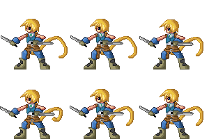
Resprited Zidane:

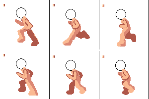
Run cycle T_T:

Though I don't see the point in putting image zoom on the run cycle since it's not shaded properly or anything -.-
I've fixed a couple of things in the other version though, but I don't have a GIF of it.
Resprited Zidane:

Run cycle T_T:

Though I don't see the point in putting image zoom on the run cycle since it's not shaded properly or anything -.-
I've fixed a couple of things in the other version though, but I don't have a GIF of it.
On the run cycle, the legs are kind of jerky on the back most frame. Moreso on the back/right leg than the other.
Also the arms could maybe use a larger movement span and the left arm looks like it stretches out when it's at the front.
The whole frame bounces up and down, too but that might be an editing error in putting together the animation because the palette and black line on the left moves too.
Also the arms could maybe use a larger movement span and the left arm looks like it stretches out when it's at the front.
The whole frame bounces up and down, too but that might be an editing error in putting together the animation because the palette and black line on the left moves too.
VexedEnigma":18bqjr08 said:WIP of my Main Chara. Happy overall I think. Not too crazy about the hair but I think the way I designed her hair just isnt well suited for spriting. =/
Anyways, C&C, edits, etc. welcomed and greatly appreciated. =]
Template is original.
This is bomb diggity yo. I like the feel of your spriting. :D
It's been awhile, but here are two of the main characters in my game; I've decided to revamp a whole lotta' things, including most of the spritework:
Hayato:
Fou-Lu:
VexedEnigma
Member
@J.D.Slasha
I really want to crit the shading of those sprites... but for some reason I can see it really working ingame. It's got a cool style to it. Kinda reminds me of flash animation for some reason.... I would say to up the contrast on some parts though, like Hayato's trousers and the lightest shade of Fou-Lu's beads really needs to be lighter or it may as well not be there. Overall though I'm really liking the style and designs. Would be interesting to see what tilesets your using to compliment the style. Oh and Fou-Lu is so cute! [Apologies if he's really a manly killing machine... but he's so cute! :biggrin: ]
@SorceressKyrsty
Thanks for the comment. Yeah the whole game is prettty desaturated with occasional neon brights thrown in. The Zidane looks cool, but why not try some bigger movements in the animation. Like, as his body drops and his legs bend, twist his feet a little, or maybe have him rock from one to the other. Also try and animate the hair a little. The movement of the hands looks good, but as -his- left hand moves, so would his elbow. Layers are really useful for editing single frames of animation. Try seperating all his body parts onto different layers and experinment with how each would/could move within the animation you've made there. Ideally, most of the image should change in each frame. Well, IMO anyway.
Thanks for the comments all. I've taken advice and changed the hair palette slightly, also edited Morgan's face and finished the Welsh-tastic Aiden Alyn Cooper :grin:

C&C? How're the designs looking do you think?
I really want to crit the shading of those sprites... but for some reason I can see it really working ingame. It's got a cool style to it. Kinda reminds me of flash animation for some reason.... I would say to up the contrast on some parts though, like Hayato's trousers and the lightest shade of Fou-Lu's beads really needs to be lighter or it may as well not be there. Overall though I'm really liking the style and designs. Would be interesting to see what tilesets your using to compliment the style. Oh and Fou-Lu is so cute! [Apologies if he's really a manly killing machine... but he's so cute! :biggrin: ]
@SorceressKyrsty
Thanks for the comment. Yeah the whole game is prettty desaturated with occasional neon brights thrown in. The Zidane looks cool, but why not try some bigger movements in the animation. Like, as his body drops and his legs bend, twist his feet a little, or maybe have him rock from one to the other. Also try and animate the hair a little. The movement of the hands looks good, but as -his- left hand moves, so would his elbow. Layers are really useful for editing single frames of animation. Try seperating all his body parts onto different layers and experinment with how each would/could move within the animation you've made there. Ideally, most of the image should change in each frame. Well, IMO anyway.
Thanks for the comments all. I've taken advice and changed the hair palette slightly, also edited Morgan's face and finished the Welsh-tastic Aiden Alyn Cooper :grin:

C&C? How're the designs looking do you think?
Thank you for viewing
HBGames is a leading amateur video game development forum and Discord server open to all ability levels. Feel free to have a nosey around!
Discord
Join our growing and active Discord server to discuss all aspects of game making in a relaxed environment.
Join Us

