Envision, Create, Share

Welcome to HBGames, a leading amateur game development forum and Discord server. All are welcome, and amongst our ranks you will find experts in their field from all aspects of video game design and development.

Peri's Pixels

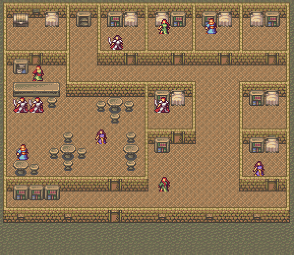
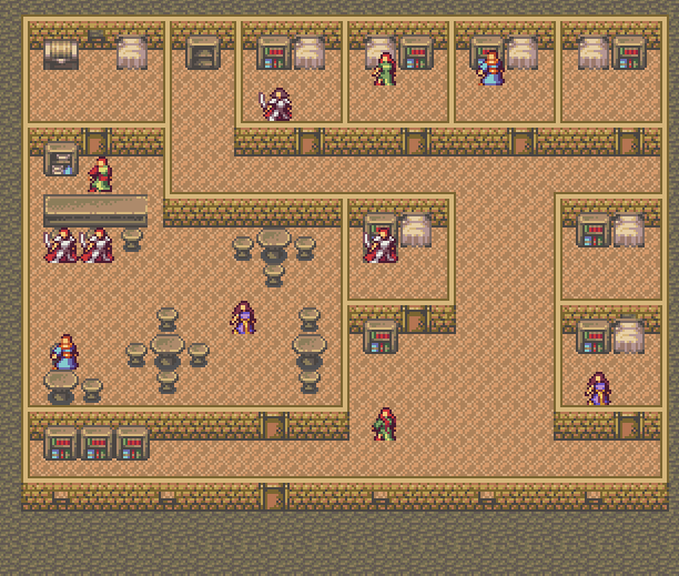
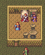
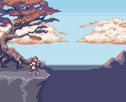
The tables and chairs are supposed to be made of rough stone; it's underground, and wood is a rare luxury. I'd probably do a better job texturing wood, but stone is kind of a requirement for the setting. :\ Thanks for the critique, anyway. Yeah, I know I used a lot of colors, more than I usually do, and one reason for that was I started reusing colors once I had them instead of making new ones at the precise value I needed, but idk, I kinda like the effect in most places. The sprites have a lot of colors for something that small, too. I'll play with it, though, and I appreciate the feedback!

EDIT: Okay, I do think I'm gonna reduce the colors in some things, but as much as I hate to say no to critique, I think I need to keep moving with this rather than make every single tile perfect if we ever want to release this thing. I'll revisit it if I still want to after everything else is done. @_@
 
Although that said, here's an update that I hope addresses some of the issues 006 brought up.

untitled-134.png


I know the perspective is inconsistent between the sprites and the tiles, but idk, I don't mind it enough to change it. I have the sprites front-on so you can see them better, and it looks all right to me. :x
 

Jason

Awesome Bro

Seriously, right there, that's my favourite style of spriting, everything just looks so oldschool and amazing, I'm loving the chest, shelves and bed, they looks amazing...
 
Thanks, jbrist! To answer your earlier question, yeah, I'll probably draw a few more sprite templates for added variety. I had them all the same initially because I was thinking about having the character creation have different pieces you could combine, and so all of them would have to have the same pose, but then I made the sprites smaller. And I don't think I'm going to animate them, which was another concern. Animations would be cool, but I think I'd rather make a bajillion different PC sprites to pick from than have an extra frame or two of animation.
 
Much improved, especially the furniture, but the top of the walls and floor still bugs me.
Quick edit to show what I mean.
Edit2.png

The floors colors are very washed out and it brings the entire room down, making it dull. The shading on the top of the walls doesn't make any sense whatsoever. There also seems to be a tiling issue with your cave floor, look closely and you'll see it. Keep up the good work, and make some forest exterior tilesets, they will be beautiful.
 
Haha, I like how you plugged in the bit about the forest exterior :p

The game takes place primarily underground, and we have yet to decide if there will be the chance to go above ground in the game.

As for the top of the walls and the furniture, she was playing around with taking out some colors there, but what she had there was what we ended up liking so far. The problem with your edits, 006, is that there is one too few colors, and it ends up looking like there are diamond shape holes in the floor that open to an orange abyss.
 
outside of what i mentioned on irc, i also agree that the palette for the tiles is way too de-sat'd. and considering most of it is brown and without clutter, it becomes boring to look at quickly. your sprites pop because they're colorful; you don't need to make them pop by ALSO making them an entirely different saturation level.
 
Yeah, you're right. I never make tiles saturated enough for some reason, and they're always monochromatic. :V You think maybe more hue variation would make it look less boring? I intend to make more interior tiles still, and I can add accents.

Uhhhh, is this any better?

untitled-140.png


@006: Yeah, the top of the wall was ugly. I think black is a bit overwhelming with how narrow they are, though, so I tried yellow instead. Thoughts? And idk, I like the texture on the floor tiles; it makes them look more three-dimensional. And, yeah, I know the cobbles don't tile correctly; I'll fix that when I get around to working on exteriors.
 

Jason

Awesome Bro

Hmm to be honest, I really prefered the earlier one, since it looked dark and gritty as if it were actually underground, I can't really see it being colourful...

*Digs up some dirt*

... Nope, not colourful here, lol.
 
Well, that was the idea with making it dark and desaturated, yeah. :S I dunno. I think this looks better but doesn't fit the setting as well or something. Then again, you'll be able to tell once I do exteriors.
 
Uhhh, so more like this?

untitled-141.png


I swear, one of these days I'll get something right the first time. :crazy: I appreciate the feedback, though! This is definitely getting better than it was before.
 
Yay!

On an unrelated note, some dude wants to commission me. I haven't actually talked to him about it yet, so idk if I'm going to take it, but I dunno how much to charge. Pixelation says $15/hr for amateurs and $50/hr for veterans, and I'm definitely on the amateur side compared to pros in the industry, but I dunno exactly how amateur. Also, I suspect I sprite unusually slowly. I mean, I'd charge on a per item basis rather than a per hour basis, but it's a good figure to keep in mind, I guess.

Well, how much would you pay for a tileset like the one I'm making now, or some portraits like the pogs (assuming I can do line art for them that doesn't suck), or some sprites like these, or whatever?
 
'Kay, so, I'm poking at this sf thing again.


I'm at a bit of an impasse. I like the idea of doing this in a high-contrast, low-color style like the clouds, but I spent fucking forever on the trunk and love it now and don't want to change it. EDIT: Well, it looks better now that I added a bunch of aa. I dunno, it may be okay. :\

Also, fuck the leaves. I still dunno what I want to do with them. :crazy: I tried the bit you see there, but idk if I like it. It's weird, because usually I'm good at organic things, but this is just not working out for me. I could render the leaves individually, but that will take me the rest of my life, so I dunno. I was going for something like this, but it's not working. :\

For those of you who saw the earlier version, the city is coming back, but I wanted to redo it.


EDIT: Okay, I messed with the leaves more.


I may go back to the other style and just make it more detailed. This takes way too long, and I don't even like it. :I
 

:smoke: I actually really like the palette for this and am tempted to do another pic of her with it. 11 colors, btw. Could've gotten it down to 10, but meh.

Thanks, Tindy. I went back to that style, but I dunno if I'm gonna keep it. I keep having this nagging feeling I should render all of the leaves.
 
Clouds look brilliant. The tree looks potentially good but for now the leaves you've done look at bit flat and 2D. The horizon mountains should look more blue/green and faint on the background sky though. At the moment the colours look too close to that on the foreground tree so they don't look clearly miles away from one another.
 
Good point, Inq; I'll fix that. Thanks for the input! And yeah, the leaves are giving me a lot of trouble for some reason. The blobby style looks flat, and I dunno how many other colors I can add, which'll make it look too undetailed next to the trunk. I'm probably going to end up rendering all the leaves individually, but I'm not looking forward to it.
 

Thank you for viewing

HBGames is a leading amateur video game development forum and Discord server open to all ability levels. Feel free to have a nosey around!

Discord

Join our growing and active Discord server to discuss all aspects of game making in a relaxed environment. Join Us

Content

  • Our Games
  • Games in Development
  • Emoji by Twemoji.
    Top