Welcome to HBGames, a leading amateur game development forum and Discord server. All are welcome, and amongst our ranks you will find experts in their field from all aspects of video game design and development.
It is a necromancer. The little balls on the lower part of the robe are actually shrunken and animated skulls that chatter a lot. Also, the claw is supposed to extend beyond her hand, so that's why the arm looks weirdly long.
That looks really good. although when it's zoomed, the face area can cause a little confusion with its lack of detail—it's not a problem at 1x though so it depends on how big you'd expect the viewer to encounter it. also i personaly wouldn't be afraid to experiment with some selout on the bonier areas of the costume though.
I added a bit more detail to the face (shading, anyway; couldn't fit facial features) and strengthened the light source a bit. As far as selout goes, whether or not it looks good really depends on the background, so I think I'm gonna avoid it for now until I decide what (if anything) I wanna do with it. I used to use crazy amounts of selout on everything and then realized that doing that made the sprites blend into the background too much, so yeah.
I also tried my hand at a walking animation, which is actually a first for me. I found a tutorial online, so it didn't end up awful, but you can tell I don't really know what I'm doing! I'm also not really sure what's wrong or how to fix it.
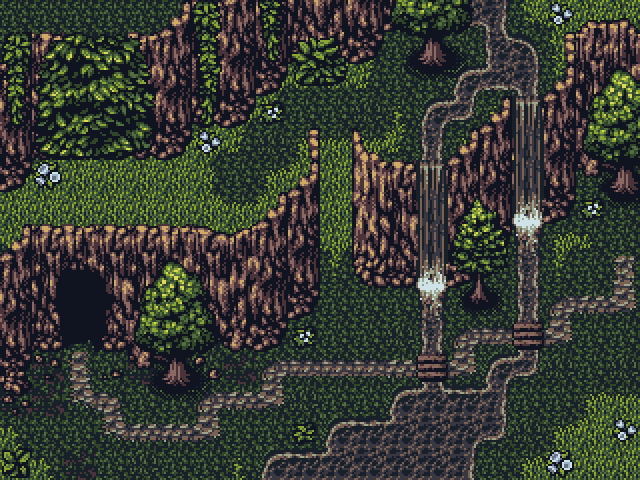
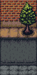
On an unrelated note, here's a test map for my forest tileset I threw together in RM:
Off the top of my head, it's missing stairs for the cliff and more ground tile variety (medium grass and dirt, perhaps?). Aside from that, I think we might be good as far as general utility stuff goes. Although I direly need to animate the water and the waterfall. Oh, yeah, and I wanted to do map borders of some sort.
Looks a little weird with Paradigm sprites, but I already knew they needed darker outlines. I think that + maybe shadows will fix that problem.
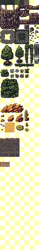
I also put all of the 16x16 tiles I've done and still like (not that many, actually o.0) into one tileset and made the palettes more consistent. The desert rocks have six colors, which is a lot compared to the rest of it, but I can't bring myself to reduce it.
Still not happy with the bricks, but maybe they'll look better when I turn them into an actual wall. The other wall I've sketched in looks more promising. Also, I need to fix the vine wall thing so it hangs better, since apparently I decided to use it as a vine wall. Oh yeah, and cave entrances would be cool.
Am I imagining things, or are the bricks a little inconsistent compared to the vegetation? I feel like the shadows aren't dark enough and therefore don't match the other tiles, but making them dark is kinda weird...
EDIT: Did some sidewalk.
Yeah, definitely gonna have to sprite some new grass barring substantial changes. I dunno, something is still a little off, I think.
I cranked up the saturation on the yellow, but the other colors were reused from other palettes, so I'd rather leave them alone unless it still needs adjusting.
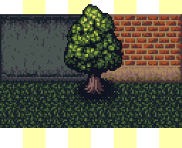
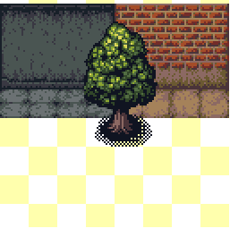
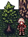
Yes that looks much better. Are you going to make the shadow on the tree a little less ... harsh? Like, set it on an alpha layer and reduce the transparency? It just looks so darn harsh.
the legs dont go back far enough to make him look like he's pushing into a new step. he strikes out his feet in front of him in giant strides, but not copying it behind him is making him look like he's trying to do that russian kalinka dance at high speeds and the running man dance from the 80's at slow speeds.
The shadows on the trees look a lot better on the tileset they were designed for, since it's more high-contrast than these new tiles. Like, if you look at the test map a few posts ago, it doesn't look out of place at all. So I might sprite new trees for use with these that are less harsh. I'm really trying to keep the style consistent, but it's haaaard.
EDIT: Oh, you mean the shadow, not the...shadows. >_> I'm silly. Uh, I might. It looked all right on dark grass, but yeah, idk. I was hoping to avoid using transparency in general, but it's not a big deal, really.
Noted about the walking animation. I'll fix that at some point.
I'm trying to make Paradigm eight-directional, and I'm mostly failing.
What's wrong with this? I can't figure it out. I mean, yeah, it's supposed to be planometric and the hands don't line up correctly, but I really couldn't make them look right. There's something else with the way it's standing that's just really weird (looks kind of pigeon-breasted or something), and I can't figure out how to fix it. @_@
Btw, the sky panorama loops now. I could've done a better job, but feh.
Yeah, the far leg is too dark, too, and the arm curves too much. Ven did an awesome edit for me. I think I'm gonna shelve that idea for the time being, though, since I have been informed that planometric is a horrible perspective and I shouldn't use it (which tbh I agree with and have now thought of a viable alternative, so yay).
Also, there was a huge contrast issue with the sprites that I am now attempting to fix.
both perspectives are technically impossible, but planometric perspectives have a tendency of making the scenery look as if it's about to fall off the bottom of the screen, giving the player a sense of mild vertigo. isometric doesn't do this.
the rm+ series adopted a front-view non-skewed, non-planometric, non-isometric view. which is typically never used solely in anything newer than about 1997 as isometric 2d appears to be more 3d and visually pleasing.
((((( There are a few things that bother me, and I need to do a horizon line.