Perihelion
Sponsor
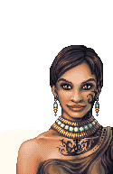
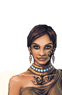
Yeah, idk what to do about the face being creepy. I did, however, redraw the arm and make sundry other small changes, but it's still weird-looking to me. I might've overcompensated when I tried making the shoulder highlight not round.
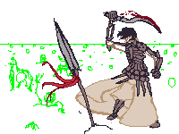
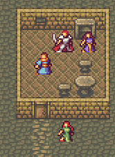
 But...it looked weird...
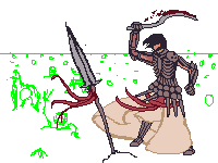