a couple other things
you do not filter snes graphics so they fit in with your resolution. it's instantly recognizable and the juxtaposition doesn't look very good. your character sprites are also inconsistent with your monster sprites; whereas the monsters have fairly soft colour scemes and no specific outlines, your character sprites use heavily contrasting colours, lots of dithering (?), and a prominent outline. they don't fit with each other -- graphical consistency is the first pillar of spriting for a project, man.
more on the sprites, whoever's spriting for you has trouble with detail in places. his poses are alright, but there are a couple bits (the flowing black material just below the red mage's knees, for instance) that bug me -- just tell him to give it a once over and fix things, because those bits either didn't have enough work put in or were drastically overthought.
probably getting too specific here for my own good, but the backs of the chairs should be visibly higher than the seat. the way you have the seats and the perspective done up right now, the train's passengers will just be sitting with their backs touching since there's nothing to lean back on.
do not use comic sans ms. comic sans ms is the ugliest font. do not use comic sans ms. there is no exception to this -- no one should ever use comic sans ms in anything ever, even ironically.
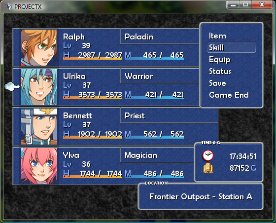
also your color scheme for the menu is sort of dull. just darkening the windows for more contrast with the white text and getting rid of those ugly bubble borders will do wonders for the aesthetics. as far as the borders go you could probably even just get rid of the black outline around the white and be good.


