
You are using an out of date browser. It may not display this or other websites correctly.
You should upgrade or use an alternative browser.
You should upgrade or use an alternative browser.
Tree Soul Kingdom - New Download Link
- Thread starter 9robin3
- Start date
Demo 2.0 is now up, after debug testing it about a halph year!
DOWNLOAD IT HERE: http://www.2shared.com/file/21EkNZP5/Tr ... EMO_2.html?
Enjoy!
Ps. FULLVERSION IS NOW IN PROGRESS!
/Robin Andblom 2012
DOWNLOAD IT HERE: http://www.2shared.com/file/21EkNZP5/Tr ... EMO_2.html?
Enjoy!
Ps. FULLVERSION IS NOW IN PROGRESS!
/Robin Andblom 2012
coreball":3hdnp3r0 said:This is just a personal pet-peeve... but as a graphic designer I make it a rule of thumb never to use Papyrus in my typographic elements.
as a aspiring graphic designer at a school for communication and design and being tortured by my teacher who tought me typography i must admit. atleast it is not comic-sans. :D i think to make it fit, you should try a simple futura.
9robin3":58avn069 said:THank you but I think I will go with the font I have now, if it is that you mean, you can see the font in the TITLE SCREEN in the beginning of this topic.
Ps. would it be necessary to change the font to make it look nicer?
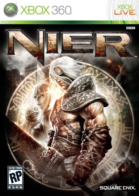
i do not like to sound rude. but the font looks cheap :/ take a look at these game-titles;


as you see those arent simple font. they are with special fx and stuff. you may take a look at my topic (viewtopic.php?f=78&t=76139) for instance, my font is hand made. you shouldnt try stick with founds you find online. try looking up dafont.com Write the desire word and modificate the Font to make it look diffrent and original. if you'd like i could help you with that
Thank you! Once I used Papyrus but someone said that it didn't fit, what Imean is that it must look cool but not to unclear. I will try using a new font or drawing one by hand. But right now I think i will stick with the one I have, and make a new font for the full game. Or will it be worth remaking the font for DEMO 2.0?
Ps. I would like to have critique on any other thing as well, as the gameplay or mapping etc
Thanks in advice
Ps. I would like to have critique on any other thing as well, as the gameplay or mapping etc
Thanks in advice
9robin3":f3lhsao2 said:Thank you! Once I used Papyrus but someone said that it didn't fit, what Imean is that it must look cool but not to unclear. I will try using a new font or drawing one by hand. But right now I think i will stick with the one I have, and make a new font for the full game. Or will it be worth remaking the font for DEMO 2.0?
Ps. I would like to have critique on any other thing as well, as the gameplay or mapping etc
Thanks in advice
a demo may not be a full game, but due to presentation things like, menus, fonts, level shuld look according to the full game. just because it is a demo, does not make it less worth the effort
I am uploading one now^^ OBS! I have changed the original picture as I found a better one^^
Just that you know I am experimenting with "epic" font liek the ones that you showed The big spiky text may NOT fit in to the calm music, but just let me know what you think!
EDIT: here it is:

I hope it looks nice^^ thanks
Just that you know I am experimenting with "epic" font liek the ones that you showed
EDIT: here it is:

I hope it looks nice^^ thanks
Too much textual contrast. Your by Robin Andblom definitely clashes a bit with everything else, while the Demo is completely different from the feel of the Tree Soul Kingdom. (also the by etc. line is made of a font that aligns itself directly to the left, while the Tree above it has the stylization that makes the center of its text a bit to the right, making the by robin etc. line seem off focus/edged to the left.) The Tree Soul kingdom is ALMOST hard to read, but not that bad. However, it needs additional shadow effects, and the image in the background clashes a bit - some spots are dark and lighter, which is a bit more noticeable with the white text and design style of the font.
The background image itself is actually very pleasing otherwise.
The background image itself is actually very pleasing otherwise.
Here are my new TITLE SCREEN(s). I have made a new font to fit the DEMO text as much as possible, I really like the DEMO font though, so making everything in the same font would be boring. Tell me what you think, this font would look more cool than the old spiky white one^^


Hope you like them (and that I can officially use it)


Hope you like them
Thank you for viewing
HBGames is a leading amateur video game development forum and Discord server open to all ability levels. Feel free to have a nosey around!
Discord
Join our growing and active Discord server to discuss all aspects of game making in a relaxed environment.
Join Us
