Envision, Create, Share

Welcome to HBGames, a leading amateur game development forum and Discord server. All are welcome, and amongst our ranks you will find experts in their field from all aspects of video game design and development.

The Screenshot Thread

Status
Not open for further replies.
Thanks for the comments everyone :). Im going to change the tint to something similiar to what Amy did.
Grassland01-2.png


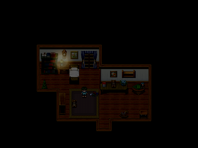
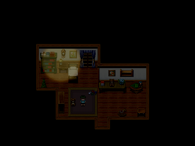
Nothing special here. I just wonder if the light effect works?
 
Look pretty good, but the lamp has a light effect but the window doesn't. Also, it's going over the wall, looks a bit off if you get what I mean.
 
I think it looks a bit better, although even one lamp would be able to add a more more light, but I guess that depends on the room itself.

Some screens from an upcoming project.
gpa1.png

memorialwip.png
 
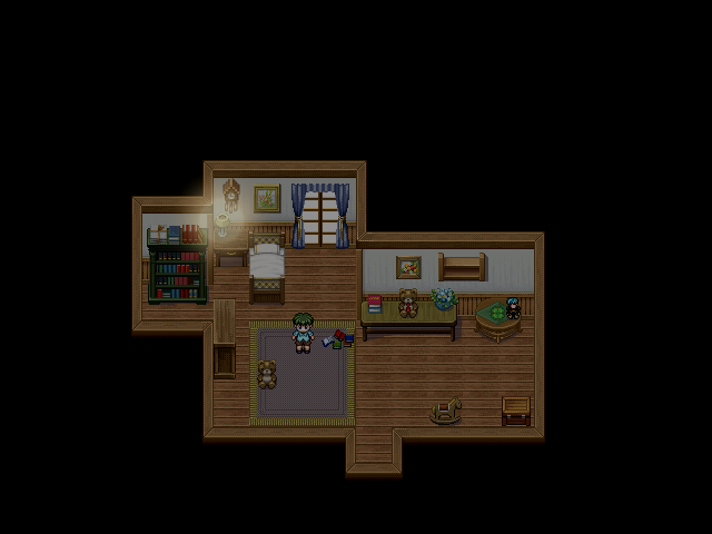
It looks a bit wonky. Light should make things easier to see at night but this light is making it harder for me to see the area that's lit up. :s
 
The Star Light System does a much better with lights that remove black from a scene and make it easier to see. Otherwise though, I quite like the scene. I looks like a believable room.
 
I've finally finalized the status screen for my game, still some fixes left here and there, and trust me you will see them, I just wanted to share the eye-delight

Graphics by Me, Script by: The LawG14
atelierstoryofficialbat.png
 
Tuna":kqnb165f said:
Interesting. Any supporting details?
It's literally a Java port of a C written ray casting engine, without the ridiculous SDL involved.

I had trouble with how to draw lines with the android SDK, once I figured that out, porting the engine was easy. Shame I know nothing about Android input so I can't get that camera to rotate or the player to move around.
 
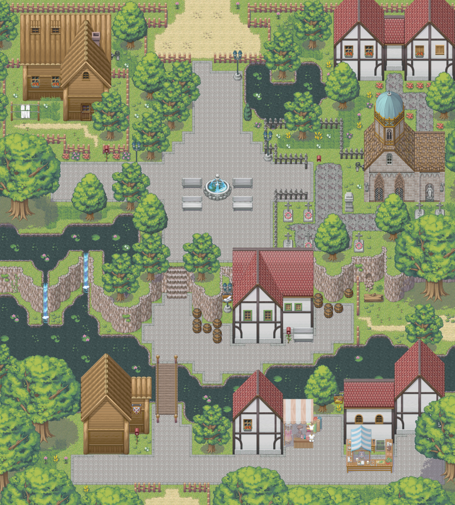
Here comes a big one(Also, Im aware of the missing doors^^):
Grassland01-7.png


And Im aware of one mapping error, but I don't feel like to make this screenshot in Paint.net again.
 

Tuna

Awesome Bro

This map is rather nice and varied. It's rather beautiful to look at. I assume you plan on adding doors to the majority of the buildings later. One thing that always bugs me about town maps is the abundance of picket fences being used as town borders. This looks tacky to me, and they don't exactly offer any sort of protection, so trees might as well be used to create a more natural border in my opinion. I think it would look really nice if the "town center" autotile was drawn on the second layer where it meets the church path autotile so that the church path autotile would run underneath it, giving it a more connected feeling. But this looks really good!
 
Akuma209":1ytpkpsc said:
I've finally finalized the status screen for my game, still some fixes left here and there, and trust me you will see them, I just wanted to share the eye-delight

Graphics by Me, Script by: The LawG14
atelierstoryofficialbat.png

Man, I really need battle backs like that (since I need 640x480 ones)

Looks absolutely lovely!
 
Tuna":1v2891l6 said:
I think it would look really nice if the "town center" autotile was drawn on the second layer where it meets the church path autotile so that the church path autotile would run underneath it, giving it a more connected feeling.

Or you could just draw the "church path" next to the "town center" with Shift held down to draw without the autotile borders, then redraw the grass around it to make the borders where you want them.
 
Shiwt, quite nice, when I look at ruins though I try to see what the building would have looked like if you know what I mean.
You've got rubble placed where the wall's intact, also the log may be better placed next to the broken wall with a stump on the other side.
Is this meant to be a dead end? I see the path entrance from the top left but see no other entrance/exit points.
 

Tuna

Awesome Bro

Very nice map! If you want to try to make your ruins even more realistic like Holder suggested, a good idea is to build the entire building with normal walls, and then start taking them away until eventually you're left with ruins like you have in this map.
 

shiwt

Member

Holder":1eve2qtc said:
You've got rubble placed where the wall's intact, also the log may be better placed next to the broken wall with a stump on the other side.
I did not think about it :)
Holder":1eve2qtc said:
Is this meant to be a dead end? I see the path entrance from the top left but see no other entrance/exit points.
Yes.

@Tuna
Thanks. It's nice that you like
 
Status
Not open for further replies.

Thank you for viewing

HBGames is a leading amateur video game development forum and Discord server open to all ability levels. Feel free to have a nosey around!

Discord

Join our growing and active Discord server to discuss all aspects of game making in a relaxed environment. Join Us

Content

  • Our Games
  • Games in Development
  • Emoji by Twemoji.
    Top