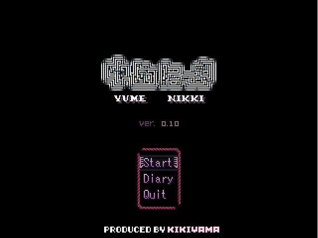
Highly successful indie game, and yet the title screen is that minimalistic. But it's well designed, so it's totally fine for it to look like that. You really don't need much to get the idea across.
Another indie game, and an RM one at that. Again, just the title and a small logo.
The text is elaborate, but you don't even really need that. See the above ones. A lot of games just do the title + company info.
Slightly more elaborate than the above ones, but you see how it's still basically utilitarian. There isn't stuff crammed in every corner; it's mostly dark with one focal point in the center.
Again, stuff is going on, but the focus is still on the title. The background pattern is subtle enough that it's not distracting.


%20(Beta).png)