Envision, Create, Share

Welcome to HBGames, a leading amateur game development forum and Discord server. All are welcome, and amongst our ranks you will find experts in their field from all aspects of video game design and development.

You are a pirate !

Jason

Awesome Bro

Hi everyone,

So a few weeks back, I posted my Plantmanthingymajig, the best thing you'd ever seen in your lives !
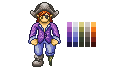
And now I think I'll submit another art, this one being, as the title says, a pirate, however, he's not the scruffy scurvy "Do me up the bum as I drink my rum" kind of pirate, he's...
... ginger.
I made him with the template I did a while back, cause I find it fun to sprite on, even if I do only use the first frame of it (Cause I'll never use it in a game anyway, lol).

Without me stalling you further, here he is in all his glory;


He has 25 colours not including the skintones (As thats from the template, didn't bother using a pallette back then, just used 'em as I found 'em, eek.), and I think I might have shaded him a little wrong, especially his trousers and boot, but other than that, I think he's come out quite well.

C&C on the design, shading, and pallette would all be appreciated, thankyou.

Edit... Oh yeah, he has two buttons on the right of his purple coat, I guess I never coloured 'em though, just imagine them a nice gold colour, lol. *Is forgetful.*
 
Define the musculature more with the coat. The texturing looks pretty good, but he looks tube-y and ill-defined. The chest needs to be brought out more, and the arms could stand a bit more definition (try darkening stuff around the elbows). Also, why is the peg leg green? You could reuse one of the colors you already have very easily. Looks good, though.
 

Jason

Awesome Bro

It's green cause the wood is meant to look seaworn and rotted etc. since he's been kept as a prisoner on a ship for sooo long (Terrible what they did to gingers back then... lol)

Defining the arms should be pretty easy, although I don't understand how to bring out the chest on a flat drawing, care to explain a little more ?

Thanks for the feedback :thumb:
 

Jason

Awesome Bro

mawk":22jtcfxx said:
wood doesn't go green basically ever

How about a little C&C instead of shitty spam, thanks. :thumb:

He brought up a valid point, which makes it constructive and not spam. He wasn't even that nasty about it. Try to be a bit more thick-skinned. ~Perihelion
 
Isn't the boot a bit large? Generally, big feet makes thing look chibi.
I suggest you to shorten the hands, as currently the legs look too short in comparison.
 

Twirly

Sponsor

Okay, let's go d:eek:
First of all, the lineart is great. Really you did a great job :D
Now only problem would be the shading

look at his arms and his legs, the left arm's and left leg's lightsource is from the left, for the right leg and arm
the light source is from the right. Also the hat seems to have his own lightsource too (above)
so yeah, I think it would be good to have one lightsource :D
Also, in the skin palette, there is one color which barely differs from the lighter one.
Hope this helped out :)
 

Jason

Awesome Bro

Well I'm not too bothered about the skin pallette cause it's from my old template which is uneditted (Couldn't find where I saved my newer one so thought fuck it...),

@Twirly; And yeah, now you mention it, the light source on the arms looks pretty screwed, although I was actually trying to make the coat have creases in it so it didn't look so straightly put on, I'll have to figure out how to change that.

@silver wind; I don't see how the arms are too long, the legs actually start about 1/3 up into the purple coat, they're pretty darn long, I just tried to make the pants seem a little baggy, not sure if anyone else thinks that, lol.
 
no the arms are a fine length imo.

you're suffering from overshading. i do this all the time, too. it's easy to do when you're staring at something at like 1000x zoom.
play by the k.i.s.s. rule (keep it simple sam).
to get yourself out of this conundrum, i'd recommend to just kill all the shading, put in base fills, and start over. any further reworking will likely just end up adding insult to injury.

in pixel art, when you've shaded something too much, it starts to look like texture instead of depth. your sprite guy looks like a flat outline with some texture on it and maybe a little light hitting it from odd angles.

when you start over, do what i call "color blocking". Start with a midtone fill on everything. Then, using the dark shades and light highlights, outline and fill the large regions that deserve shading or highlights. Then refine the selout between those regions. Avoid dithering as much as possible.

Anatomically, the guy's neck slopes too much like an equilateral triangle, connecting to his shoulders. And his head looks a little too small.
 

Jason

Awesome Bro

Well the neck, they're meant to be neck muscles, like if you've ever seen pro wrestlers (Oh god.. PRO !? They take steriods !), but if it looks bad, I can change it.

And yeah, I really need to stop overshading, I just try to cram in too much detail, otherwise if I don't, it doesn't look good enough to me.

I'll have a try at this "colour blocking" thingy...
 
Well I'm hardly a pixel expert ^^;
I did try to move the torso up, and it looked better to me.
.....
piratexmpl.png

piratexmpl2-1.png
 

Jason

Awesome Bro

But then the arms look way too short and the legs look really odd, lol. I think I got the proportions pretty much right with the template :huh:
 

Numb

Member

Actually, Jbrist, the arms look fine, in fact they look better.
I really hope your arms aren't longer than your legs, because there not suppose to look like that.
 

Thank you for viewing

HBGames is a leading amateur video game development forum and Discord server open to all ability levels. Feel free to have a nosey around!

Discord

Join our growing and active Discord server to discuss all aspects of game making in a relaxed environment. Join Us

Content

  • Our Games
  • Games in Development
  • Emoji by Twemoji.
    Top