
Perihelion
Sponsor
If you're making your own assets, or even if you're just significantly adapting ones you already have, it's important to do concept art first if you want to develop a strong and distinctive aesthetic for your game. Although you need creativity to do this, you actually don't need to be a great artist! All you need is Photoshop or a similar image editing program. Composited images are used for preliminary concept art all the time in the industry. I'm in the process of making some for my game, and I figured people might be interested in the process.
These composites are quick and rough, but the goal is to convey the idea rather than to make beautiful and convincing art. In theory, if I were going to do the whole concept art process properly, I would take these and use them as references for a painting. I'm not planning on modeling everything from scratch in my game, though, so the final architectural details are probably going to depend a lot on what I can find. I'm seeking more to develop ideas on mood, space, and lighting/effects.


Here's a walkthrough of the second image:
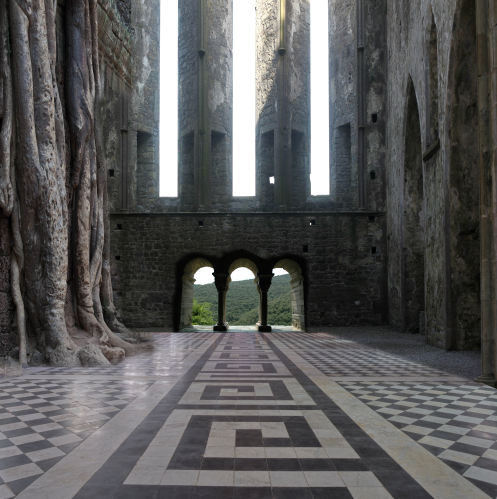
I started by finding a bunch of stock photos on deviantART and working out the composition of the scene. I roughly cut away undesired areas using a layer mask and a large fuzzy brush. In retrospect, I should have done something about the perspective of the walls not matching the floor, but the final image was so dark you couldn't tell anyway.
Composited in the view through the arches and applied a levels layer on top of the background to make the contrast more consistent. I just noticed I messed up the perspective in the blue arch a little bit, but I selected the bottom parts of the photos (where you can see the perspective of the wall meeting the floor) and squashed them until they matched the perspective of the floor.
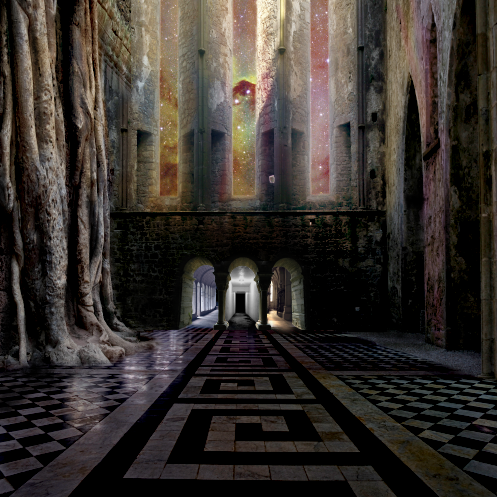
Added in nebula through the windows and did some lighting on the top half of the screen. I think it's mostly big fuzzy brush on low opacity on layers set to linear dodge or soft light.
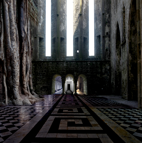
Added in lighting on the doors. Some combination of normal/linear dodge layers alternating between a textured brush and an untextured brush. Also made the background bluer.

Applied a yellowish grunge texture set to overlay on top of everything.
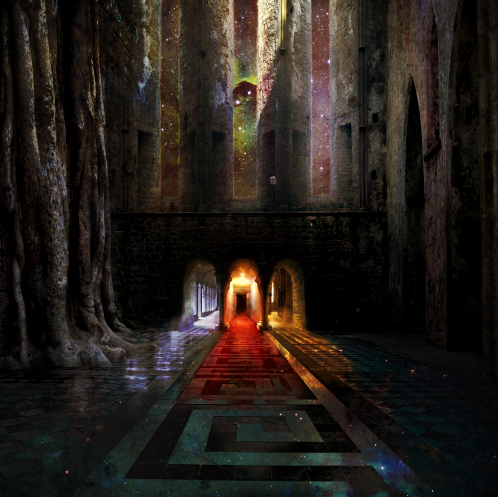
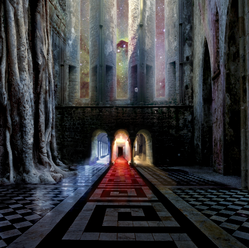
Added nebula on the floor. What I did was disable the overlay layer, did a color select on the black lines of the floor, used the selection to create a layer mask to show the nebula, then duplicated the layer mask, inverted it, and filled the layer with black to increase the contrast between the nebula and the floor. So the white tiles in the background are actually the black tiles in the foreground, whereas the black tiles in the background are the space tiles in the foreground. (You can tell if you look at the spirals in the center. I think the effect is kind of neat.) Then I adjusted the layer mask, applied gradients, etc. so it was only visible where I wanted it.
I hope this was helpful. I'm probably going to be making more of these, so I can do more walkthroughs if people are interested.
These composites are quick and rough, but the goal is to convey the idea rather than to make beautiful and convincing art. In theory, if I were going to do the whole concept art process properly, I would take these and use them as references for a painting. I'm not planning on modeling everything from scratch in my game, though, so the final architectural details are probably going to depend a lot on what I can find. I'm seeking more to develop ideas on mood, space, and lighting/effects.
Here's a walkthrough of the second image:
I started by finding a bunch of stock photos on deviantART and working out the composition of the scene. I roughly cut away undesired areas using a layer mask and a large fuzzy brush. In retrospect, I should have done something about the perspective of the walls not matching the floor, but the final image was so dark you couldn't tell anyway.
Composited in the view through the arches and applied a levels layer on top of the background to make the contrast more consistent. I just noticed I messed up the perspective in the blue arch a little bit, but I selected the bottom parts of the photos (where you can see the perspective of the wall meeting the floor) and squashed them until they matched the perspective of the floor.
Added in nebula through the windows and did some lighting on the top half of the screen. I think it's mostly big fuzzy brush on low opacity on layers set to linear dodge or soft light.
Added in lighting on the doors. Some combination of normal/linear dodge layers alternating between a textured brush and an untextured brush. Also made the background bluer.
Applied a yellowish grunge texture set to overlay on top of everything.
Added nebula on the floor. What I did was disable the overlay layer, did a color select on the black lines of the floor, used the selection to create a layer mask to show the nebula, then duplicated the layer mask, inverted it, and filled the layer with black to increase the contrast between the nebula and the floor. So the white tiles in the background are actually the black tiles in the foreground, whereas the black tiles in the background are the space tiles in the foreground. (You can tell if you look at the spirals in the center. I think the effect is kind of neat.) Then I adjusted the layer mask, applied gradients, etc. so it was only visible where I wanted it.
I hope this was helpful. I'm probably going to be making more of these, so I can do more walkthroughs if people are interested.