Envision, Create, Share

Welcome to HBGames, a leading amateur game development forum and Discord server. All are welcome, and amongst our ranks you will find experts in their field from all aspects of video game design and development.

VERY first projects. Please critique!

Hey everyone. A while ago I started this topic after I finally broke down to buy a wacom tablet. But since then I haven't posted many new pieces, so this is kind of a refreshing of the post... post. If that makes sense at all.

So... I'll cut the crap and just throw up the previous art and the newest stuff.

RiokoComplete.jpg
Blink_edited-2.jpg
Survivorcopy.jpg
LadySpartan.jpg

Please, feel free to critique, comment, spit, or even curse at my artwork. Hopefully I'll have more up soon.
 
Oh barf, bamboo looks awful just by looking at the pixelation in the writing.

For the first two... the colors are okay, you could set up a more compositionally aesthetic scheme if you kept the colors closer towards a common scheme.
Like the red in kira's (the guy) hair doesn't quite work well, as the hair isn't really that interesting and its being a focus hog right now. Where as the saturated red in Misa's lipstick works to draw the eye over to her (Because of the small amount as well), but then her hair lacks any definition. So its more like... yeah, you colored it, but then what? What are you trying to get.

For the second picture, I think the purple is fine. I'm not going to go much into detail because its already a simple color combo as it is.

As for your drawn picture, learn to use layers! It'll help so much more. You need more confidence as well in your mark making. Your lines are hesitant and unsure (and its not just with the tablet either, I can tell the pictures on paper suffer from the same sketchiness). Work on your lines before I'll go critique the color. Also proportions of the arm to the torso is wonky, the arm is too thin where the torso is too elongated.
 
Actually, Bamboo looks pretty good in Opencanvas.  However; the drawn picture was in photoshop 6.0  (it doesn't pick up the pressure sensitivity)  That's why it looks so weak.  And you're totally right.  I'm sketching out a character right now and I'm really trying to focus on my line confidence.  I very much appreciate your comments.

If it still looks wierd (because of the bamboo)  let me know.  I'll take it back in a heartbeat.  It was $105.  And if it's going to be crap, I'll go get a different one. 

And again, I was just coloring those black and whites to test out the capabilities.  Thanks for the compliments.  And I see what you mean about the lack of detail in Misa's hair.  Compred to Kira's, it's terrible.  I should have left it white and just done a really light cream to detail it up a bit.  And yeah, the red is too much.  I should have stayed with brown or blond.  What color is it supposed to be?  Do you know?

I've never seen the two before, but obviously they're from somewhere.  A series or something.

Here, I'll post what I'm working on:
http://i71.photobucket.com/albums/i132/ ... er/New.jpg[/img]
This one is beng done in OpenCanvas,  it's obviously the better choice until I can get back to my desktop which has Photoshop 7 Elements  (I know there are a lot of bad things said about it, but I love it!)

He looks a lot like the guy in my signature, in case you didn't notice.  lol.  I love the style.  And his left shoulder piece looks like a loaf of bread.... shit.
 
Yeah, no idea what his shoulder thing is suppose to be, but its ridiculous.
At anyrate, thats opencanvas? That looks like a pencil sketch to me.

light/kira/raito/whatever's hair is a light brown, and Misa's is a blond. If you make kira's eyes red, it would help so much more instead of his hair.
 
Huh.  Well I'm not going to go back to those recolors.  I don't care much for them anyway.  Just practice. 
And yeah.  It is just a sketch at the moment.  But it is using OpenCanvas and my Bamboo.  I have no idea how to make it into an actual anime looking picture....  None whatsoever.  So I'm just sketching.  I'll have to go look at some tutorials I guess.

Should I lose the shoulders all together?  Or just structure them a little better?
 
Lol.  I wish I knew how to "go" anything right now... Though I'll try to stay away from generic anything.  Here's the guy.  I'm almost positive I'm going to redo his shirt.  The brown looks terrible and the brush strokes look really... I don't know.

I don't know how to get it to stop looking like a water color painting though.

I think I have to use a different program so my stroke pressure doesn't determine the darkness of the color... not that I don't like that.  But it gets in the way.  Geh.... any suggestions?

http://i71.photobucket.com/albums/i132/ ... mplete.jpg[/img]
 
Your first two pieces I'm impressed with. The others I'm kinda iffy with. They're okay...BUT they aren't as good as the other ones. Which makes me question why that is.

The Deathnote fanart is really well colored. And the birthday card looking one is almost of some what professional quality. But then you get to the one with the shoulder and its kinda hit or miss. It reminds me of Juno [[and one of my exes]] for some odd reason and the latest one the quality just kinda dropped all together. Now unless you're experimenting with different styles [[which is fine]] but I'd say stick with how you did the first two. Because the death note one carries an interesting style. Its not typical anime but it still has anime influences. Either ways your up to a good start. And PE is a horrible program imo. But to each their own. Can't wait to see how you improve over the time though! g'luck with it. I'll check her as often as you post ha.

Also did you really draw that second one? Because if you read the fine print at the very bottom it doesn't seem like you drew it. :eek: not accusing you of it but you can't steal other peoples artwork bro!

Also the bamboo isn't the problem with the pixelation writing. Its a wacom. I don't think they'd release crap. What kind of brush did you use for it? It looks like you used the pencil tool or something. Either ways its a fine piece of machinery [[sp?]]. I wish I'd bought one actually.
 
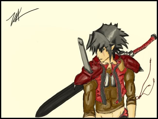
Well, the first two I DID NOT draw. I merely googled for black and white anime, to practice coloring with.  Even when I did my art on paper, I always did black and white.  I couldn't paint and I never found any other means of coloring my art without making it look like crap.  Those were NOT DONE BY ME!  I did not steal them,  I just borrowed so I could attempt my version of coloring them.  That's why they look good.  Because I didn't draw them. lol  Just colored 'em.

The third one was the first time I'd ever used photoshop to actually draw something, so I'm still very unsure of what kinds of brushes look good with what.  In the past I've solely used photoshop to touch up photos, add effects, text and make banners, like the one in my signature.  I didn't draw that either.

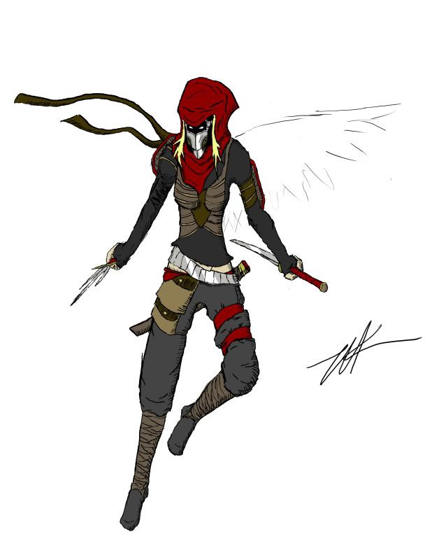
However; I did use that guy as a base to start the last drawing I did.  That one I did completely.  Could you critique that one for me?  I'm going to play all day with my bamboo to see if I can find my style, and figure out which program works best for me.  I have three that came with the tablet, and I haven't used any of them yet.  I need to watch some tutorials on brushes and drawing I suppose.  All the tutorials I've seen end with a very rough sketch then suddenly start painting and the sketchiness of the lines are totally gone!  I don't know how to get rid of them!  lol.  So I'm just going to keep experimenting.

Thanks for the critiques.  I'll post what I come up with today when it's finished. And I'll probably redo Rioko's jacket, which is the last picture I did.

EDIT:  p.s.  I love Juno, so I don't even care that it reminds you of that. XD  And THAT is the one that I thought looked like a birthday card. 


EDIT:  Alright guys, all day I worked on this one using Photoshop Elements 5.0.3 I believe.  I love the program for art, but can't stand it for editing photos, so I'm keeping my Photoshop 6.0 too.  Anyway... this is what I came up with.  The Mrs. saw the last/first one I did, and requested a "warrior princess" I tried really hard not to roll my eyes.  She loves Sailor Moon, so I just kind of gave it a go.  I like the style, but she's way too plain for me... no armor, no weapons, just some angry eyes and betty spaghetti legs.  Please, critique me!
http://i71.photobucket.com/albums/i132/ ... /Chloe.jpg[/img]
From what I can tell, it definitely lacks detail.  But I'm still trying to get that part of the style down.  I would love any suggestions you could hand out while you're picking the piece apart.  Thank you!

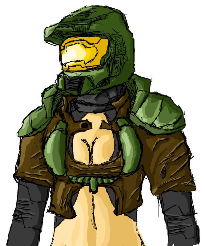
Oh yeah!  Here's a guy I played around with when I first installed the new photoshop.  I call him Blink.  There are billions of them in the world, but no one has ever seen one up close and personal.  He's that thing everyone sees out of the corner of their eye, but when they turn, he's gone.  : )
http://i71.photobucket.com/albums/i132/ ... ited-2.jpg[/img]
 
Oh well I didn't happen to  read that. I mean fanart is fine [[which I thought you just redrew them]] but now that I got ya' my mistake for that.

You need to get PS7 or up because 6 is missing a lot of the good stuff that was introduced in PS7 or CS2, CS3 things like that. You're limiting artistic abilities by using dated software. BUT it is good that you're making due with what you have. :) Might I suggest looking into sketchbook pro? Its a hell of a lot better than PSE and you can export drawings into PS. So its a win win kinda situation.

Now onto the art:

The first one. You seem to have a good grasp of anatomy down. Thats good. Its just you exaggerate the proportions by a lot. I'm not to sure if thats because of the style or not. I'm not familiar with the style type but yeah you might want to look into more realistic proportions. I can't seem to type for shit. :/ either ways also two-toned shading doesn't really work well for forms. It may look good in anime but it tends to make drawings look a little flat. As is the case with the first one. The face is okay but triangular noses aren't to attractive looking. :( also the eyes are very DBZ'ish. Which is also very '97. But again this is style so if this is what you're shooting for then ignore me altogether.

I'm not really a big fan of the second piece as its lacking in well anything. Being to harsh? Of course not! This is a learning thing and well crits will help you to grow as an artist! But yes the face has no "shading" on it whatsoever! I don't know but as it stands thats your weakest piece out of all of them. Not to be to knitpicky or anything like that. But it does seem you appear to be getting used to your tablet kinda good. So thats a plus.

And also I loved Juno! Its one of my favorite movies! [[fag]] but its okay because its a good piece without being overly complicated y'know?
 
Never love a piece. Then you settle for it and never want to improve. While I do like this newest one. Is it done digitally or traditionally? I can't really tell the difference between a hand made drawing and a computer hand made drawing. :/ either ways it looks good. Still working with the long anatomy and the pose is kinda stiff. But other than that its passable. :) one thing I do like is how just the flat colors are enough. They seem to work well with how you did the simplistic shading method for some odd reason to me. So g'job there.
 

Anonymous

Guest

FFFFFFFFFFFFFFFFFFFFFFFFFFFFFFFFFFFFFFFFFFFFFFFFFFFFFFFFFFFFFFFFFFFFFFFFFFFFFFFFFFFFFFFFFFFFFFFFFFFFFFFFFFFFFFFFFFFFFFFFFFFFFFFFFFFFFFFFFFFFFFFFFFFFFFFFFFFFFFFFFFFFFFFFFFFFFFFFFFFFFFFFFFFFFFFFFFFFFFFFFFFFFFFFFFFFFFFFFFFFFFFFFFFFFFFFFFFFFFFFFFFFFFFFFFFFFFFFFFFFFFFFFFFFFFFFFFFFFFFFFFFFFFFFFFFFFFFFFFFFFFFFFFFFFFFFFFFFFFFFFFFFFFFFFFFFFFFFFFFFFFFFFFFFFFFFFFFFFFFFFFFFFFFFFFFFFFFFFFFFFFFFFFFFFFFFFFFFFFFFFFFFFFFFFFFFFFFFFFFFFFFFFFFFFFFFFFFFFFFFFFFFFFFFFFFFFFFFFFFFFFFFFFFFFFFFFFFFFFFFFFFFFFFFFFFFFFFFFFFFFFFFFFFFFFFFFFFFFFFFFFFFFFFFFFFFFFFFFFFFFFFFFFFFFFFFFFFFFFFFFFFFFFFFFFFFFFFFFFFFFFFFFFFFFFFFFFFFFFFFFFFFFFFFFFFFFFFFFFFFFFFFFFFFFFFFFFFFFFFFFFFFFFFFFFFFFFFFFFFFFFFFFFFFFFFFFFFFFFFFFFFFFFFFFFFFFFFFFFFFFFFFFFFFFFFFFFFFFFFFFFFFFFFFFFFFFFFFFFFFFFFFFFFFFFFFFFFFFFFFFFFFFFFFFFFFFFFFFFFFFFFFFFFFFFFFFFFFFFFFFFFFFFFFFFFFFFFFFFFFFFFFFFFFFFFFFFFFFFFFFFFFFFFFFFFFFFFFFFFFFFFFFFFFFFFFFFFFFFFFFFFFFFFFFFFFFFFFFFFFFFFFFFFFFFFFFFFFFFFFFFFFFFFFFFFFFFFFFFFFFFFFFFFFFFFFFFFFFFFFFFFFFFFFFFFFFFFFFFFFFFFFFFFFFFFFFFFFFFFFFFFFFFFFFFFFFFFFFFFFFFFFFFFFFFFFFFFFFFFFFFFFFFFFFFFFFFFFFFFFFFFFFFFFFFFFFFFFFFFFFFFFFFFFFFFFFFFFFFFFFFFFFFFFFFFFFFFFFFFFFFFFFFFFFFFFFFFFFFFFFFFFFFFFFFFFFFFFFFFFFFFFFFFFFFFFFFFFFFFFFFFFFFFFFFFFFFFFFFFFFFFFFFFFFFFFFFFFFFFFFFFFFFFFFFFFFFFFFFFFFFFFFFFFFFFFFFFFFFFFFFFFFFFFFFFFFFFFFFFFFFFFFFFFFFFFFFFFFFFFFFFFFFFFFFFFFFFFFFFFFFFFFFFFFFFFFFFFFFFFFFFFFFFFFFFFFFFFFFFFFFFFFFFFFFFFFFFFFFFFFFFFFFFFFFFFFFFFFFFFFFFFFFFFFFFFFFFFFFFFFFFFFFFFFFFFFFFFFFFFFFFFFFFFFFFFFFFFFFFFFFFFFFFFFFFFFFFFFFFFFFFFFFFFFFFFFFFFFFFFFFFFFFFFFFFFFFFFFFFFFFFFFFFFFFFFFFFFFFFFFFFFFFFFFFFFFFFFFFFFFFFFFFFFFFFFFFFFFFFFFFFFFFFFFFFFFFFFFFFFFFFFFFFFFFFFFFFFFFFFFFFFFFFFFFFFFFFFFFFFFFFFFFFFFFFFFFFFFFFFFFFFFFFFFFFFFFFFFFFFFFFFFFFFFFFFFFFFFFFFFFFFFFFFFFFFFFFFFFFFFFFFFFFFFFFFFFFFFFFFFFFFFFFFFFFFFFFFFFFFFFFFFFFFFFFFFFFFFFFFFFFFFFFFFFFFFFFFFFFFFFFFFFFFFFFFFFFFFFFFFFFFFFFFFFFFFFFFFFFFFFFFFFFFFFFFFFFFFFFFFFFFFFFFFFFFFFFFFFFFFFFFFFFFFFFFFFFFFFFFFFFFFFFFFFFFFFFFFFFFFFFFFFFFFFFFFFFFFFFFFFFFFFFFFFFFFFFFFFFFFFFFFFFFFFFFFFFFFFFFFFFFFFFFFFFFFFFFFFFFFFFFFFFFFFFFFFFFFFFFFFFFFFFFFFFFFFFFFFFFFFFFFFFFFFFFFFFFFFFFFFFFFFFFFFFFFFFFFFFFFFFFFFFFFFFFFFFFFFFFFFFFFFFFFFFFFFFFFFFFFFFFFFFFFFFFFFFFFFFFFFFFFFFFFFFFFFFFFFFFFFFFFFFFFFFFFFFFFFFFFFFFFFFFFFFFFFFFFFFFFFFFFFFFFFFFFFFFFFFFFFFFFFFFFFFFFFFFFFFFFFFFFFFFFFFFFFFFFFFFFFFFFFFFFFFFFFFFFFFFFFFFFFFFFFFFFFFFFFFFFFFFFFFFFFFFFFFFFFFFFFFFFFFFFFFFFFFFFFFFFFFFFFFFFFFFFFFFFFFFFFFFFFFFFFFFFFFFFFFFFFFFFFFFFFFFFFFFFFFFFFFFFFFFFFFFFFFFFFFFFFFFFFFFFFFFFFFFFFFFFFFFFFFFFFFFFFFFFFFFFFFFFFFFFFFFFFFFFFFFFFFFFFFFFFFFFFFFFFFFFFFFFFFFFFFFFFFFFFFFFFFFFFFFFFFFFFFFFFFFFFFFFFFFFFFFFFFFFFFFFFFFFFFFFFFFFFFFFFFFFFFFFFFFFFFFFFFFFFFFFFFFFFFFFFFFFFFFFFFFFFFFFFFFFFFFFFFFFFFFFFFFFFFFFFFFFFFFFFFFFFFFFFFFFFFFFFFFFFFFFFFFFFFFFFFFFFFFFFFFFFFFFFFFFFFFFFFFFFFFFFFFFFFFFFFFFFFFFFFFFFFFFFFFFFFFFFFFFFFFFFFFFFFFFFFFFFFFFFFFFFFFFFFFFFFFFFFFFFFFFFFFFFFFFFFFFFFFFFFFFFFFFFFFFFFFFFFFFFFFFFFFFFFFFFFFFFFFFFFFFFFFFFFFFFFFFFFFFFFFFFFFFFFFFFFFFFFFFFFFFFFFFFFFFFFFFFFFFFFFFFFFFFFFFFFFFFFFFFFFFFFFFFFFFFFFFFFFFFFFFFFFFFFFFFFFFFFFFFFFFFFFFFFFFFFFFFFFFFFFFFFFFFFFFFFFFFFFFFFFFFFFFFFFFFFFFFFFFFFFFFFFFFFFFFFFFFFFFFFFFFFFFFFFFFFFFFFFFFFFFFFFFFFFFFFFFFFFFFFFFFFFFFFFFFFFFFFFFFFFFFFFFFFFFFFFFFFFFFFFFFFFFFFFFFFFFFFFFFFFFFFFFFFFFFFFFFFFFFFFFFFFFFFFFFFFFFFFFFFFFFFFFFFFFFFFFFFFFFFFFFFFFFFFFFFFFFFFFFFFFFFFFFFFFFFFFFFFFFFFFFFFFFFFFFFFFFFFFFFFFFFFFFFFFFFFFFFFFFFFFFFFFFFFFFFFFFFFFFFFFFFFFFFFFFFFFFFFFFFFFFFFFFFFFFFFFFFFFFFFFFFFFFFFFFFFFFFFFFFFFFFFFFFFFFFFFFFFFFFFFFFFFFFFFFFFFFFFFFFFFFFFFFFFFFFFFFFFFFFFFFFFFFFFFFFFFFFFFFFFFFFFFFFFFFFFFFFFFFFFFFFFFFFFFFFFFFFFFFFFFFFFFFFFFFFFFFFFFFFFFFFFFFFFFFFFFFFFFFFFFFFFFFFFFFFFFFFFFFFFFFFFFFFFFFFFFFFFFFFFFFFFFFFFFFFFFFFFFFFFFFFFFFFFFFFFFFFFFFFFFFFFFFFFFFFFFFFFFFFFFFFFFFFFFFFFFFFFFFFFFFFFFFFFFFFFFFFFFFFFFFFFFFFFFFFFFFFFFFFFFFFFFFFFFFFFFFFFFFFFFFFFFFFFFFFFFFFFFFFFFFFFFFFFFFFFFFFFFFFFFFFFFFFFFFFFFFFFFFFFFFFFFFFFFFFFFFFFFFFFFFFFFFFFFFFFFFFFFFFFFFFFFFFFFFFFFFFFFFFFFFFFFFFFFFFFFFFFFFFFFFFFFFFFFFFFFFFFFFFFFFFFFFFFFFFFFFFFFFFFFFFFFFFFFFFFFFFFFFFFFFFFFFFFFFFFFFFFFFFFFFFFFFFFFFFFFFFFFFFFFFFFFFFFFFFFFFFFFFFFFFFFFFFFFFFFFFFFFFFFFFFFFFFFFFFFFFFFFFFFFFFFFFFFFFFFFFFFFFFFFFFFFFFFFFFFFFFFFFFFFFFFFFFFFFFFFFFFFFFFFFFFFFFFFFFFFFFFFFFFFFFFFFFFFFFFFFFFFFFFFFFFFFFFFFFFFFFFFFFFFFFFFFFFFFFFFFFFFFFFFFFFFFFFFFFFFFFFFFFFFFFFFFFFFFFFFFFFFFFFFFFFFFFFFFFFFFFFFFFFFFFFFFFFFFFFFFFFFFFFFFFFFFFFFFFFFFFFFFFFFFFFFFFFFFFFFFFFFFFFFFFFFFFFFFFFFFFFFFFFFFFFFFFFFFFFFFFFFFFFFFFFFFFFFFFFFFFFFFFFFFFFFFFFFFFFFFFFFFFFFFFFFFFFFFFFFFFFFFFFFFFFFFFFFFFFFFFFFFFFFFFFFFFFFFFFFFFFFFFFFFFFFFFFFFFFFFFFFFFFFFFFFFFFFFFFFFFFFFFFFFFFFFFFFFFFFFFFFFFFFFFFFFFFFFFFFFFFFFFFFFFFFFFFFFFFFFFFFFFFFFFFFFFFFFFFFFFFFFFFFFFFFFFFFFFFFFFFFFFFFFFFFFFFFFFFFFFFFFFFFFFFFFFFFFFFFFFFFFFFFFFFFFFFFFFFFFFFFFFFFFFFFFFFFFFFFFFFFFFFFFFFFFFFFFFFFFFFFFFFFFFFFFFFFFFFFFFFFFFFFFFFFFFFFFFFFFFFFFFFFFFFFFFFFFFFFFFFFFFFFFFFFFFFFFFFFFFFFFFFFFFFFFFFFFFFFFFFFFFFFFFFFFFFFFFFFFFFFFFFFFFFFFFFFFFFFFFFFFFFFFFFFFFFFFFFFFFFFFFFFFFFFFFFFFFFFFFFFFFFFFFFFFFFFFFFFFFFFFFFFFFFFFFFFFFFFFFFFFFFFFFFFFFFFFFFFFFFFFFFFFFFFFFFFFFFFFFFFFFFFFFFFFFFFFFFFFFFFFFFFFFFFFFFFFFFFFFFFFFFFFFFFFFFFFFFFFFFFFFFFFFFFFFFFFFFFFFFFFFFFFFFFFFFFFFFFFFFFFFFFFFFFFFFFFFFFFFFFFFFFFFFFFFFFFFFFFFFFFFFFFFFFFFFFFFFFFFFFFFFFFFFFFFFFFFFFFFFFFFFFFFFFFFFFFFFFFFFFFFFFFFFFFFFFFFFFFFFFFFFFFFFFFFFFFFFFFFFFFFFFFFFFFFFFFFFFFFFFFFFFFFFFFFFFFFFFFFFFFFFFFFFFFFFFFFFFFFFFFFFFFFFFFFFFFFFFFFFFFFFFFFFFFFFFFFFFFFFFFFFFFFFFFFFFFFFFFFFFFFFFFFFFFFFFFFFFFFFFFFFFFFFFFFFFFFFFFFFFFFFFFFFFFFFFFFFFFFFFFFFFFFFFFFFFFFFFFFFFFFFFFFFFFFFFFFFFFFFFFFFFFFFFFFFFFFFFFFFFFFFFFFFFFFFFFFFFFFFFFFFFFFFFFFFFFFFFFFFFFFFFFFFFFFFFFFFFFFFFFFFFFFFFFFFFFFFFFFFFFFFFFFFFFFFFFFFFFFFFFFFFFFFFFFFFFFFFFFFFFFFFFFFFFFFFFFFFFFFFFFFFFFFFFFFFFFFFFFFFFFFFFFFFFFFFFFFFFFFFFFFFFFFFFFFFFFFFFFFFFFFFFFFFFFFFFFFFFFFFFFFFFFFFFFFFFFFFFFFFFFFFFFFFFFFFFFFFFFFFFFFFFFFFFFFFFFFFFFFFFFFFFFFFFFFFFFFFFFFFFFFFFFFFFFFFFFFFFFFFFFFFFFFFFFFFFFFFFFFFFFFFFFFFFFFFFFFFFFFFFFFFFFFFFFFFFFFFFFFFFFFFFFFFFFFFFFFFFFFFFFFFFFFFFFFFFFFFFFFFFFFFFFFFFFFFFFFFFFFFFFFFFFFFFFFFFFFFFFFFFFFFFFFFFFFFFFFFFFFFFFF
 
....  Umm. 

First off, domowoj.... wtf?  Seriously did you need to post that in my thread?  I do believe that's what they call spam.  Dessonance??  Where the hell are you?

Second, thank you for the compliments Makasu.  I love the style I should have said.  I think I've found what works best for me.  I'm terrible at the shading obviously... it's clearly visible with the other pieces, but this one I tried a new style and I really enjoyed it.  Not only was it easy, but with a little more practice I think it'll really help my art along.

Tomorrow I'm moving back home with the folks... UGH.  Obviously the economy is shit in St. George, UT.  Three weeks and no hope whatsoever for a job.  So I won't do a big piece tomorrow, but I'm really trying to do a little bit of art every day.  After highschool I didn't draw for years.  Big mistake.

Anyway.  Thanks a lot for the critique.  I hope I get some more.


EDIT:  By the way.  Every picture on here was drawn with my Bamboo Fun Tablet.  Nothing was done on traditional paper.  : )  Be proud. 
 
You know, the reason this thread is here, is to tell how what needs improvement. Nump.

Edit: the hell... there were 2 posts with some guy with sephiroth in this thread, then I hit f5 and its gone. Oh well.
 
Wow, you're actually a really talented artist Mikee. I think you're just lacking the 'direction' and skills that comes from practice. That ninja-angel concept is an awesome idea and shows great imagination, as well as a good understanding of basic proportions like Makasu has already mentioned. Really good work!

As for critique? I think the one thing that stands out for me on that picture (ignoring the colour version atm) is the folds in the clothes. Particularly just above her left knee, and on her hood. I remember having this issue when I was at school, and I spent like a whole week just drawing people's trousers in class! :lol: Once you start to really pay attention to creases and folds, you start to internally recognize how they work. After that week, drawing clothing becoming second nature to me. Might be something you want to try out.
 

Anonymous

Guest

FFFFFFFFFFFFFFFFFFFFFFFFFFFFFFFFFFFFFFFFFFFFFFFFFFFFFFFFFFFFFFFFFFFFFFFFFFFFFFFFFFFFFFFFFFFFFFFFFFFFFFFFFFFFFFFFFFFFFFFFFFFFFFFFFFFFFFFFFFFFFFFFFFFFFFFFFFFFFFFFFFFFFFFFFFFFFFFFFFFFFFFFFFFFFFFFFFFFFFFFFFFFFFFFFFFFFFFFFFFFFFFFFFFFFFFFFFFFFFFFFFFFFFFFFFFFFFFFFFFFFFFFFFFFFFFFFFFFFFFFFFFFFFFFFFFFFFFFFFFFFFFFFFFFFFFFFFFFFFFFFFFFFFFFFFFFFFFFFFFFFFFFFFFFFFFFFFFFFFFFFFFFFFFFFFFFFFFFFFFFFFFFF
 
Lol domowoj I was going to quote it but it would've spammed his shit even more. XD either ways bro don't get mad if people spam your shit. Its cool. Just go with the flow.
 

Anonymous

Guest

oh man that's lagging the pgup/pgdn something fierce. sorry bro.
 

Thank you for viewing

HBGames is a leading amateur video game development forum and Discord server open to all ability levels. Feel free to have a nosey around!

Discord

Join our growing and active Discord server to discuss all aspects of game making in a relaxed environment. Join Us

Content

  • Our Games
  • Games in Development
  • Emoji by Twemoji.
    Top