Envision, Create, Share

Welcome to HBGames, a leading amateur game development forum and Discord server. All are welcome, and amongst our ranks you will find experts in their field from all aspects of video game design and development.

'TIME BREAK' - Detailed Synopsis

Thanks for all the support! ;) That's what I meant in the feedback post. The word "suck". Lol, how is that supposed to make me feel? In order to improve or just to let me know that I should retire from this? But it's ok now. ;)

Tindy, I removed the beggining event from the demo, like the most demos are supposed to be. It's just a preview and in the original is where all the magic happens.

Cheers!
 
Walktroughwalls.jpg

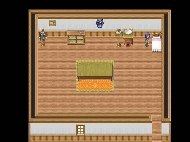
Funny enough, the wall to the south is not passable. Could it possible be so that you originally put the wall on the wrong layer and then "erased" it with the wrong tile? Figure out what went wrong here and correct it.

I also fell victim to the missing teleporter at the left of the city.

I think it's rather interesting that the main character is an old man. His ability to hear peoples thoughts can also be interesting. Your dialogs are a bit to rough though. I can see that you're trying, but the dialogs doesn't really sell the illusion that it's living people with their own thoughts and personalities we're dealing with. In short, you seem to have the ideas, but you need more practice in putting them into reality.

The first fight nearly killed me. Both monsters went faster than me and one scored a critical hit. When I won the battle, I had 18 hit points left. In parts of the game where you only have one or two characters, you need to take critical hits into account.
 
Calibre":29s4l04e said:
MaRkNemesis":29s4l04e said:
As I said before, any error that you see in the demo it's already fixed in the full version

Cheers

How can you possibly know this as fact?

Lol?! Because I'm sure of it. I've corrected the errors you see in the demo. Period. ;)

Cheers!
 
Am I missing something, or wouldn't an ancient and powerful mage be able to take down these monsters fairly easily? Surely with all his years of experience he should be able to take these things down easily!
 
MaRkNemesis":1y0hprsh said:
Calibre":1y0hprsh said:
MaRkNemesis":1y0hprsh said:
As I said before, any error that you see in the demo it's already fixed in the full version

Cheers

How can you possibly know this as fact?

Lol?! Because I'm sure of it. I've corrected the errors you see in the demo. Period. ;)

Cheers!

Why isn't the full version up instead of a bug ridden outdated version you've already fixed?
 
WeAreSuperhero":14tio89p said:
Am I missing something, or wouldn't an ancient and powerful mage be able to take down these monsters fairly easily? Surely with all his years of experience he should be able to take these things down easily!

That's also corrected, but when you see the full version you'll see.

ebhz.Ash.4rm":14tio89p said:
Why isn't the full version up instead of a bug ridden outdated version you've already fixed?

Because the originial it's not finished yet, this is the demo!
 
First of all, I'm impressed at how maturely you handled some of the obnoxious comments that folks have left on your thread. I also hate when people leave criticism without any advice about how to improve. I have a few tips for you about your maps:
1.) Check out the screenshot thread and look for maps that you like, then try to learn from them.
2.) I would suggest making your indoor maps smaller... the room in the map that Crystalgate referenced could probably be about a quarter of the size given the amount of furniture inside. Think about how that room would look in real life, and large it is relative to the person and furniture in it.
3.) Learn which tiles go well together. I know some folks have already pointed you towards some tutorials, but here's one more just in case:

http://www.youtube.com/watch?v=2cGUIcP6-YY

She has a bunch of other tutorials as well that I've found to be very helpful.
 

Nolund

Sponsor

Haha, I remember I used that tutorial when I first started learning RMXP.

Now, I can't really give you much advice as I haven't played your demo. But I can suggest you something.

You've been told your mapping isn't very good. That's fine, there's no problem with that (my mapping is that great either, you just gotta keep going). However, there are some things you should take into account.

You've been told there are bugs in your game. Now, you SAY you've fixed them all (and I speak from experience here, you can never know if you have them all. I thought I found all of mine and my beta tester found a couple I didn't notice), so what I suggest is, fix the MAIN problems with your maps (downsize and symmetry are 2 words you hear a lot in this thread, so focus on those). You haven't done much, and already your game will be improved. Once you get that done, reupload your demo with your bug fixes.

Just because it's a demo doesn't mean you can't have more than one version of it.
 
It's not too bad, one thing that was really bugging me was your windowskin, it doesn't seem to match/fit in. I suggest changing it to suit maybe your title screen's colour.

Your maps aren't exactly bad or anything, just a bit boring.

Besides that, the intro isn't bad.
 
Okay. I've watched the video, and I have a couple of things to say. Keep in mind that these are just my opinions though.

First off, your spelling, punctuation, capitalization, and grammar could use some work. I don't know if it's because you're translating from another language, but regardless, it needs to be better.

As has been already stated, your maps could use some work. Your maps have a great deal of empty space. Try to compact everything a little bit, and try to avoid bland rectangular rooms. Avoiding squares is definitely a good thing.

Shadow as a name is a little bit odd. I can't really imagine her parents deciding to name her that. If it's a title or an assumed name, then I guess it makes sense, but otherwise it doesn't really fit.

I see that you used the color slide for a couple of characters. It will look a lot better to just recolor it. The slider bar makes them look off color, and it's not very pleasing.

And finally, I don't think telepathy means what you think it means. Telepathy usually refers to reading other people's minds. I'm pretty sure you're using it to describe magic. I'd recommend changing it to something more suiting.

Other then that, it looks fine. Keep up the good work!
 
That reminds me; The starting bit with Shadow & Alex got really confusing for me, I understand what you were trying to do with the scene, but maybe you could work on it. Like Energy said, Telepathy is probably not the word your looking for, maybe you were thinking Telekinesis.
 
Thanks for the suggestions. I'll try to give the best explanations:

- I'm portuguese, so the grammar is not really great. I'll give it another look.

- My mapping is not that great either :S But I've done some improvements in the full version.

- Shadow is not her real name. You'll have to play the game for more story details. :P

- Alex has the ability of Telepathy and he is a magician. Also part of the plot.

Cheers, thanks! ;)
 

mila2

Member

don't worry about ur mapping 2 much theirs a lot of douch bags on this site that like 2 nitpick.
over all the game was good i'd say but it could do a lot better if u had a different battle system.
 
mila2":35x2klbf said:
don't worry about ur mapping 2 much theirs a lot of douch bags on this site that like 2 nitpick.
over all the game was good i'd say but it could do a lot better if u had a different battle system.

Thanks mate. I know... my mapping is not that bad, and I've been improving it in the full version. What battle system do you suggest?

Thanks for the support
 

Thank you for viewing

HBGames is a leading amateur video game development forum and Discord server open to all ability levels. Feel free to have a nosey around!

Discord

Join our growing and active Discord server to discuss all aspects of game making in a relaxed environment. Join Us

Content

  • Our Games
  • Games in Development
  • Emoji by Twemoji.
    Top