Envision, Create, Share

Welcome to HBGames, a leading amateur game development forum and Discord server. All are welcome, and amongst our ranks you will find experts in their field from all aspects of video game design and development.
The Devil's Broker

The Devil's Broker

Yeah, I wish the real sprites that go in this scene were done. I'm thinking I can probably get away with this, though. It's iffy, but it's probably better than using a CG for the whole scene, since it's pretty long.
 
I reckon it looks pretty good, personally! Have you considered how / where you UI will be? If you're that unhappy with certain aspects, perhaps you can angle it so that its hidden behind the UI.
 
Yep, the UI is in progress. I've hired someone, and we have the dialogue UI almost done, actually. I think it'll help a little bit to have UI on there, but the design we went with is fairly lightweight, so it won't cover up huge amounts of stuff.
 
I don't think it's so much of an issue with your background composition as it is the characters not interacting with the car. I think if the guy on the right had a frame with his arm forward holding the right side of the wheel, the weirdness would be cleared.
 
Yeah, I'll probably do something like that in the real scene. The arms animate, luckily, so it shouldn't be too bad to do.

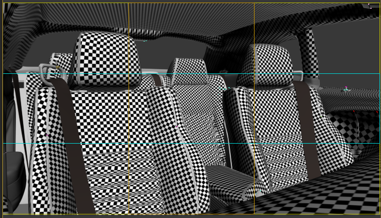
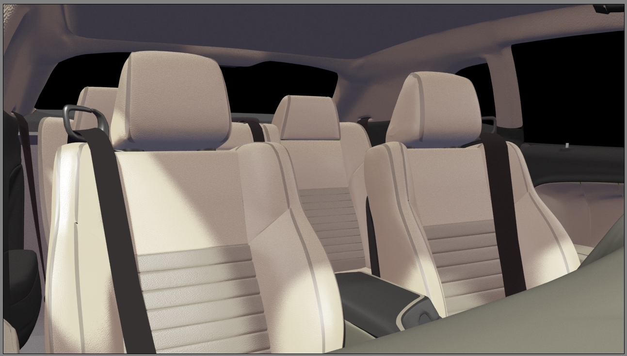
UV mapping this in preparation for materials. I'll probably be using bump maps on a lot of things because the geometry is pretty simple.

d87489499660a171f421cb62dba1cfc9.png
 
fbe49ec2e4aa8a00a76500e7948fff70.jpg

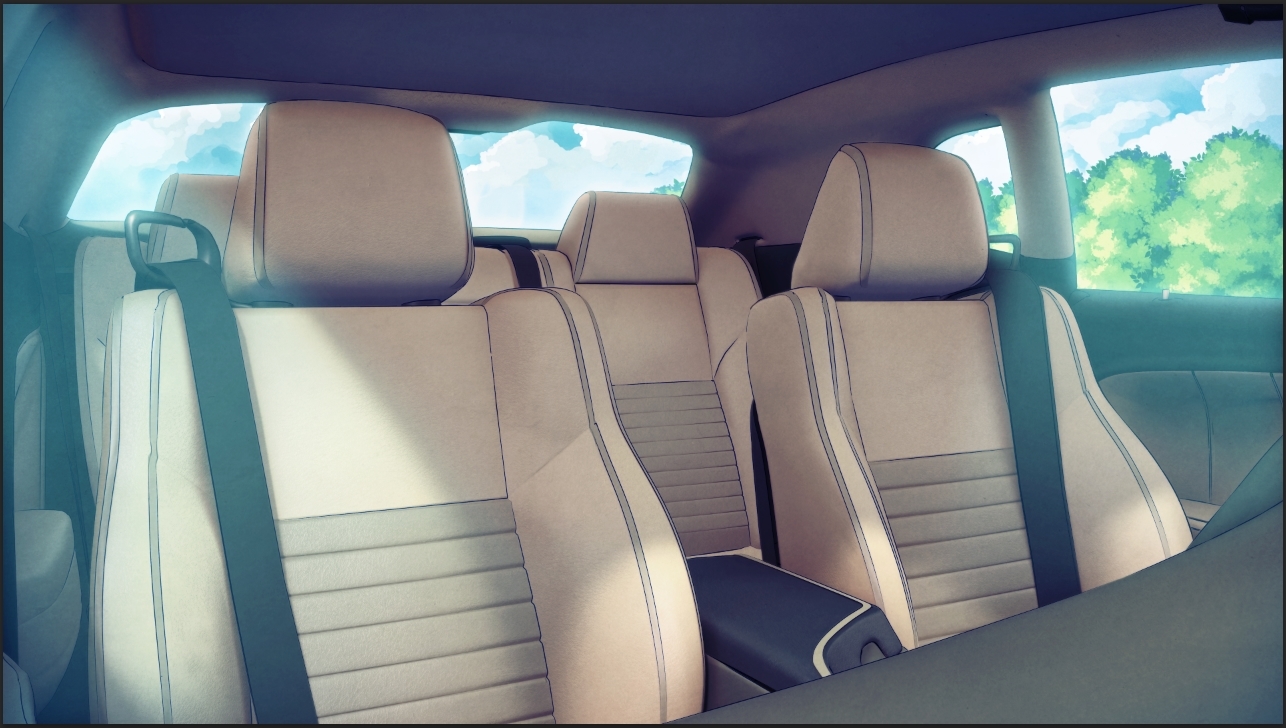
Hmmm, this isn't as good as the others. Not sure what to do about it, though... I figured this one was going to be tough because there's not much I can do with the scene.
 

arev

Sponsor

How about placing the camera on the midle back seat, looking through the front windshield? You could then show the road passing by - a few blurred frames in a loop should suffice. Not sure if this even fits your concept, or is it even worth the additional work. As for the current shot - wouldn't you want the seat belts to be over the characters?
 
I originally had the camera facing the dash because it's more interesting, but I changed it because I realized the portraits would look extremely bizarre. As for seatbelts, yeah, I might draw seatbelts on top of them for this scene. I'll, er, figure it out when I get there? :S
 
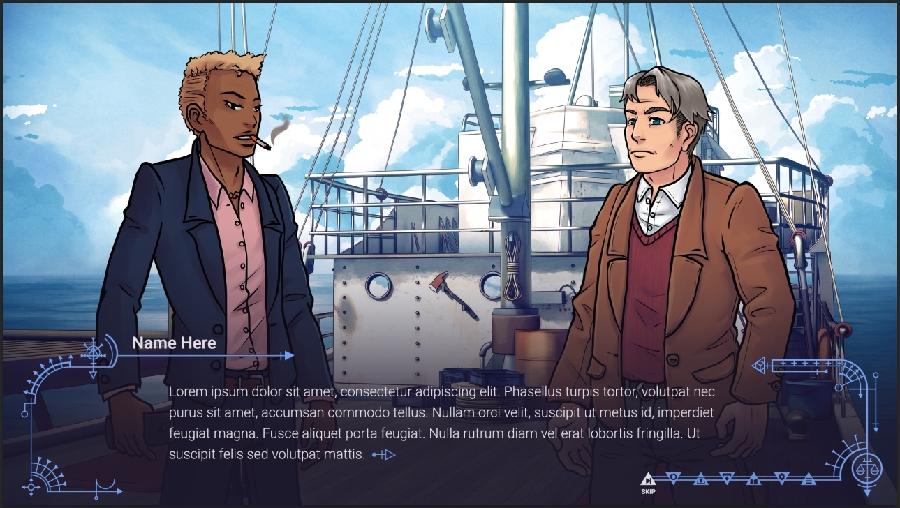
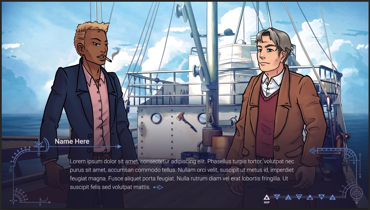
Cool, I have my dialogue UI from the UI artist! I'll show it soon, but I need to pick a new font because it seems like the one she used costs money. Which font do you guys like the most of these three?

7a8fa8414deb80ff19592b3bea3e296e.png
 

arev

Sponsor

I like the bottom one more, but only if the buttons color matches the gradient. As for the font - I can't really find any distinctive features between the second and the third. The first one is to narrow, so I'd go with one of the other two.
 
I can't discern the difference between the 2nd and 3rd fonts either; though I didn't even notice the narrowing of the 1st until Arev pointed it out... But I agree about it being too narrow, so I prefer the other two.
And I much prefer the second UI by far. Trying to read the text with the top one, I feel like the UI decoration is trying to compete for my eyes' attention with how much they stand out.
Though with how me and Strawberry have opposing opinions on the readability -- perhaps provide both, with an option to switch between the two in some options screen?
But perhaps I am just a sucker for a good options screen. :p
 
Haven't posted in a while, but UI and portraits are coming along well from contractors, and I'm working on the third draft (fifth if you count the first two drafts that I completely trashed) of the story. I have to add a few scenes and also fix a load of things. I'm making headway with it, but I keep discovering problems faster than I fix them... Urgh. I'm hoping to have the new scenes drafted by this week and maybe all the other issues fixed by next week, but we'll see how that goes. I'm pushing myself to make this story as good as I can, and it's very mentally exhausting. I miss being in the rough draft stages where I could fix all the problems later. Now it's later... :sad: :sad: :sad: :sad: :sad: :sad: :sad:
 
I have spent the entire last month editing and am not done yet. Really awful.

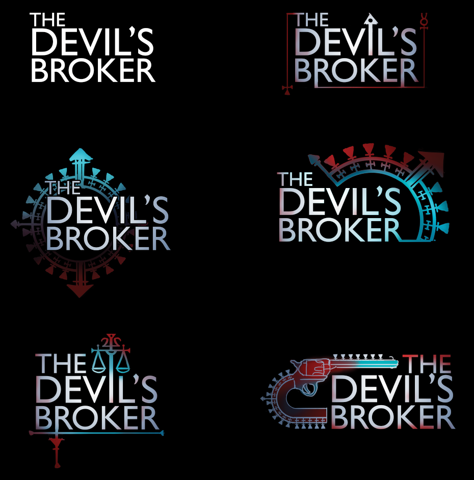
Anyway, right now I'm trying to figure out a logo. I tried a few, but I'm not wild about any of them:

a6509b9389e8efed4a9b722ec66a6378.png


I'm gonna try some more typography-oriented ones...
 

Thank you for viewing

HBGames is a leading amateur video game development forum and Discord server open to all ability levels. Feel free to have a nosey around!

Discord

Join our growing and active Discord server to discuss all aspects of game making in a relaxed environment. Join Us

Content

  • Our Games
  • Games in Development
  • Emoji by Twemoji.
    Top