
You are using an out of date browser. It may not display this or other websites correctly.
You should upgrade or use an alternative browser.
You should upgrade or use an alternative browser.
The 5-Year Contest Screenshot Thread
- Thread starter dadevvtsvre
- Start date
... What's this, ANOTHER screenshot already ?!

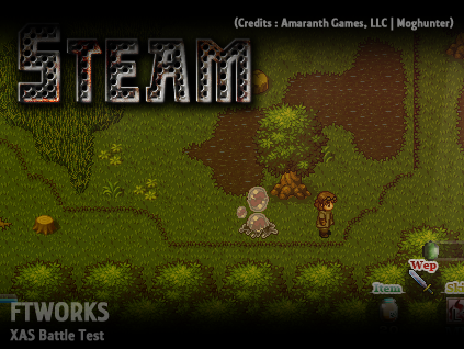
Just showing off new enemies... giant earthworms that jump and spew blood on you, which funnily enough really does hurt... I've also got the "hit" animation for when you get hit by an enemy (As you can see the green guy doing), and then I threw a few humans into the map too so there's a little variety !
And also for anyone who's wanted to know, the black border is an image, just makes it look cooler in my opinion...
Hmm I guess it DOES look like Ice, however, I did actually try dithering before I got to this stage, and it just looked like squares of carpet... lol, although I don't mind how they are now, they MAY change in the future, haha.
And yeah I can't wait until I can actually show more visuals, I mean, all I've got at the moment is my test map, it's basically just a long corridor that looks EXACTLY like the one in the pictures, that goes on for, well... 200 tiles long, lol... and I've just got enemies spawning in it randomly, as it was originally meant to be a test of the combat, which by the way, is all entirely evented... infact, EVERYTHING is, although I would prefer if I could script the HUDs for it, although that'll never happen !
But yeah, thanks for the comment there DeM.
piggman77":23w600gh said:
Um, Yeah. Kind of just a test, there's still quite a bit more I need to tweak and add. Is it too dark though?
piggman, looks great :thumb: It's got that unique style you seem to capture in every one of your tilesets. A couple of things bother me, though. Something about the crates look off (they seem to blend into the ground?). The shiny pole lacks depth in the water and looks kinda flat. I'm not sure what those white dots are in the windows; and the roof could be better (it's general shape, not the pixeling. The little piece missing from the top looks funny).
Oh, I also notice some lines on the floor, don't know if that's intentional. And to answer your question, I think it looks fine.
Perihelion
Sponsor
jbrist, the green guy still doesn't stand out enough from the background, imo. The red guys look good, but maybe try a different color for the main character or the background.
Perihelion":l3h7f34t said:jbrist, the green guy still doesn't stand out enough from the background, imo. The red guys look good, but maybe try a different color for the main character or the background.
That's because I haven't changed anything on the characters yet, lol...
And I'm still trying to find some colours that look separate for the background and main character, I'm still keeping with blue/green, but I'm trying to get the shades right so they don't clash or blend or anything.
It's all evented, every single bit of it (Except the resolution script ofcourse, lol)
And to be honest, it wasn't exactly hard to event, just time consuming, and because I'm using quite a few conditional branches, the framerate can dip, which is kinda bad, although it IS only by like 5FPS... although I'm gonna' see if anyone will help script it instead.
And to be honest, it wasn't exactly hard to event, just time consuming, and because I'm using quite a few conditional branches, the framerate can dip, which is kinda bad, although it IS only by like 5FPS... although I'm gonna' see if anyone will help script it instead.
Testing Alice animation and movement. Since I have to deal with many exams and projects during this month, I'll be using Game Maker 7.0 for this.
http://www.youtube.com/watch?v=4skUZ74v9Vw
I took the BG from Muramasa - Demon Blade as placeholders. Just want to test the scale of the character, as well as some background/foreground camera movement.
http://www.youtube.com/watch?v=4skUZ74v9Vw
I took the BG from Muramasa - Demon Blade as placeholders. Just want to test the scale of the character, as well as some background/foreground camera movement.
Thank you for viewing
HBGames is a leading amateur video game development forum and Discord server open to all ability levels. Feel free to have a nosey around!
Discord
Join our growing and active Discord server to discuss all aspects of game making in a relaxed environment.
Join Us


