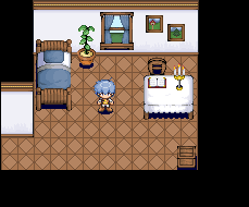
Looking pretty good for a first attempt. However, there are are a lot of inconsistencies.
Light sources are inconsistent. It looks like the light is coming from the center or something on the table, and it's very clearly the right on the bed. I suggest upper left as a nice general light source.
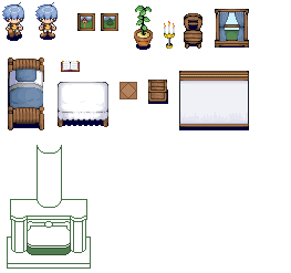
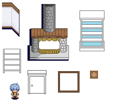
The level of detail is inconsistent. Objects like the crate are nicely detailed, but they look very out of place next to, say, the floor, which has all of three colors.
Your palettes could use more contrast, as there isn't a lot of distinction between shades right now--the wall, for example, looks almost completely white, and the bed has a bunch of nearly identical shades as well.
In general, it does look kind of flat, but that might not necessarily be a bad thing since you're going for a cartoonish look.
That's all that jumps out at me atm, but yeah, nice work. Your main issue is just making sure everything is consistent.