
You are using an out of date browser. It may not display this or other websites correctly.
You should upgrade or use an alternative browser.
You should upgrade or use an alternative browser.
Some of my graphics
- Thread starter Red_blue
- Start date

I'm not really an artist myself but it's looking good.
Not sure about the shoes though? I can't see any 'roundness' to show where the feet and legs seperate. If you know what I mean? They look a bit like boxes to me at the moment.
And maybe add a bit more white to the eyes? unless you're trying to get them kinda cutesy?
Other than that I likes it a lot :smile:
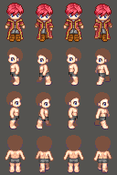
Yea, I've always had this strange problem when drawing pants or feet. Usualy I try my best to cover them up.
Thanks for pointing out the eyes. When I started the sprite, it was supose to be a child but I decided to change it and forgot about the eyes. I updated with the full walk down animation and I tried to fix the shoes a bit.
Thanks for pointing out the eyes. When I started the sprite, it was supose to be a child but I decided to change it and forgot about the eyes. I updated with the full walk down animation and I tried to fix the shoes a bit.
The boots are def better, but something still bugs me about them I just dont know what lol. Still probably better than what I could do.
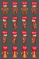
Also in the front views the eyes are inconsistent, the last frame has square eyes but the others dont.
There's a gap between the hair and head on the side view? Or that could be my eyes lol.
And ya copy and pasted the last frame from the back view, which I guess is ok but the shading goes the opposite drection ;p Just a personal thing but that would bug me.
I do really like the trenchcoat whatsit though :biggrin: very very nice!
LOL...I'm always forgetting somthing. Forgot to fix the shading on the last frame. The hair on the side veiw is touching the head but the greyish color on his head is very similar to the background (which is supose to be blue 0_0) so it looks like his head isn't attached to his hair. Thanks for pointing it out.
ZephyrSkye
Member
Though the trenchcoat does look a little too round. It's beacuse it's pillow shaded just a bit (on the back view). I find it interesting as all getup, though.
yeah, I pillow shaded on the back veiw at the bottom half of the coat but its a good place holder for now. I'm walking around testing to make sure the actual animation looks nice. I kinda rushed the back veiw but im going to add detail after I fix some "weirdness" with the side-veiw's walk animation. It looks kinda out of place.
Thank you for viewing
HBGames is a leading amateur video game development forum and Discord server open to all ability levels. Feel free to have a nosey around!
Discord
Join our growing and active Discord server to discuss all aspects of game making in a relaxed environment.
Join Us