Envision, Create, Share

Welcome to HBGames, a leading amateur game development forum and Discord server. All are welcome, and amongst our ranks you will find experts in their field from all aspects of video game design and development.

Scraps Template [WIP]

Status
Not open for further replies.

___

Sponsor

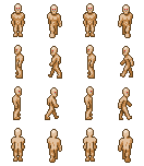
Please note: this is -not- available for use, as it is incomplete and doesn't fit any current RTP anyway. Its purpose is to serve as a somewhat more realistically proportioned template for use with the tyke-scale tilesets I've worked on (see my workshop, link below). Criticism only please, I'm looking for something along the lines of "this looks awkward, try this" not "looks funny" or "jeez another template". In particular I don't like the side walk animations and would love suggestions on how to make them look a little more natural on such a small scale. As with all my stuff here it will eventually be available if/when I'm satisfied with it for general use under Creative Commons of course, but I request nobody use this version. :) Its palette is four color+outline, as in my tyke tilesets.

Scrapstemplate.png
 
I don't like the shadowing on it. the leg that is shadowed doesn't seem right. Almost like it is fake, but it alternates which is bothering me. It clashes with his skin, try making it the same color, it doesn't matter if it doesn't shade that well, people do that for their sprites.
 

|3_32

Sponsor

Not bad, I instantly thought "world map", but w/e.

Just a few problems, as mentioned the head, but not because of the size, the sideview head looks like it should be metal and on top of a robot, the strange red eye you have going on there is throwing it off a bit.

Also there doesn't seem like much contrast going on in the shading other then the legs that are in shadow.  If you up'd the contrast on the rest of the body a little the back legs would seem better.

On the rearview his legs seem too short, and his trailing leg seems to be too fat.

Other then that, "Jeez Not another template .... "
 

___

Sponsor

Thanks for the suggestions, I'll take them into account.  Funny you guys should complain the head is too small though, as it's still about double the size it should be according to normal human proportions :)  I'm explicitly *not* going for the chibi big head look.  I will change his eyes to a more natural color as well since it's throwing some people off apparently, I picked red because it stands out the most.  I think I have an idea on the side view head that will help.

Edit:  Okay took in your suggestions (except the head thing :P).  Put an updated version at the top of the thread, I think it already looks a lot better, so thanks a lot :)  Oh, as far as it being yet another template, I have no delusions of starting another RTP or any nonsense like that and I would rather it didn't get orphaned on the template sticky either.  It's just for a small personal project and I wanted some good ol' C&C to improve it before I put it into action. :)  Oh, his eyes are still red, sorry.  Will change them tonight.

Edit:  Thanks everyone for the help, this has been moved into my workshop (see sig).  I put in a request to have this thread locked, any further comments, etc. can go in that one. :D
 
Status
Not open for further replies.

Thank you for viewing

HBGames is a leading amateur video game development forum and Discord server open to all ability levels. Feel free to have a nosey around!

Discord

Join our growing and active Discord server to discuss all aspects of game making in a relaxed environment. Join Us

Content

  • Our Games
  • Games in Development
  • Emoji by Twemoji.
    Top