NEW UPDATE 1/27/2010!
I just want to tell my tales.
I have had these small stories and outlandish tales rolling around in my head since 1968. One in particular concerns the rise and fall of the great Alfar kingdom. It is a huge and epic tale spanning generations. I have written of it, I have painted images relating to it, I have sculpted in clay images from the tale over the years in hopes of sharing the tale and the adventures therein with the world. That land is real for me. The characters in those stories are all as living as any flesh and blood entity. This tale and others are constantly beating at the walls of my mind to give them release. Then in 2000 I was struck with the idea of using digital media as a way to tell these tales. I started considering a computer role playing game. I mean, many of these tales grew in size and depth back in my old school D&D days so it only made sense. I was intrigued by the whole prospect. Thus began my game making adventures. I tried a number of "game making engines" like "RPG studio", "adventure maker" and yes Mark's "Game Maker". I messed around with RM2k and started a couple of projects based on these tales. Unfortunately, my life was in shambles at the time and I never finished the projects. Again in 2002 I approached the idea of telling my tales using computer games. I looked to RM2k once again but found it to be too limited for my oh so grand plans, so I used another well known engine to make my first RPG. It was a prequel of sorts to introduce some characters that would play important roles throughout the tales of Alfar. The game went as far as a beta version before life distracted me once again.
Well my life is in much better order now, I have a few more years coding experience, and found the joy and power of RMXP and Ruby scripting. So I have decided remake that old dusty RPG from back in 2002. It is called "Dungeon Dwellers". I have made a lot of progress and am enjoying myself immensely. The storyline is simple enough in this small game.
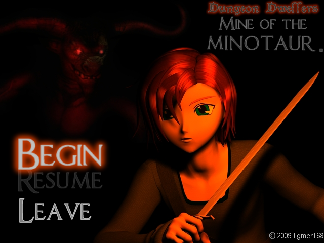
Dungeon Dwellers RPG.
Once upon a time
in the far away future,
on a non-existing world,
lived a less than extraordinary
bloke known by the name…
Fen Pogo.
He was to become the first
in a long line
of great and mythical heroes that
would come to be known as…
Dungeon Dwellerz.
That is yet to happen
in the past.
When we first meet up with good Fen
he is little more than the town hoodlum,
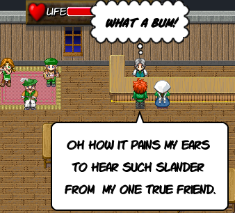
spending most of his time in the local pub
soaking up the ale and the rest of his time
trying to seduce the town wives and daughters.
But all of that is about to change!
Dungeon Dwellers.
Mine of the Minotaur.
I love the power and flexibility provided by RMXP and scripting, it has opened up all kinds of possibilities. And the greater range in graphics size and resolution offers the potential for an artist such as myself to show off a bit. Speaking of which...
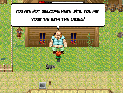
Here are a couple of screen shots showing two different versions of a sprite for a large brutish character.
This first one shows the larger of the two. Although I like the detail that can be shown with this large fella',
I think that this one is just too big.
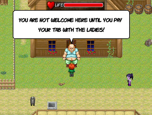
In the above version, the large ogreish fella' is still huge but fits the game much better don't you agree?
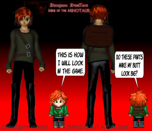
So, I just wanted to share and maybe get some feed back as I go along. I am thinking of using mostly RTP tiles and chars for NPCs with heavy editing for the most part in this first game. Although the main characters and supporting NPCs will all be original graphics, I think for the sake of time and efficiency it would be best for me to rely on pre-existing graphics. I enjoy pixel art any ways...
http://www.youtube.com/watch?v=TxEPhgRz848
Like I said, I am very impressed with the added capabilities provided by using scripting. Here are a few features of the game so far...
Thanks for taking the time to read this somewhat lengthy post. Let me know if you have any questions or if there is anything that you would like to see. In the meantime, here is a lil' glimpse.
NEW ALPHA DEMO!
A small alpha demo to show some basic game play and test for lag etc. In theory you should NOT need RMXP installed to play this Demo (let me know). Please leave comments and criticism.
I have had these small stories and outlandish tales rolling around in my head since 1968. One in particular concerns the rise and fall of the great Alfar kingdom. It is a huge and epic tale spanning generations. I have written of it, I have painted images relating to it, I have sculpted in clay images from the tale over the years in hopes of sharing the tale and the adventures therein with the world. That land is real for me. The characters in those stories are all as living as any flesh and blood entity. This tale and others are constantly beating at the walls of my mind to give them release. Then in 2000 I was struck with the idea of using digital media as a way to tell these tales. I started considering a computer role playing game. I mean, many of these tales grew in size and depth back in my old school D&D days so it only made sense. I was intrigued by the whole prospect. Thus began my game making adventures. I tried a number of "game making engines" like "RPG studio", "adventure maker" and yes Mark's "Game Maker". I messed around with RM2k and started a couple of projects based on these tales. Unfortunately, my life was in shambles at the time and I never finished the projects. Again in 2002 I approached the idea of telling my tales using computer games. I looked to RM2k once again but found it to be too limited for my oh so grand plans, so I used another well known engine to make my first RPG. It was a prequel of sorts to introduce some characters that would play important roles throughout the tales of Alfar. The game went as far as a beta version before life distracted me once again.
http://www.youtube.com/watch?v=cX5dImRGFWY
Once upon a time
in the far away future,
on a non-existing world,
lived a less than extraordinary
bloke known by the name…
Fen Pogo.
He was to become the first
in a long line
of great and mythical heroes that
would come to be known as…
Dungeon Dwellerz.
That is yet to happen
in the past.
When we first meet up with good Fen
he is little more than the town hoodlum,
spending most of his time in the local pub
soaking up the ale and the rest of his time
trying to seduce the town wives and daughters.
But all of that is about to change!
Dungeon Dwellers.
Mine of the Minotaur.
I love the power and flexibility provided by RMXP and scripting, it has opened up all kinds of possibilities. And the greater range in graphics size and resolution offers the potential for an artist such as myself to show off a bit. Speaking of which...

This first one shows the larger of the two. Although I like the detail that can be shown with this large fella',
I think that this one is just too big.

Day and Night.
In game battles on the playing field as well as first person boss battles.
Ability for char to get drunk.
Ability to pick pocket and break into houses.
A bunch of mini-games; poker, 3 card monty, chicken chase, and more.
A number of side quest
In game battles on the playing field as well as first person boss battles.
Ability for char to get drunk.
Ability to pick pocket and break into houses.
A bunch of mini-games; poker, 3 card monty, chicken chase, and more.
A number of side quest
http://www.youtube.com/watch?v=-R14WR2nS_g
A small alpha demo to show some basic game play and test for lag etc. In theory you should NOT need RMXP installed to play this Demo (let me know). Please leave comments and criticism.

