Envision, Create, Share

Welcome to HBGames, a leading amateur game development forum and Discord server. All are welcome, and amongst our ranks you will find experts in their field from all aspects of video game design and development.

[Relic] - CRITIQUE WANTED (Demo Available!)

logogo.jpg


Please notice that this was copied and pasted from another forum where I have the project hosted, I didnt want to type it all again so the dates may seem peculiar since this was just posted today.


DOWNLOAD

:!: 1Aug2009 - Added a few extra screen shots.

:!: 8Aug2009 - Still working on the game nothing too impressive to report. I have refined the Battle System and the Sphere Grid system is now fully functional with a browse tool. I will post some new screenshots once I have finalized the Battle System. I have decided to change from a CTB to an ATB system because I like the feel of the battle-system as ATB much better.

:!: 11Aug2009 - Battle system is getting finishing polish. I think I like the way everything looks and feels now. The true creation is now really getting underway since I have the mechanical parts of the game out of the way. Keep tuned guys!

:!: 12Aug2009 - Posted 4 new screen-shots. A few showing off the new battle-system. Also another one revealing a bit more of what to expect from the sphere-grid system. Also updated/revised a few of the character introductions.
Please keep the feedback coming! Stay Tuned for future updates!!

:!: 29Aug2009 - CBS is Finished. Now working on the balancing of the game mechanics.

:!: 13OCT2009 - Mechanics are getting closer to being finished, the hp/damage etc

:!: 09JUN2010 - PROJECT HAS BEEN REVIVED, Work is now resuming!

:!: 11JUN2010 - Did some polishing and pieced together a DEMO TEASER, approximately an hour of game-play.

--------------------------------
Summary & Brief Story
RELIC, is a semi-linear RPG following the story of a boy named Cale as he searches for his lost father. He learns of his fathers trade as a Captain of "The Vanguard", a treasure ship that his family owns. Join Cale in his adventure across the world in search of clues towards locating his missing father and the rumored "Relic" he was carrying aboard his ship. Cale learns of the disappearance of his fathers ship and isn't settled with the stories that tell of his death over twenty years ago. He sets out on a dedicated journey to finally reunite himself with his long lost family once he has discovered he was raised as an orphan by a kind local family where he grew up.


Main Characters:

o39.png

Cale - Protagonist - Main Character
Age: 21 G: Male H:6' 1"
Cale is the focus of the entire story of Relic and his prime motive is to reunite with his long lost family once he discovers he is an orphan of twenty plus years. He is a reckless young man who is on a mission strengthened by his burning desire to solve the mystery behind the disappearance of his father's vessel "The Vanguard" and possibly find the truth about the fabled Relic he was transporting before his mysterious disappearance.

f8_13.png

Sabrina - Antagonist - Main Nemesis
Age: 27 G: Fem. H:5' 7"
Sabrina is a tell-tale roguish character with no further interests than her own pockets. She is ultimately set to destroying Cale after their first encounter where Cale embarrasses her in combat and she swears revenge upon him. She is a ranking officer in an underground crime organization called "The Shades" and is a wanted criminal. She is not to be taken lightly.

o2_14.png

Lemitz - Protagonist
Age: 30 G: Male H:6' 4"
Lemitz is a unique breed, always seeking to be the best at everything and he does not take lightly to failure, some might call him a perfectionist. He harshly judges Cale's every mistake in an attempt to better his own ego. Cale and Lemitz are a dysfunctional family at-best. Lemitz is inexplicable intrigued by Cale's motivational drive and he later learns of Cale's mission, blindly believing the mysterious Relic will teach him everything he needs to become an all-powerful warrior.

c6.png

Jayci - Protagonist
Age: 20 G: Fem. H:5'5"
Jayci appears to be a sense lacking mercenary whom is in it for monetary gain.. Cale suspects she has another hidden motive.

o19.png

??? - Protagonist
I have not developed the fourth protagonist yet.

o8.png

Ra'ama - Antagonist
Age: ~50 G: Male H: Unk.
Not too much can be revealed here about Ra'ama, the most I can tell you about this character is his motive. To find and fuse his power with the Relic.

Features:
AMS by Dubealex
Enu's Sideview Battle-system (Heavily Modified)
Atoa's CTB Addon for Enu's SBS (Modified)
Fully Animated Battles for both Enemies and Characters.
Visible Encounters made possible with Gubid's Enemy Detection System
A Unique approach to currency using a DnD'esque system customized for this game. This script was written by: Jimmie
100% Custom Skill Point Distribution System & Leveling System (Self Scripted)
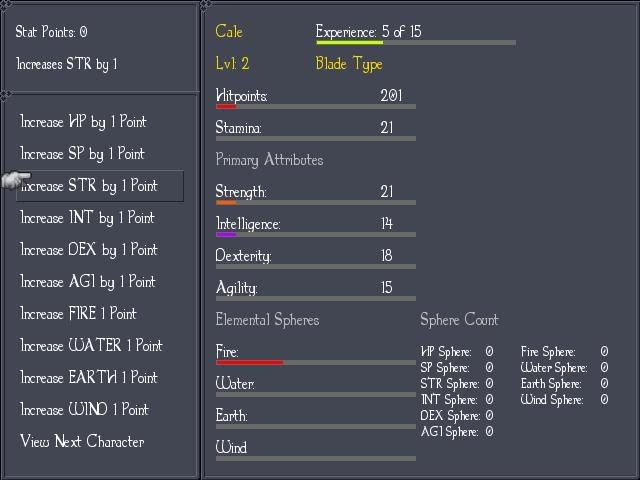
100% Custom Sphere/Ability Grids for all Main Characters, featuring numberless possibilities. (Play the character you WANT to play!) (Self Scripted.. with help from Jimmie! :))

Full Credits (Thus Far)
Scripting
▬▬▬▬▬▬▬▬▬▬▬▬▬▬▬
◄►DnD Style Currency◄►
▪Jimmie

◄►Sideview Battle System◄►
▪Enu
▪Atoa
▪Kylock
▪Mr. Bubble
▪cairn
▪Epinor Flamblade
▪Enelvon

◄►CTB Addon◄►
▪Atoa

◄►Credits Script◄►
▪Unknown
▪MiDas Mike
▪Paul Baker

◄►Disable F12 Script◄►
▪Cremno

◄►Advanced Weather System◄►
▪ccoa
▪ScriptKitty
▪Mr. DJ

◄►Slant Bars◄►
▪Clive

◄►Title Splash◄►
▪KGC Group

◄►Enemy Detection System◄►
▪Gubid

◄►Advanced Message System◄►
▪dubealex


Graphics
▬▬▬▬▬▬▬▬▬▬▬▬▬▬▬
▪Enterbrain
RTP

▪zanyzora
(www.teamanti.com)
Tilesets
Objects sets

▪Etolier
(http://www5f.biglobe.ne.jp/~itazu/etolier)
Character Sets
Animations

▪Hungry Mouse
(http://hungrymouse.hp.infoseek.co.jp)
Objects sets

▪Ruruga
(http://fayforest.sakura.ne.jp)
Character Face Graphics
Character Sets

▪Sithjester
(http://www.untamed.wild-refuge.net)
Enemy Character Sets

▪silentKnight72
A Charset

▪Ty
Recolored Charset

▪Herbtoker
Charset


Music and sound
▬▬▬▬▬▬▬▬▬▬▬▬▬▬▬
▪Enterbrain
RTP

▪David Lowe
Title Screen Music

Screenshots! (The good stuff)
This title screen was made by me.

SS1.jpg

SS2.jpg

SS4.jpg

(I know that blank space is ugly, I am going to put a battler image in there. I just haven't got ones that are to my liking yet.)
SS5.jpg

SS6.jpg

SS7.jpg

SS8.jpg

SS9.jpg


NEW SCREENS (ADDED 12AUG 2009)
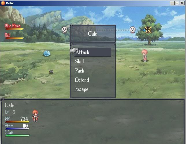
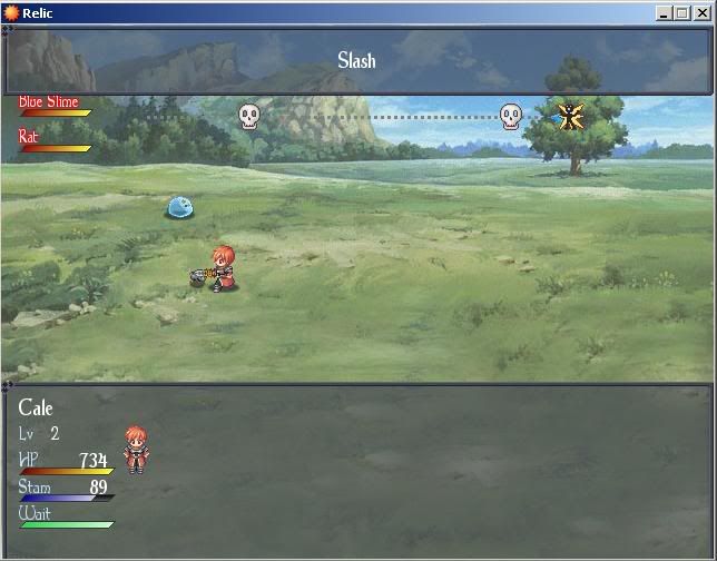
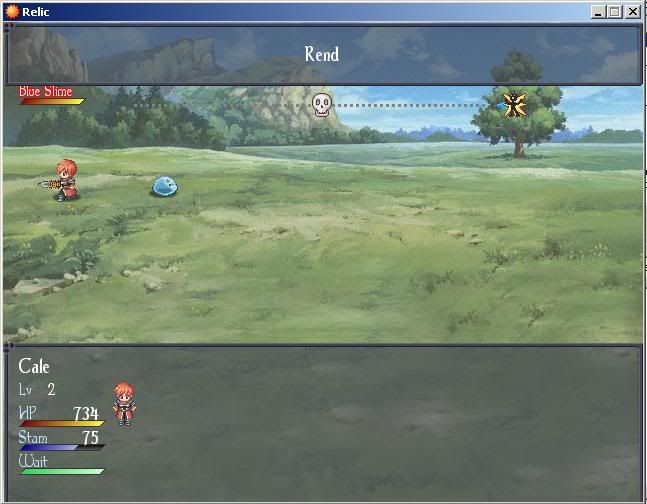
The refined and new battle-system (ATB style now)
ss10.jpg

ss11.jpg

ss12.jpg

ss13.jpg


Just showing off my PS project here.. :)
zergling2005.jpg
 
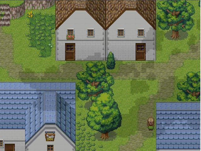
Your story and characters very original but my only complaint is your mapping. It looks decent but it needs a lot of work and improvement, I suggest reading some tutorials and practicing by making as many practice maps as you can, like 2 or 3 a day til you get the hang of making a proper good looking map. Your screenshots also look a bit blurry...jpeg is a horrible format for screenshots, I recommend saving them as .png instead. Also, what are the sci-fi-ish skill tree/room like maps for?
 
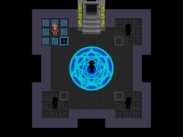
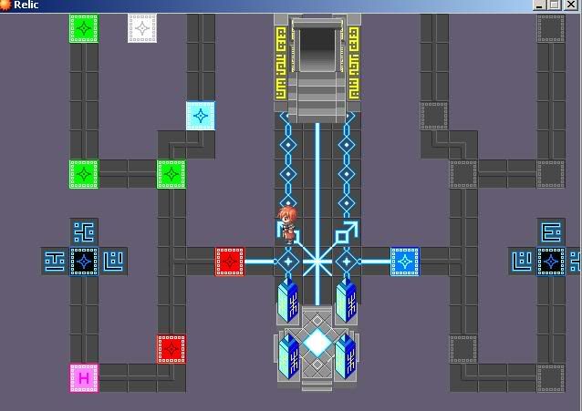
The sci-fi ish' screen shots are the sphere grid, it is a separate entity from the game-world.

What specifically do you think I need improvement on my mapping? I spent probably an hour on some of those maps and just curious what you think needs improvement.

Thank you for the FEEDBACK! I'm really needing more of it to stay motivated.
 
Also, for the sphere grid...instead of Cale, may I suggest using a cursor? With a cursor, you could get rid of the entrances and just use a parrelarel process event that teleports the player out back to their previous location (mapid, player x, player y stored in variables and then used with Transport Player).

Besides reading tutorials...spread details out and dont' clumb them...when I was at your level, that was a mistake I made often. Don't abuse shadows and use, use them sparingly or when needed.

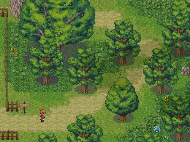
Map 1 (Field/Forest): Again, don't clump objects. Also smooth out the shadows or get rid of them from the trees. Spread your trees out a bit. Make sure that grass on the left doesn't go under the fence, it looks bad. Don't clump the shadow grass and sand together. Make a path with the sand but spread it out a bit and make it random in some parts. Spread out the shadow grass too. Some of your trees are missing parts. I also suggest setting the grass to bush flag so the slime doesn't look weird on it.

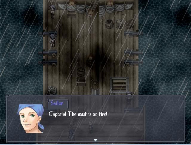
Map 2 (Ship): Looks good overall. Again, don't clump things unless their manmade and and spread them out a bit. I wouldn't recommend using the fog. Also, try looking for some better looking fire sprites...

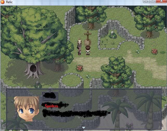
Map 3 (Grave): Looks good. May I suggest using a panorama? Otherwise, dont' forgot to spread out details like greenery and sand/shadow grass. Also, try to make sure everything (epsically cliffs and mounds) don't look too squarish or circlish, make the more random like nature does it.

Map 4 (Town): Spread details out again as I noted earlier. Get rid of the shadows or whatever...their blocky looks terrible. Try adding osme variety to the houses. Look for custom NPCs or try spriting your own.

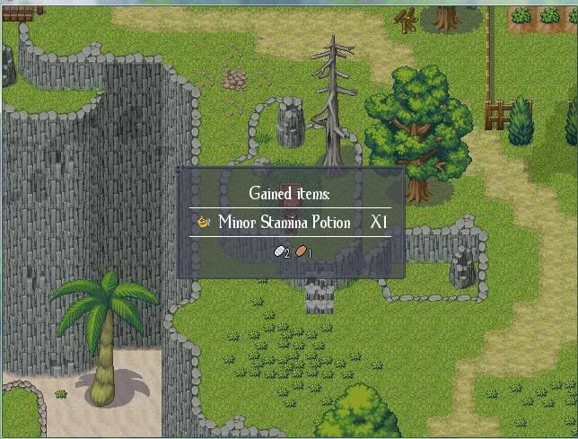
Map 5 (Screen with found item): Don't clump details as I said and spread them. Weeds together in a group looks bad. Spread weeks out and pair two or three together to make the look of a messy area. You also appear to be missing cliff edges. Don't group the rock dust or whatever together either. GET RID OF THE SHADOWS OR IMPROVE THEM. >_< Sorry. Some of your cliffs look too square, try redoing them and making them look more random. Spread details out.
 
Thank you so much for your critique! I can see what your talking about and there is definite room for improvement on most of those maps.

FYI. The Block shadows you keep mentioning are actually supposed to resemble clouds, and those shadows drift lazily across the screen. You disagree with them I suppose? I intended for the blockyness to capture the true "Pixel" art used in these kind of games but I think after reading your comments that if I were to use a smooth realistic shadow of a cloud it would looks far better as the blocky style clashes with the smooth world tiles.

Thoughts?

Thanks,
-Zerg
 

bladeking77

Awesome Bro

I downloaded and played trough the demo... And here are some of my opinions:

- Your story is original and exciting, but there is a bit too much dialogue, especially in the intro. Even though the story was good, I had to skip at some points. Beside that, it can get really interesting at some points and I like Cale's Character.

- Is it just me, or at the beginning ( As soon as you get to walk ), In Cane's house, you can pass trough All Walls and Objects???

- Your mapping doesn't look very bad when you play the game, but there are lots of improvements you could add.

- Battles aren't bad either and I like the graphic timer that shows you when is Your and when Enemy's turn. Also it is always better to have Specific, rather than the Random battles. There is one thing though: Enemy's health bar does not show the damage as soon as they receive it, but only after their turn ( Or something like that ) and that can be little screwy sometimes. And just one final minor thing: I wonder how can a tiny Rat be stronger than a Slime.

- As for Equipment, Stats, Level UP and Sphere Systems, they're well made and give the real RPG Feeling to the Game. :)

- I don't know whether the Music is Custom, or you got it from somewhere, but it is nice.

I hope this helps you somehow. ;)
That's about it. All in all, it is a Good Game. Thumbs Up. :)
 
what i've written down while playing:

titlescreen: shows that you know how to use photoshop, but you're not fully aware of how to design a nice logo etc. the colors clash for example.

intro: spellcheck! ("your" instead of "you're", "were could be"?...) He says the ship is 400 miles off course, next he says he has no idea where they are and that they could be 1000 miles off course.

A woman on board is bad luck amongst pirates, nice little fact you used there.

They run too fast when they go check out the storm!

good use of sound effects when they are thrown overboard.

the fire isn't animated and there is a gushing rain, so the fire would die fast, don't you think?

nice use of the monster sound effects

that beach is really not well mapped =/

9 years later... Poof... Out of nowhere!... There should be a little musical scene or something when the story retakes 9 years later. Now it's out of the blue.

spellcheck! "dont" and "wouldn't of understand"

all of a sudden you go to her grave. it's a little out of the blue again.

inner house map is to big. All the characters are passable... The protagonist's mom looks like a dude! =/

how in earth did they found out all that information from his real father without ever meeting him?
 
gRaViJa, thank you for taking the time to give me that feedback. It's much appreciated!
bladeking77, Thank you as-well, that information is really helpful to get me to improve my work.

I'm taking notes on all of this for immersion into the next release!

-Zerg
 
The game got several bugs. The main character can move trough walls the first time you get control of him until you agree to progress the story (is there really anything else to do?). Pressing F12 results into a stack level to deep error. When I played I did rather early realize I misspent my money and decided to start over since that's much faster than grinding. This time I speed trough the opening cutscenes as fast as possible and somehow that resulted into the save menu never being enabled. If you re-enter Cale's home, he will now suddenly have two twin sisters.

Anyway, the story is rather good during the ship scenes. It gets less good during the scenes with Cale's foster family. One problem is that they go past way to fast. Cale is leaving what has been his family for over 20 years, but the player barely meet them. I can see a dilemma though, you do not want to just make the opening cutscenes longer. Still, it's very hard to care when Cale just arrives and moments later leave.

I assume Cale is supposed to be white. Well, when he's about ten years, he has brown skin and hair. Ten years later his skin is white and his hair red. Also, his clothes should resemble that of his foster family. I can understand if they were to give him more medieval clothes when he's about to leave, but he has those clothes before the family had any chance of knowing what he was about to do.

Speaking of which, why is there a tribal looking family so close to a medieval town?

Mind you, the story looks like it could be interesting. However, there are to much in it that seems off which makes it impossible for me to feel immersed. Cale foster family needs more development and has to make more sense.
 
LaDestitute":2y4j3bsl said:
Your story and characters very original but my only complaint is your mapping. It looks decent but it needs a lot of work and improvement, I suggest reading some tutorials and practicing by making as many practice maps as you can, like 2 or 3 a day til you get the hang of making a proper good looking map.

that was my first tought. you use different tilesets from different sites, and each individuall tileset has its own, lets call it, flair. the ones from enterbrain for example use shadows, are multicolored, but some of your tilest in the game are just plain colores that make the overall good idea less good :/ im not trying to say it is bad, but try to work on the tilesets abit more. you can easily export them, work on them, import them back even without changing the leveldesign and it will still aply the tileset. i wish you good look with that one, because developing own tilesets is a hard work but it works great when it is done :)
 

Thank you for viewing

HBGames is a leading amateur video game development forum and Discord server open to all ability levels. Feel free to have a nosey around!

Discord

Join our growing and active Discord server to discuss all aspects of game making in a relaxed environment. Join Us

Content

  • Our Games
  • Games in Development
  • Emoji by Twemoji.
    Top