Welcome to HBGames, a leading amateur game development forum and Discord server. All are welcome, and amongst our ranks you will find experts in their field from all aspects of video game design and development.
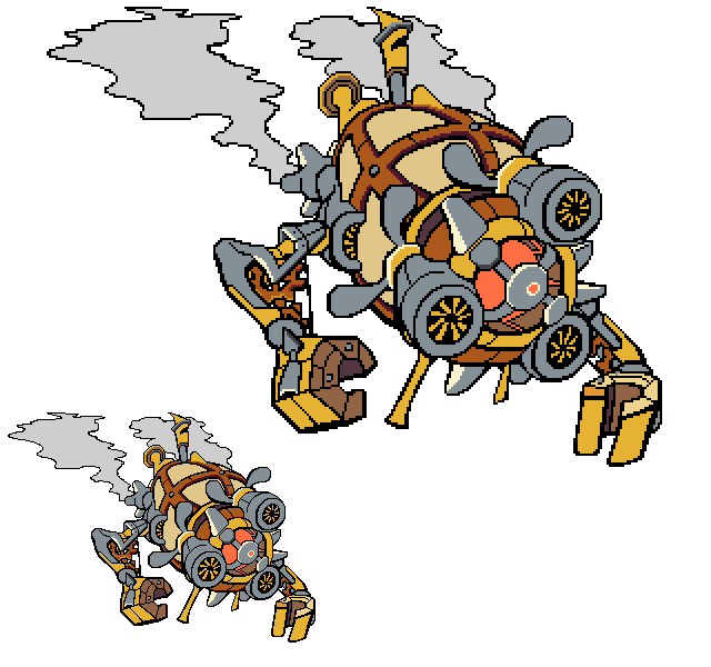
On the people-characters, though, it looks like they (esp. the pants) need more AA on the outlines. Some of the "jaggy's" stand out a little too harshly in contrast to the rest of it, which looks pretty smooth.
I think the trousers look more jagged to you because they're dark colours appearing over bright colours. The contrast between the trousers and the forum background makes them stand out more. I don't think there's any real difference between them and the upper body parts of the sprites. I can't smooth them out on the outside because they're game sprites.
No, Boon, I can't use the IMGZOOM. I don't want to. And I can't get on IRC or work on more sprites for a short while.
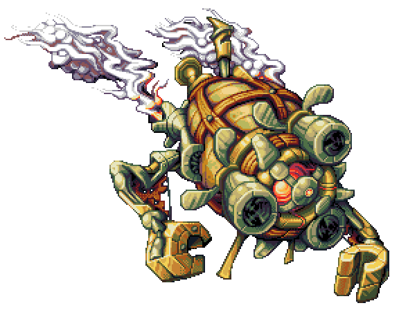
Got a new work in progress piece. It's a bit big for the RM2K3 screen, but I may as well go the whole hog on it. It'd make a good boss sprite even if some of it gets cut off.
I chose to attempt this as it's a more demanding sprite and it's a step up for me. I think the design's gone well and the line thickness really helps to bring it out. The concept for this sprite is that it's some sort of steam powered security drone. It's got that zepplin/airship look and I think it's pretty funky.
Damn Inq. When you are sleeping at night, I'm going to steal your talent for myself. No seriously great work Inq., do you actually do this for a career though? Or just a hobby?

") I've never seen or heard of Steamboy though.
I've never seen or heard of Steamboy though.