
Hey everyone.
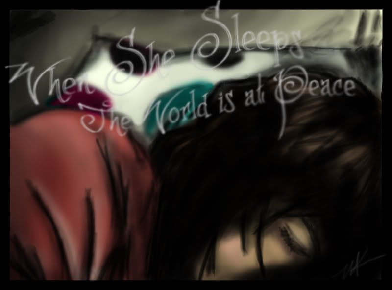
I've been experimenting with a new style other than the cartoony looking stuff, and I'm beginning to like it. However; I know I'm doing something wrong that's taking away from the pictures. So this is my latest work. If I could get a few indepth critiques about what looks strange, what looks right? Maybe some pointers would be great. Again... I'm a new digital artist and I'm not so sure how to go about this stuff. I'm using Photoshop, and I love it, so even though you all have programs that you like better, I'll stick with this, unless you've got some fool proof evidence that I NEED to use something else. lol
And for those of you who I fought with over the Spartan. I apologize. I appreciate the critiques. I just didn't like defending my imagination as I didn't even use it for that picture. This one is actually a portrait of a good friend of mine. It's a photograph I took when she fell asleep one day, but the lighting was bad, so her face was a bit difficult to determine. Meh. I tried.
Hope you like it, and again, I'm sorry for being such a bitch in the last few posts.