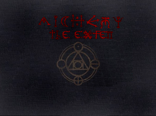
Envision, Create, Share

Welcome to HBGames, a leading amateur game development forum and Discord server. All are welcome, and amongst our ranks you will find experts in their field from all aspects of video game design and development.

My Title Critque?

Hmm that is a pretty cool book, But I am not that good... sadly but I'm learning

But I could remap the book? and put the stuff and put it on that book... Thats all I can do for the Time being... Its going to be months before this thing is out...
 
Sorry about the double post - my browser was acting odd, I fixed it so that the second post has its own value

also - its a cloth oooh - how did I not figure that out?
I would then ruffle it at the edges like so:
slow.jpg
\

EDIT:
lol I keep just missing you
yeah the cloth looks really nice
the only problem I have with it is
THE TEXT IS STILL FUNKILY OUT OF ALIGNMENT
Seriously you might not notice it, but it detracts from your work

but otherwise very nice title :thumb:
 
I'm sorry... I'm not that good at Adobe yet... :( 
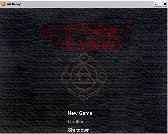
I can't Shadow worth a filp... so thus it would be hard for me to ruffle the edges without any shadows


EDIT:
Nevermind the upper message^ Thanks I can try to align it better :)
 
Something that really, really, bugs you...
you just can't stand something being that way
Dictionary.com":g75c6hoe said:
a particular and often continual annoyance; personal bugbear: This train service is one of my pet peeves.
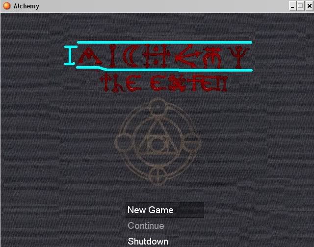
Apparently mine is unaligned text, funny cause my handwriting used to be all over the place


Final Result^

lol I am really getting into this game... lol First one I've sat and Designed for over 2 hours for the Title. lol Now for the WindowSkin... lol
 
Ok since my Title is perfection I thought its time to work on the Windowskin! :)
http://www.arpgmaker.com/viewtopic.php?f=92&t=66442

EDIT:Thank you so much for all of the Help Velocir_X :grin:
 
Wow that really does look good, Kodi Hammon.
I shouldnt have left so early last night...
One thing though, when the title is used in game, where does the menu appear?
Does it overlapp the symbol?
Would it look better if it didnt?
 
I'm thinking get rid of the fabric look in the background. You should have it so the symbol is in the middle with a solid black background, color red, and maybe some glowin' behind it. :D
 

candle

Sponsor

Personally, I think the text is a bad idea. I can barely read it. I see nothing wrong with one or two special characters, but the whole thing? That just screams "amateur" at me.
 

Thank you for viewing

HBGames is a leading amateur video game development forum and Discord server open to all ability levels. Feel free to have a nosey around!

Discord

Join our growing and active Discord server to discuss all aspects of game making in a relaxed environment. Join Us

Content

  • Our Games
  • Games in Development
  • Emoji by Twemoji.
    Top