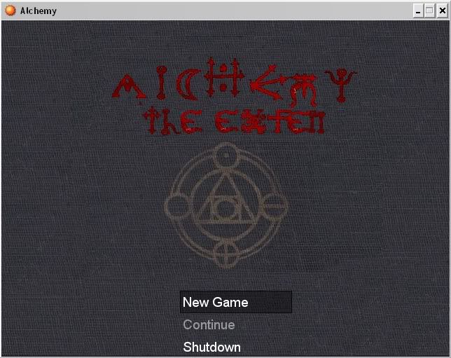
Envision, Create, Share

Welcome to HBGames, a leading amateur game development forum and Discord server. All are welcome, and amongst our ranks you will find experts in their field from all aspects of video game design and development.

My Title Critque?

I can read it fine, but that might have something to do with you telling me what it said...
The writing is interesting but the title screen as a whole looks kinda bland.
If there is gona be a subtitle added to the title it would be good to post that in the same writing, without telling us what it says and asking us If we can read it.

Though on second thought, people should know what it says already if they've gone to the trouble of downloading your game or whatever...
 
Your letter are uneven, that seriously detracts from it
furthermore the title would look best large, and across the top above the symbol
furthermore it (looks) like a book cover, so you should add edges to make it look more defined

But anyway it looks nice - I like the simplistic look
 
Nah I meant something like this
2714073530_cc09d0267e.jpg

feel free to move the command window were ever

its just that when you set it off to the side it unbalances it (I took a graphic art class :P)
 
Yes, it does look nice centered, and I actually cant read the subtitle...
Obviously I can read 'the' but what is the next word, 'exfen'?
 
If your going to do the book look like Velocir_X has suggested, I think you should make it look worn like an old book.
Discolor some spots and try make it look like the cover is peeling at the edges.
This is because when I think of Alchemy I think of Old, what do you think?
 
Nah he doesn't have to go to for the book look,
its just what sprung to mind when I saw his texture - just looks like a lot of my books
the main thing to get out of my pic is the thing about the text - its what really bugs me
but yeah if he goes for the book look I'd suggest making it worn in places
 
Actually I think I will go for the Book. What would make it even better with Book look is when you click New game it flings open and it fades to the screen where you begin. that would be awsome but for now I go with normal Book
 
Well here it is...


I don't really Like it that much so I'm going to make it look like Cloth... :) 
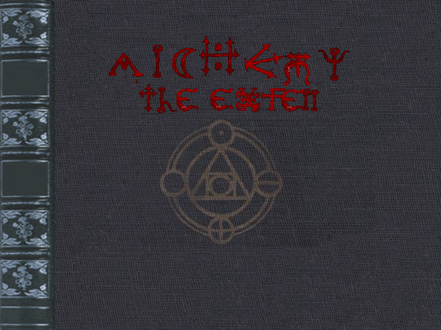
I Think that would be better? Any agreements?
 
(excuse the double post its accidental)
also I'd suggest following Kuidon's age thing and make it frayed in places
oldbook.gif

Finally the text problem is still not fixed
 

Thank you for viewing

HBGames is a leading amateur video game development forum and Discord server open to all ability levels. Feel free to have a nosey around!

Discord

Join our growing and active Discord server to discuss all aspects of game making in a relaxed environment. Join Us

Content

  • Our Games
  • Games in Development
  • Emoji by Twemoji.
    Top