Envision, Create, Share

Welcome to HBGames, a leading amateur game development forum and Discord server. All are welcome, and amongst our ranks you will find experts in their field from all aspects of video game design and development.

My Custom Battler Works :)

The following work is being developed strictly for my project, please do not use them as your own, thanks :)


Good day and welcome to my thread! I recently started working on pixel art again after not doing it for a couple years. My specialty in art has always been drawing fighter characters and monsters, as well as fleshing out action scenes. As a child, my gift (more like my obsession) was drawing whatever was on the screen that I thought was cool. I would spend more time with my games paused (or standing still) drawing everything down to last detail, then I would playing them.

Naturally, being good at drawing on paper doesn't automatically make you a great pixel artist. For the longest time, I could draw but could never pixel, but one day I finally decided to say screw it and try... well, following concepts that I've learned over the years reading art books, and with alot of help and guidance from my new friend Peri I had been inspired get this far in just a few days...


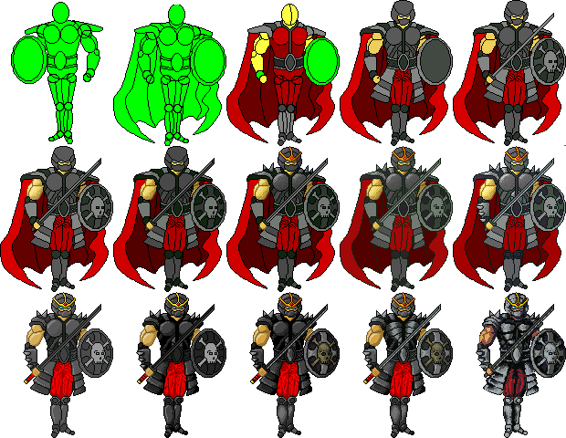
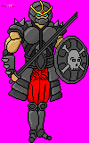
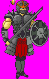
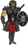
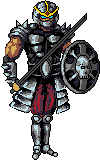
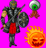
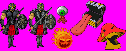
Here's some updates of some of the old battlers and a couple new ones. The pants on the Dark Knights have been slightly updated, some minor shading changes to the Eyeglops and I went crazy on the Firebomb. The Mimic is new, I added a lil' bit of shading on it, and I just barely started the Shroom.


I know, I know, this isn't pixel art ;)

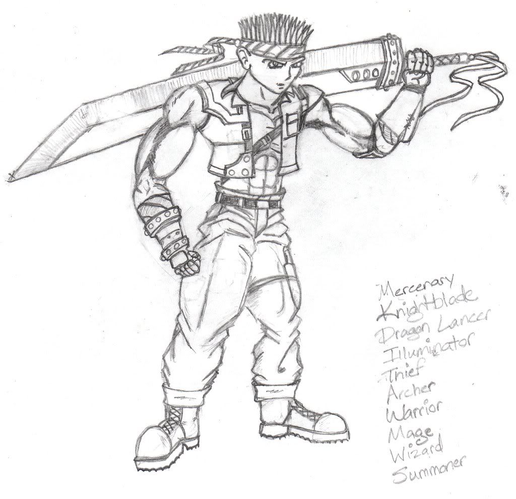
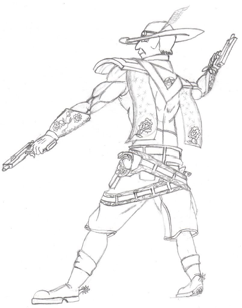
I've created these sketches of a couple major main characters in my project, which I will be spriting out later on down the road. I might not do these ones right away because I feel it would be better to get some practice with smaller scale sprites for now, but I will eventually get to them...

IMG_0009.jpg

IMG_0001.jpg

Thank you for dropping by, hope you've enjoyed my thread! Check back throughout the future, I will probably be posting more work here as time goes by :)
 
It looks pretty decent, but it looks like you got two-thirds of the way through shading him and got bored (this is on the last version you posted, the one without the cape). His shield, the belt, the leg cover on the viewer's right and the entirety of his legs and feet still need it. After that he'll look pretty nice (and even nicer if you shade and re-add the cape), but he also doesn't quite match the RTP battlers in style (your pixeley style of shading looks cool but isn't the same as the style of shading used by the RTP), so he'd mostly be useful only in works with a lot more custom battlers that match him in style.
 
Yeah I had to temporarily remove the cape so I could focus on fixing shoulder guards; with the way they were in the origional first two images or so, they were flat panel-looking accessories that the cape was going to drape off of, but then the way I shaped them later on was kinda funky, so I had to fix it. In the end, yes he'll be wearing his cape again.

I haven't had the time to finish shading all of the remaining areas yet but hopefully I will soon. The shading looks off from the RTP because I use alot of dithering; I personally like the style, and don't mind if it blends with RTP or not because I was going to make all custom battlers for my project. Also, the shield may remain unshaded for some time because I plan on improving the skull and crossbones.

On the other hand, Peri told me in IRC that the shading and stuff should be revisited altogether, and I agree because it looks really grainy because I dithered the hell out of it. So, the new image I actually worked backwards on strictly from nothing but outline, re-applied the colors and their highlights and respective shadows on everything but the shield, since the shield and cape are both coming last.

I'm gonna await Peri's advice before I do anything further with the new image as-is because I honestly don't know much about shading yet and I could probably use some pro tips :)

This is the battler with revisited shading, I worked backwords and started it over... its darker so I'll have to adjust the brightness or contrast or something, but overall I wanted to focus on re-applying the colors and highlights before tweaking the other stuff.


This is what it looked like before Peri told me to redo it... you can see I did origionally add some highlights and stuff but dithered the hell out of it along the road of shading. I'm working backwards in the version above this one to avoid the 'grainy' look and give it a more sleek and shiny feel.


BTW thanks for the feedback Brickman :thumb:
 
Now he looks very good. The shading sort of gives certain parts the impression that he's a balloon though (the two circle parts on his chest, his biceps, the armor on the lower part of his legs, and to a smaller extent his helmet).
 
Hey, Kain, your blank still had dithering on it! I will break you of that habit like an egg-sucking dog, as one of my robotics mentors used to say.


You have a tendency to use a lot of almost identical colors. Don't do that. It makes it really hard to change colors, and it muddies up your work a lot. When I went back over it and cleaned out all the dithering, I also got rid of a lot of the almost identical colors.


The key is not the number of colors you use; it's what colors you use. You want each shade to be distinct and contrast with the others. Also, you want more hue variation than you're prone to putting in; it'll really bring your pieces to life.

Another thing is that your shading lacks form. You have a tendency to do a little outline right at the edge of an item, but you need to be more daring than that if you want to portray volume. It's hard to explain in words, but yeah, study lighting.

Okay, so I scribbled over it with my tablet for a few minutes. It's sloppy as hell, I forgot to do a couple things, and some things still look weird, but you get the idea of what I was going for. Also, it should be noted that the metal only uses five colors, including the outline color.


Btw, the key thing with metal is really high contrast.

Anyway, I challenge you to not use any dithering at all when you go back over it. None. Not a bit!
 
Peri your edit version looks really neat, thank you very much for helping me out and giving me advice along the way! Althought I might not update it further (here) from what I've already done, I'll go over the remaining issues that you've brought up :)

I'm done as far as updating the knight (I'll still be working on him occassionally and fixing remaining issues) but onto better things I've started some new battler sprites. Still I'm keeping this thread open, and I shall be posting more of my works here whenever I feel like. For those of you interested, this is what I've done over the past day or so...


The Eyeglops is more or less finished, might fix some last minute issues with the tentacles or something idk. The Firebomb is still a work in progress, I plan on adding more variations in color and shading since it is fire. I've also got a slime that I plan on doing later in the week, more or less simpilier battlers compared to my evil knight >:|
 
good to see people spriting battlers like this, the fireball looks wicked as well as the others good job, the only thing that looks outta place to me are the pants shading but anyway goodluck on the slime
 

Thank you for viewing

HBGames is a leading amateur video game development forum and Discord server open to all ability levels. Feel free to have a nosey around!

Discord

Join our growing and active Discord server to discuss all aspects of game making in a relaxed environment. Join Us

Content

  • Our Games
  • Games in Development
  • Emoji by Twemoji.
    Top