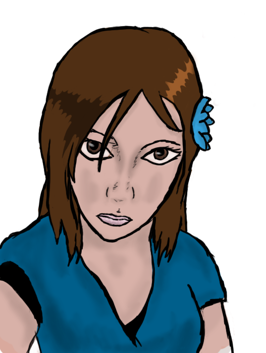
The head looks too big on the first one, the length of the sleeves do not look relatively the same either.
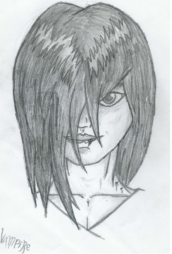
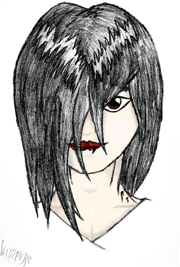
The vampire is kind of ok, but you drew the lips wrong, and it's supposed to be a woman, right? His linart looks like she has a masculine chest.
Of course this one is a bit stylized, but this should give you an idea of what lips are supposed to look like in shape.
In both the coloring isn't good. You are shading with merely a darker tone of the same type of color, and it is not contrasting enough to make it stand out, making the pieces look flat.