Closedworlds
Member
Hi guys, this is my first post.
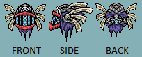
I created this monster sprite for a game I am currently working on.
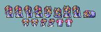
The style I was going for is FFV's monster sprites. There is also a little map sprite of him.
I make most of the graphics for FF Essence but this monster will not be for that game.
I would appreciate a good critique because I've been told he doesn't look proportionate, regardless of all the editing I've done to him lately.
C+C
UPDATE *11/23/2009*
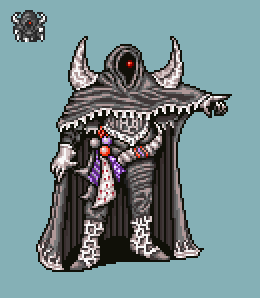
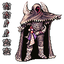
Thanks a lot to Perihelion for the beautification. He added more creative coloring, redid the detail in the cloak/hood, and improved the lighting.
I elongated the torso, redid "his left" shoulder spike, pulled the arm up, redid the hands, redid the torso, and redid the boots. Also Completed map sprite.
Unfortunately, I think his hands are still a little crappy and I need help shading the inside of the cloak. I cannot do hands to save my life.
I created this monster sprite for a game I am currently working on.
The style I was going for is FFV's monster sprites. There is also a little map sprite of him.
I make most of the graphics for FF Essence but this monster will not be for that game.
I would appreciate a good critique because I've been told he doesn't look proportionate, regardless of all the editing I've done to him lately.
C+C
UPDATE *11/23/2009*
Thanks a lot to Perihelion for the beautification. He added more creative coloring, redid the detail in the cloak/hood, and improved the lighting.
I elongated the torso, redid "his left" shoulder spike, pulled the arm up, redid the hands, redid the torso, and redid the boots. Also Completed map sprite.
Unfortunately, I think his hands are still a little crappy and I need help shading the inside of the cloak. I cannot do hands to save my life.