Envision, Create, Share

Welcome to HBGames, a leading amateur game development forum and Discord server. All are welcome, and amongst our ranks you will find experts in their field from all aspects of video game design and development.

LotD Menu Designs

Favourite menu design?

  • V.1

    Votes: 0 0.0%
  • V.2

    Votes: 6 85.7%
  • V.3

    Votes: 1 14.3%
  • An adaption (please post what)

    Votes: 0 0.0%

  • Total voters
    7
I'm in need of a bit of help and criticism here. Don't worry about the game itself (development blog in my sig but its brand new), its a project of mine thats been in progress for ages now but it's never actually come to anything. Now it has. The game itself is a survival horror game, and thats all you need to know for this :P. What I'm stuck on now is the menu design. I have three different designs, the last of which is my current version. The game's style has changed a bit after I made the first menu, and I wasn't that happy with it anyway. But I still think it's lacking something. Ignore the change in screen resolution, thats something else that's changed as I've gone on.
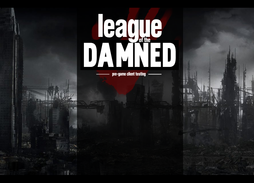
V.1
titletest3.png


V.2
titletest2.png

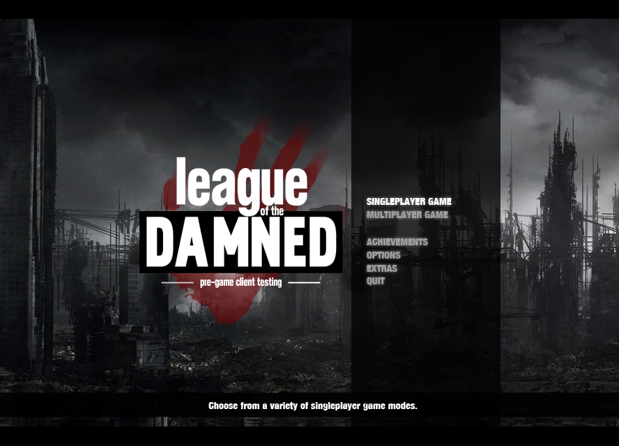
The background of this title is animated, with the clouds passing slowly behind the buildings.

V.3 (current)
titletest1.png

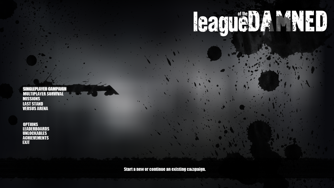
My plan with this design is to have the background flicker in and out of view, as if it is the view from someone's eyes who is close to passing out.

What I really want to know is everyones opinions on the current one and what I could do to improve it, the others are there as comparisons and to give examples of what other features I could add back in if needed. Thanks in advance :).
 
Wow, these menus look like something off a PS3 game, props. I prefer the second menu V.2 simply because I think the photography in the background is kick-ass, the first one looked a little too plane and the last one is just grey :blank: ( the background ) Which maybe would work out for a pause menu but not really for the title screen where you want the players feel the initial atmosphere of the game.

Just curios but is this an rm2k3 game or a full 3d game?
 
Second one is the best, looks very proffesional. But better change background with some footage from game. I mean - better be sure that in-game graphics are not different from these that are in menu, because you can dissapoint players on very start of the game and I'm sure you do not want this. ;)

Also quick feedback about other versions:

First one is slightly worse than second, I preffer menu content to be on right side.

Third one - looks like Source games clone, HL, L4D, etc. ;x
 
@Echo Magnum: Ah, thanks. Thats high praise :). Maybe then if I took the design of the background of the second one and put it with the layout of the third? Because the problem I have with the second one is that the actual game options seem a bit scrunched up. The game's built in Game Maker, and its built on a false 3d top down engine.

@GameBoy: Thanks. I know what you mean, I've seen lots of examples when title screens are beter looking then the actual game (a few being mine :P) so perhaps thats an idea. The third design was moddled on source and I guess I was feeling too lazy to actually change enough for it to be it's own design.

Thanks for the comments. Once my computer's up and running again (motherboard failed :( ) I'll get back to this and do a redesign taking into account what you've said.
 

Thank you for viewing

HBGames is a leading amateur video game development forum and Discord server open to all ability levels. Feel free to have a nosey around!

Discord

Join our growing and active Discord server to discuss all aspects of game making in a relaxed environment. Join Us

Content

  • Our Games
  • Games in Development
  • Emoji by Twemoji.
    Top