Envision, Create, Share

Welcome to HBGames, a leading amateur game development forum and Discord server. All are welcome, and amongst our ranks you will find experts in their field from all aspects of video game design and development.

Kailis

mawk":3f7q4uvd said:
Some of these people (from the first page) should've refused to even post, because your artist has more talent in their left nut, and more will to just get up and fuckin' do it than they do!
"more talent" =ФтФ=

enjoy your nike noses and Silent Hill body proportions

I'm gonna be over there drawin people who look like people and cats who have enormous eyes but otherwise resemble cats

Who the fuck else has attempted at all-custom graphics?
cough cough wow is there something in my throat cough

honestly I'd be happy if people like you stopped posting just to debunk legit criticism in favour of vanilla praise. it's not up to people to "protect" the maker from negative critique. have you seen what happens when someone gets nothing but positive feedback? it's not pretty.

I assume I'm one of the few who've actually received negative and positive criticism, I'm 21, I hope to high hells I can handle it. I'd rather someone be honest so I can fix shit, than just get showered in sprinkles and fuckin' pixie dust. Because those kind of comments are nice, I used to comment a paragraph to them, now I can only say thanks, cause I've almost heard it all before and I don't want to beat a dead horse.

I agree with what Mawk says, not to be a suck up, but from my own honest opinion I've seen what he said in other words more or less to many times before.

Now to comment on Kain:
Well I decided to go with a stylized chibi look so that it fits with the sprite style, especially now since we work with Breeze V2, I'm still waiting for art to be made in this style I just recently saw some sketches from my artist who has been recovering from surgery recently, so little slow in that department.

I have everything custom cause i'm tired of seeing bullshit games made in this program using the RTP. I have higher expectations and see more potential in the system than to use default kiddy stuff. I did make the game in RTP a long time ago, I have tons of screenshots and finished the first episode back then, now I'm completely remaking it in all custom stuff cause I got tired of seeing RTP. I have always had custom music, cause I think the RTP song choices are an utter disgrace to the rpg world, they are off key and poorly executed songs. Like Dungeon03 was the only one worthy of being decent.

But thanks for the comments, it let me get some of my energy pent up from work released into words.
 
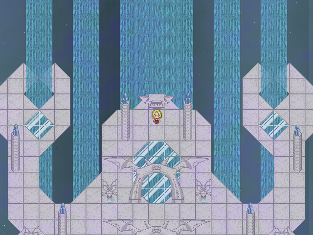
DSCSScreen.png


You got a whole bunch of perspective issues hurting this map. First the shading on the arches make them appear very flat, but that is made worse by the perspective problem presented by the waterfalls and choice of panorama. Since the sides of this map are open you need a panorama with a defined horizon that way you better create the illusion that to their interior and exterior sides there is a cavernous void or pit and to their upper front the skyline and horizon. Second consider the logic of the waterfalls and where they are going.

You need to decide if the wings on both sides either move up in elevation or go deeper into the background. Either effect is going to effect the logical visibility of those waterfalls. The fall flows as they currently are generally reflect that the wings are elevated and not going deeper into the background, but there is nothing about the wings that suggests that other than the waterfalls, so you end up with a strange paperdoll like look. It would help if the wings had interior sides and some cliff like tiles and stairs that would complete such a look. If you go the other route you need to cut off the falls at their logical perspective points. Because otherwise by the logic of the current waterfalls you map plane meets the waterfalls like this |\ (first plane being the waterfall and the second being them map ground) instead of a normal 90 degree angle like this |_. If you were meeting the waterfall in a normal ~90 degree angle the water would drop out of perspective not flow all the way under all the way under the main corridor area. If that's the route I think you should mask it under some interior siding. Also consider using some kind of interior siding because the complete lack of it makes the floors look like they're made of paper plates, and it only furthers the whole flatness problem the map has.

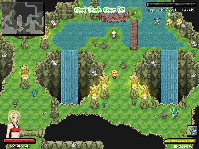
CRCScreen.png

The tileset style on this map seems to fit your sprites the best and has the best look imo. And unlike the map discussed above the shading gives it depth, though the grass seems a bit leaf like.
 
Captain Murphy":fq7huud1 said:
DSCSScreen.png


You got a whole bunch of perspective issues hurting this map. First the shading on the arches make them appear very flat, but that is made worse by the perspective problem presented by the waterfalls and choice of panorama. Since the sides of this map are open you need a panorama with a defined horizon that way you better create the illusion that to their interior and exterior sides there is a cavernous void or pit and to their upper front the skyline and horizon. Second consider the logic of the waterfalls and where they are going.

You need to decide if the wings on both sides either move up in elevation or go deeper into the background. Either effect is going to effect the logical visibility of those waterfalls. The fall flows as they currently are generally reflect that the wings are elevated and not going deeper into the background, but there is nothing about the wings that suggests that other than the waterfalls, so you end up with a strange paperdoll like look. It would help if the wings had interior sides and some cliff like tiles and stairs that would complete such a look. If you go the other route you need to cut off the falls at their logical perspective points. Because otherwise by the logic of the current waterfalls you map plane meets the waterfalls like this |\ (first plane being the waterfall and the second being them map ground) instead of a normal 90 degree angle like this |_. If you were meeting the waterfall in a normal ~90 degree angle the water would drop out of perspective not flow all the way under all the way under the main corridor area. If that's the route I think you should mask it under some interior siding. Also consider using some kind of interior siding because the complete lack of it makes the floors look like they're made of paper plates, and it only furthers the whole flatness problem the map has.

CRCScreen.png

The tileset style on this map seems to fit your sprites the best and has the best look imo. And unlike the map discussed above the shading gives it depth, though the grass seems a bit leaf like.

Thanks. All the tilesets you see right now are actually, not going to be used. Even the one you said fit. I imagine my spriter, Green Raven, will be making a unique tileset for that one as well. All our tilesets are going to receive a make over from the template creator himself, and will reflect a much better outcome of the tilesets in the way I envisioned them, not my old pixel artist.

Once we get the last of these character/npc/enemy sprites done we are starting on tilesets, then I will post new map screenshots for all to see.
 
Hello All,
I haven't updated this project in a while since I usually just post new pictures and stuff in the screenshots thread. However I will go ahead and put up some screenshots and concepts that I am looking to do. Lately I am having major trouble getting scripts and need a dedicated scripter who works fast and effectively. A lot of work has gone into this project and to have these things done would make it all that much better. So any help in the RGSS field is greatly appreciated!

As well we just opened up our development team's new website, I am not going to advertise the link, however it is in my signature for those who wish to view information and updates on this game at any time.

Screenshots:
NewTitleUpd.png
NewTitleUpd2.png
BattleWIP.png


Concepts:
EquipMenu1.png
SaveAndLoadMenu.png
BuyingItem1_2.png
HUD-WIP.png
SillyMockup.png
 

Frodo

Member

Looks pretty cute. I like the breeze style sprites, except the main girl. She looks a little off for some reason.
 
Thanks for the comments. That's the breeze style, some people love it, some hate it, tough luck *shrug* :)

Here is the latest screenshot, taken from in game as our HUD is finished now. Yeah still waiting on new tilesets, sorry I wanna show them off as much as you'd all like to see them, trust me XD
New_HUD.png
 
Seems like your game is getting a lot of negative feedback. It appears like quite a strong effort at a game to me. Yeah, there are a lot of graphical issues as stated by other posters, but since you've got a new artist and are taking on advice, I don't think people should dwell on this issue further. Good to see you're taking the heavy critique well.

Hang in there! :box:
 
TheInquisitor":1u553a9p said:
Seems like your game is getting a lot of negative feedback. It appears like quite a strong effort at a game to me. Yeah, there are a lot of graphical issues as stated by other posters, but since you've got a new artist and are taking on advice, I don't think people should dwell on this issue further. Good to see you're taking the heavy critique well.

Hang in there! :box:

Thanks, I've only been dealing with these comments since RMXP.net. They really don't bother me, considering I've been working on this game for almost 9 years now. We are already further from this art stuff they "dwell" on. I'm not gonna run away and whine like a little kid when someone actually critiques my game.

Thanks for the support...
 
Hello everyone,

NokiNotSoBright.png
Hope you all get a laugh out of Noki being an idiot as usual ;) Yay for sketch art!

ReyvkGuitar.png

Yes, rock out Reyvk to some new content for our viewers!!!

Kailis_Sprite_Sheet.png

unfinished_screen.png

I have a pretty big update with a lot of new needed stuff to look at, mainly new sprites and their specified origin. Be aware there are enemies not shown here that are just minor edits or color swaps, their appearance is not necessary to be seen. As well a little mock up screen of a new tileset in the works. :) Enjoy.
 

Jason

Awesome Bro

Wow the new sprites are looking really nice, I especially love the worm and the skeleton, his facial expression looks like :huh: haha.

Can't wait to see more updates pal !
 
jъГìsт":1gi6yj9r said:
Wow the new sprites are looking really nice, I especially love the worm and the skeleton, his facial expression looks like :huh: haha.

Can't wait to see more updates pal !

Thanks, our spriter really out-does himself with this game, he is very passionate about it. The Skeleton is indeed very confused. That is just a lesser Shovi. (Essentially an NPC like, non important Shovi)

Will try to keep you updated as much as I can ;)
 
Hello everyone.

Well, We have been hard at work with this game. Currently the first portion of the tilesets for the first big dungeon are being made and almost finished, then onto the 2nd part of them. While this has been undergone, I took the time to get our beastiary up and running.

Kailis Beastiary

This link goes to our Beastiary for the games, it will be divided up by game and sub divided into bosses, enemies, and as soon as I can gather the sprites, NPC's. I don't know if I want to add the Characters yet, as there is a section for them already, but only time can tell what is to be expected. For now, enjoy this.

Sight - How many tiles ahead the enemy can see in a 180 arc.
Hearing - How many tiles around the enemy can hear you walking, in a 360.
Heart - Full Heart is 20 HP, so increments of 5. Full, Three-Fourths, Half, Quarter.

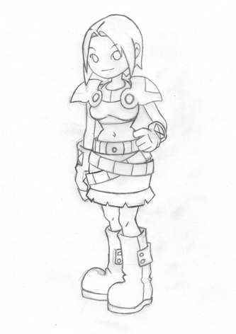
Also I have a few other important and non-important things to put out that I failed to release in the last few weeks on HBGames.org. One is a finalized art style, presented in this sketch, the eyes are colored in later so they look a little off.

NewLunaArt.png


This was originally built for a contest, but I broke a bunch of the rules and finished it anyways. It is a watered down version of our battle system. There are not a ton of flashy graphics for you to see and a lot of music, just a basic look at the battle system. Please read the read me below and pay attention to it before you download this game demo. The demo itself releases no information about the game itself, to keep our real productions under wraps still.

Kailis: Battle March

This short demo is a watered down version of our battle system using non-special animated sprites and very limited resources from our game. It demonstrates a few select things within Kailis. We hope you enjoy.

!PLEASE INSTALL THE FONTS IN THE FONT FOLDER OF THE GAME FOLDER BEFORE PLAYING!

Read Me:
Here is the explination of controls:

Attack - S
Defend - D
Sneak - Z
Dash - A
Jump - Spacebar
Potions (If in inventory) - W or I
Equip Skill Menu - N
Skill (If equipped) - Q
Minimap - M
Target Enemy - E
HUD - Z (Remember this controls Sneak as well, left this unchanged by accident)
Directional Keys - Up Arrow, Down Arrow, Left Arrow, and Right Arrow
Long Jump - Directional Key+A+Space

Font Fold Information:
You need to install these fonts into your Windows>Fonts folder to be able to view text in Kailis.

One final note, this was a question brought up to me on another website:
Is all the artwork custom? It's pretty good. It's obvious that you've put in a lot more work than the average joe.

I do have a question that's been bugging me though: if you've been working on the first episode for nine years, how long will the others take?

My response:
Yes it is ALL custom art, music, everything.

To answer your question, as everyone asks this. The game has taken 9 years right now due to this list:
Year 1-4: Written planning and development, as well as the first concept art stages.
Year 4-7: Learning RMXP fundamentals and mechanics to a decent extent, as well as improving my mapping skills.
Year 7-8: Spent actually making the full game, before I broke it into episodes, demo was created and production in RTP stopped.
Year 8-9: Switched over to completely custom graphics, music, sound, art, everything for the game and began breaking it into episodes, thus forcing me to rewrite the story to be deeper for each episode and do more planning while creating the game itself as resources came in.

If that makes sense to you, the first 6-7 years were basically me learning the program, how to go about designing the game, mapping, and learning from my mistakes. Which is inevitably why Kailis is as far as it is today and as strong. I've never given up on the project where others do. It's come a long way. Here...
LunaEvolve.png


Maybe this will explain how far it came, because I started Kailis as a "testrun" in RM2K, then moved it to RM2K3, where I finally decided to stop and write the story before going further, and by the time I finished, and got back onto RM2K3, RMXP came out and I started from Year 4-7 then.

Hope this makes sense, thanks for the question though.

Maybe this will answer some questions others have as well. I've been around for quite some time and so has Kailis, but why it is taking so long has always been a looming question for all.

~Axerax
 

Jason

Awesome Bro

Lol "Evolution of Luna", looks like she's come quite a way, especially from blue to red, maybe you could add a blue costume to the game as an easter egg ?
 
jъГìsт":6iefflbk said:
Lol "Evolution of Luna", looks like she's come quite a way, especially from blue to red, maybe you could add a blue costume to the game as an easter egg ?

Lol, yeah, maybe I've thought about that It wouldn't be hard for me to do.
 

mawk

Sponsor

Year 1-4: Written planning and development, as well as the first concept art stages.
Year 4-7: Learning RMXP fundamentals and mechanics to a decent extent, as well as improving my mapping skills.
Year 7-8: Spent actually making the full game, before I broke it into episodes, demo was created and production in RTP stopped.
Year 8-9: Switched over to completely custom graphics, music, sound, art, everything for the game and began breaking it into episodes, thus forcing me to rewrite the story to be deeper for each episode and do more planning while creating the game itself as resources came in.
jesus christ.
 

Jason

Awesome Bro

And to be honest, that drawing you've shown, looks better than the others you've done (Don't take offence, although it's your work anyway so I can't see that happening), and it'd look pretty good coloured, although her left leg (The one closest to us), well, the foot just seems odd...
 
jъГìsт":1922uig3 said:
And to be honest, that drawing you've shown, looks better than the others you've done (Don't take offence, although it's your work anyway so I can't see that happening), and it'd look pretty good coloured, although her left leg (The one closest to us), well, the foot just seems odd...

Hmm I guess you are right.
I was bored and decided to do some recolouring out of boredom, I guess this is sort of how they "would" have looked like years ago.
Episode1CrewAltCostumes.png


I'm sort of happy with how they look now.
 

Jason

Awesome Bro

Yeah, the dragon doesn't look too good in red, although Luna wouldn't look too bad if her hair wasn't blue/strangepurple, maybe still blonde, or brown, lol.

Oh well, you could easily use it as an unlockable easter egg lol.
 
jъГìsт":fqehv6kf said:
Yeah, the dragon doesn't look too good in red, although Luna wouldn't look too bad if her hair wasn't blue/strangepurple, maybe still blonde, or brown, lol.

Oh well, you could easily use it as an unlockable easter egg lol.

If you've ever read the history of the game development on my website you'd know Luna used to have brown hair. I scrapped the idea before developing it in the programs though. I prefer how they look now.

Yeah easter egg of maybe armor changing, would be nice, She looks fine with blonde hair and blue armor too.

EDIT:
I forgot to add on my update post this portion.

In tribute to this and help spread the word of our game, I decided to make some User Bars. please use them to link back to this topic if you wish. Or wear them as support. I'll make some more once we get more of the main characters and bosses done. Characters with a white and color background are generally good characters where as the black and color are the bad guys of the game. Thanks for your support!
LunaUB.png

ReyvkUB.png

NokiUB.png

LongcrestUB.png

RikkiUB.png

RyveUB.png

AskarUB.png
 

Thank you for viewing

HBGames is a leading amateur video game development forum and Discord server open to all ability levels. Feel free to have a nosey around!

Discord

Join our growing and active Discord server to discuss all aspects of game making in a relaxed environment. Join Us

Content

  • Our Games
  • Games in Development
  • Emoji by Twemoji.
    Top