Envision, Create, Share

Welcome to HBGames, a leading amateur game development forum and Discord server. All are welcome, and amongst our ranks you will find experts in their field from all aspects of video game design and development.

I Feel Lost (Art Advice)

Most of you know of my drawing style. And how I draw sketches, A LOT.

MYSTYLE.png


Each time I attempt to color my art, either traditionally or digitally, it feels like I lose my style - as seen here.

I've been saving a bunch of pictures from artists I follow/like in hopes of some inspiration. So I'm very curious: does any seem like a good fit for my style?

You can see them here.

Thank you!
 
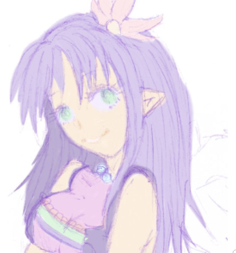
What I personally recommend is that because your linework is so gentle and soft, using pale pastel colors might be a really good way to start.

As I suspected, you're using near-psychedelic harshly bright colors for outlines that are soft and gentle, as a result it looks quite messy, I'll see if I can't quickly color one of the arts above to give you an idea of what may look really nice

32c0bd079a3bd16375cef2fbd58b7ca0.png

Here we go, no idea how she's meant to be colored so I just went with what looks decent to me, however, one thing i will say is that you will need to recolor the outlines, thankfully this is easy, just make a new layer above the linework, turn it into a clipping mask, then add a bright saturated color to that layer, then perhaps a couple dobs where another color fits better. For example:
af7cdc9bebeb1a843e478c7eb63cd7b0.png

Without the clipping layer mode on it looks like this.
6ab414c93cd5b72699e62cfea8e74800.png

Hope I helped.
 
So I actually enjoyed the last piece you posted in pwoym, it was decently colored. What I would suggest you do in diversify what colors you use. Example: the red in the hair. Instead of just using hues of red and orange, add some purple or blues. Blend your reds with different colors to create a palette. The more exotic you are with your color choice the better it will look and the less 'flat' it will appear
 
What I would really recommend you do is check out what studio ghibli does with their colors, I think your style matches that style very well. Keep it simple and clean while diversifying your colors a bit
 
Well the pastel coloring was just one route, what's difficult about using harsher colors is that Strawb's line art is very soft so it tends to be very obvious where one color ends and another starts, which as a result, looks very messy.

But Strawb's lineart is gorgeous, so I think if it can be preserved somehow, it should be.
 

Thank you for viewing

HBGames is a leading amateur video game development forum and Discord server open to all ability levels. Feel free to have a nosey around!

Discord

Join our growing and active Discord server to discuss all aspects of game making in a relaxed environment. Join Us

Content

  • Our Games
  • Games in Development
  • Emoji by Twemoji.
    Top