
You are using an out of date browser. It may not display this or other websites correctly.
You should upgrade or use an alternative browser.
You should upgrade or use an alternative browser.
Game's Title Screen - WIP
- Thread starter Roxas
- Start date
LegacyCrono
Member
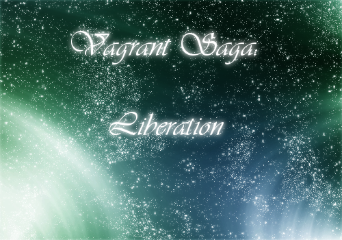
I think it looks bad. But that's just me.What do you think?
You should try changing the background art, maybe it'll look better.
")
Also, change the font. The spacing between the "Vagrant Saga" and "Liberation" is way too big. The glow doesn't look right, too...
Uh... Any relations with Vagrant Story? :P
SEE YA!!!!
There's nothing wrong with the concept, but I think the fact that there isn't enough contrast between the text and the stars is your biggest problem. Also the image lacks depth, there's no indication that it is space - really its just a bunch of white dots. Is your story about space? or is it designed to indicate the vast-ness which is space? Whats its relevance to your game? You're font clashes a lot because its white on white dots, the glow makes alot more bright color surrounding the font which also reducing the impact of the text.
If you work on it, I would recommend making a visual focal point. A core to the image. Looking at this title I really have no idea where my eyes should be looking. The addition of a planet, or logo would help a lot. The actual font represents a classical era, where the background represents a futuristic era with the swirls of color. The color gives of a very "Clarity-fresh" feeling but there's still no visual focal point which really leaves me thinking - "K, so?"
If you work on it, I would recommend making a visual focal point. A core to the image. Looking at this title I really have no idea where my eyes should be looking. The addition of a planet, or logo would help a lot. The actual font represents a classical era, where the background represents a futuristic era with the swirls of color. The color gives of a very "Clarity-fresh" feeling but there's still no visual focal point which really leaves me thinking - "K, so?"
Thank you for viewing
HBGames is a leading amateur video game development forum and Discord server open to all ability levels. Feel free to have a nosey around!
Discord
Join our growing and active Discord server to discuss all aspects of game making in a relaxed environment.
Join Us