Welcome to HBGames, a leading amateur game development forum and Discord server. All are welcome, and amongst our ranks you will find experts in their field from all aspects of video game design and development.
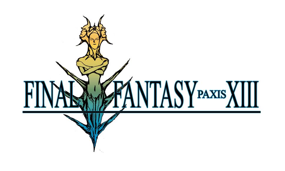
The picture on the logos for the older games didn't use black lines at all. Instead those lines were erased out.
The newer game logos are different, they have lines in them. They are thinner and the gradient goes over them.
The outline around the letters doesn't do enough to separate from the picture.
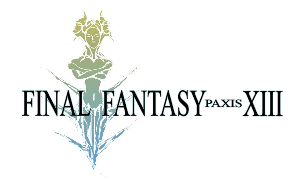
You should play with the position of the picture and the letters. Like in this one the sword goes infront of the letters:
Thnaks for the input. The word paxis is a play on the Latin words pax pacis, wich mean peace. But at the moment the story for this game is still in development, so the logo and subtitle can change at any time. I will reveal the game formally sometime this year.
Goodness, everyone is so technical about the logo. It's not a real Final Fantasy game. I personally like the logo. I think it's different and I like different. I don't think you should change it.

")