
eharper256
Member
eharper 256's The Enemy Within Graphics Workshop
--------------------------------------------------------------------------------------------------------------
I know its anal, but its got to be said: The graphics here are PROTOTYPES for my game; The Enemy Within, and are created or edited by me.
So Please DON'T Leech/Use without asking me first! Thanks :thumb:
--------------------------------------------------------------------------------------------------------------
I'm sure you can tell that my so called 'style' is heavily influenced by Naramura; and that I often use parts of his excellent work in contributing to my sprites, except that I use alot more outlining. So he deserves the credit just as much as me for creating sprites for T.E.W.
--------------------------------------------------------------------------------------------------------------
Yeah, I suppose I'll take requests. But I'm a terribly busy guy with semi-active internet habits (sometimes I'll just dissappear), so if you do request, please don't expect thats its 100% certain that the jobs gonna be done. Sorry... :dead:
--------------------------------------------------------------------------------------------------------------
--------------------------------------------------------------------------------------------------------------
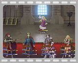
Hey guys; as I noted (without reply... :'( ) on my project topic, I've finally got back into the swing of things for The Enemy Within. As part of the features of the new version ( 0.8 ), I'll be updating alot of the graphical work even further. However, I am daunted by the prospect of my new battle animation idea; mainly because there's SO much that needs to be done (at least 8 frames of animation x 3 weapons x 4 classes for each character = 96 highly detailed frames...). Therefore, the purpose of this topic is get feedback on my work, and also, hopefully, to act as further inspiration for myself.
Anyhow, firstly, I redid the class change system slightly; allowing 3 potential choices for the player (for each character) once they reach a certain plot point whereupon they can use an artifact of a past hero or accomplishment as a focus for the test of the silvered rose. Of course, this has meant lots of new sprites and battlers, so, I'll ask everyone's opinion on these first. Without further ado, the progression charts:
--------------------------------------------------------------------------------------------------------------
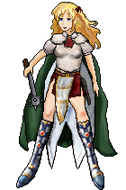
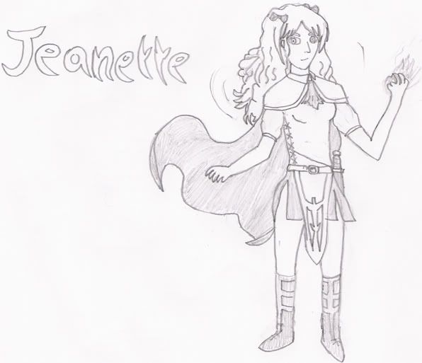
Jeanette
Re-Revised (Again!) 03/04/09. Well, actually, I lost the below sprites of Jeanette in the recent HD crash, so I had to re-do her yet again. However, this has probably benefited her, since I got to rebuild her jawbone (which ~was~ a little odd before), as well as fixing her shirt and knees and her apparent jaundice. I'll do a new prog chart for her soon, but for now heres the newer version (with mace):
Here's the older versions:
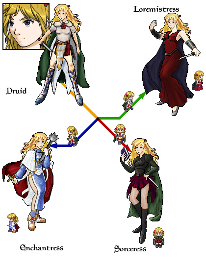
Re-Revised 10/09/08. Her base druid sprite got basically recreated from scratch. Because, hey, her face was also squashed before, like Fortinbras', in my opinion. Because of that it was difficult to edit her eyes to match the others. The legs are basically the same, as are bits of hair, but almost everything else is new. The scarf has been made much smaller so you can actually see her chest (saucy!). The shoulderpads of a different design, matching her sketch version. She has shorter, puffier sleeves, again to match the sketch. The hanging decorative waist thing has also reduced in size. The cape is less billowing. Her face is bigger with less hair covering it. So alot of alterations...really...
The other class sprites were also updated with the new head, face and shoulders. I think it makes them look better, but then of course I'm gonna be biased.
--------------------------------------------------------------------------------------------------------------
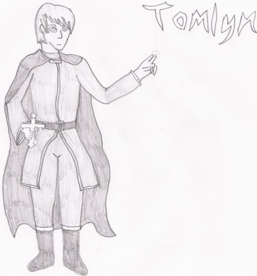
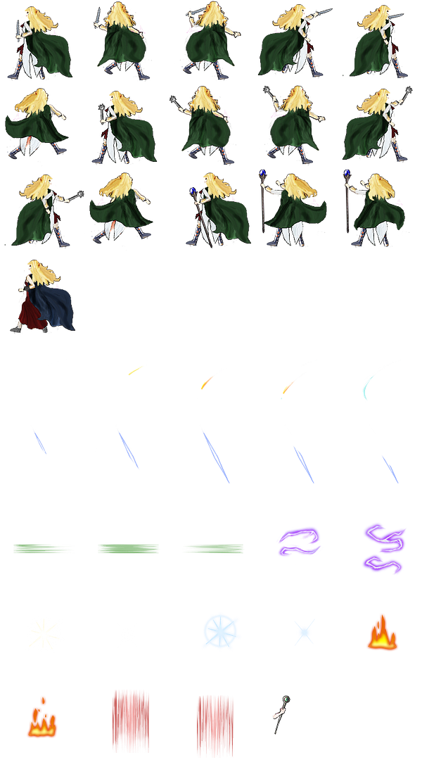
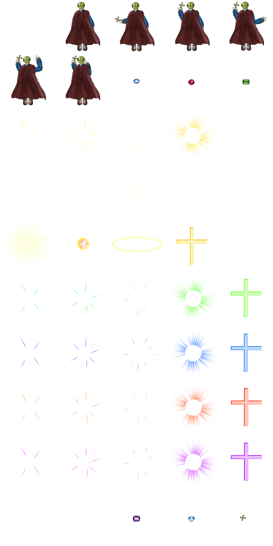
Tomlyn
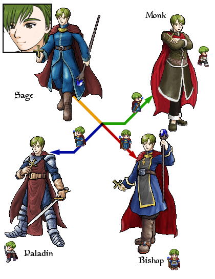
Revised 17/06/08. Tomlyn has had much less change, though the Monk sprite is totally new, and the Paladin has gone through a couple of revisions. I'm not entirely sure about the Bishops staff; it might need rotating a bit. Also, since its not keeping with the others, I'm wondering whether or not to give the monk the bronze cross as well. The Sage also doesn't typically wield the staff until later in the game, but I've made him have one here for completeness sake.
--------------------------------------------------------------------------------------------------------------
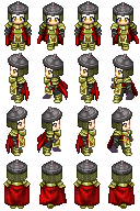
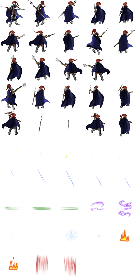
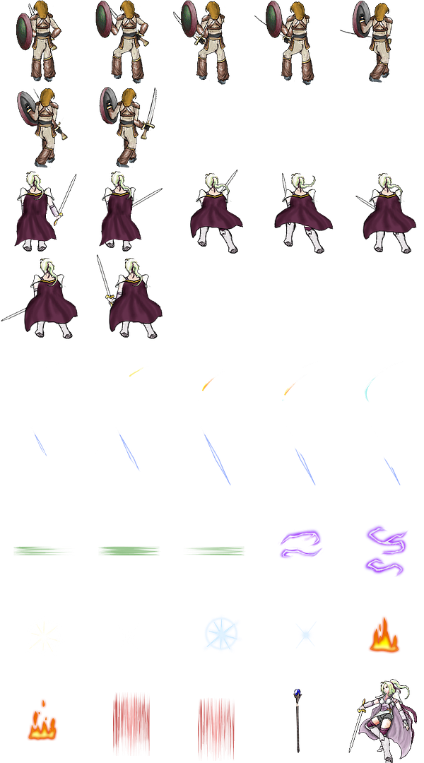
Risa
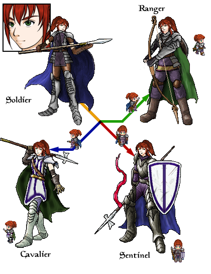
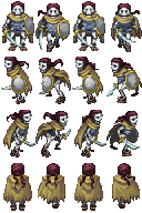
Revised 17/06/08. The Guardian sprite was previously the Cavalier, but I made a new, more appropriate Cavalier sprite (seeing as how getting this class ingame requires Risa to become Fortinbras' squire, I used a couple of parts from him and made them female sized). Though its a little smaller than the others, I do still like it, especially with the casual poleax slung over the shoulder look shes sporting. I redid the Ranger. This is her bow armed pose, as can be seen, but she can also continue to use spears and javelins as a ranger.
--------------------------------------------------------------------------------------------------------------
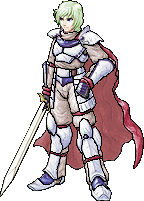
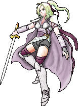
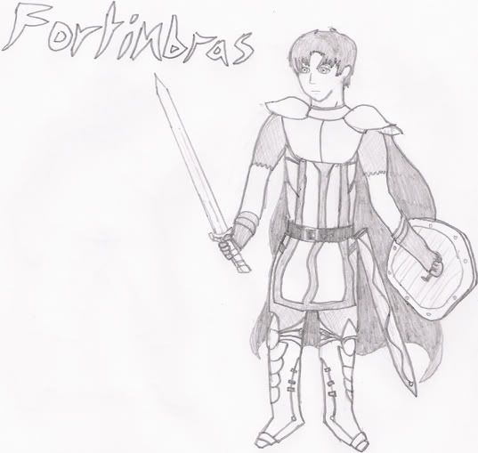
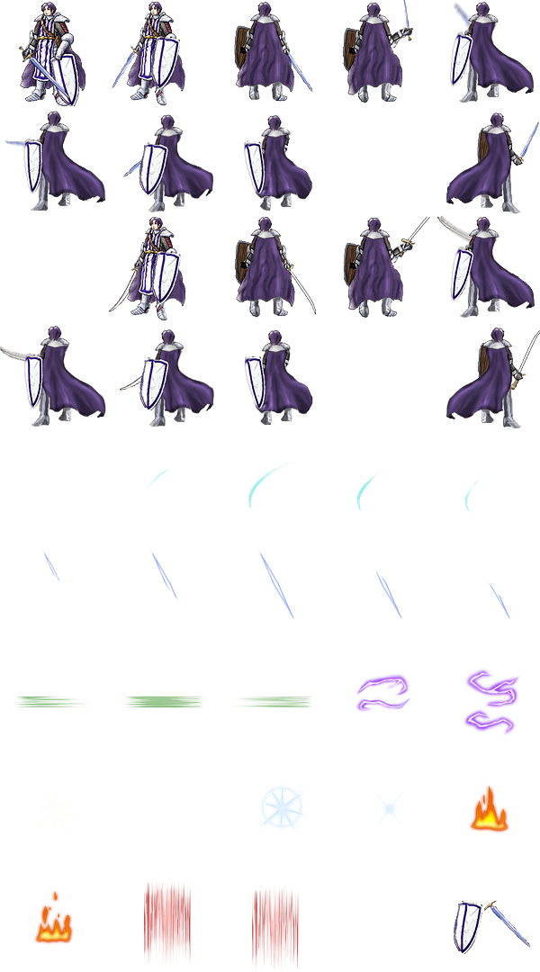
Fortinbras
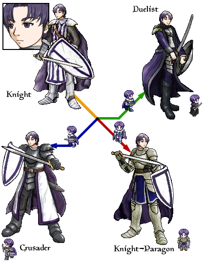
Revised 17/06/08. Fortinbras has had a total facelift, since I always thought had a weird crunched face before. I also no longer have to get irate about him not holding his shield up. The Knight Paragon properly looks like a 'knight in shining armour' stereotype now, mind, ROFL. But that forms an excellent contrast to the dark looking Duelist, so its all good. Speaking of the Duelist, I totally modified that too, and gave him a Katana by default (since that vicious looking Scimitar he had before is now used by Triela, and hey, being a Duelist means he gets trained by the Samurai of Tuskuru, so its correct.)
--------------------------------------------------------------------------------------------------------------
Also recently done include:
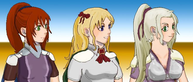
The new portraits for the status screen
Risa, Jeanette and Hecate:
Fortinbras and Tomlyn:
I put a heck of alot of work into these. They're to go with my newly reshuffled and reprogrammed status screen in the menu. The old element wheel has gone, but it looks much nicer in general. Still need to do Prince Elijah.
Skeleton Battler
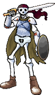
A new skelly- I didn't like how blasted big the previous skeleton battler was before- he looked like the skeleton of a troll or something.
Skeleton Charset
Resized and Retouched Skelly Characterset to make him human-sized. To be used with the above.
--------------------------------------------------------------------------------------------------------------
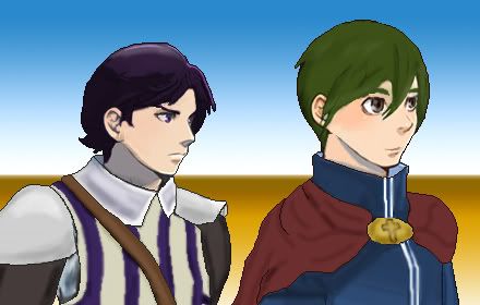
Prince Elijah & Princess Hecate
If you'd played the demo to the end, you'll know this is Prince Elijah and Princess Hecate. They're also some of Naramura's most popular characters, it seems; so I retouched them to make them slightly more unique for TEW.
--------------------------------------------------------------------------------------------------------------
Slime Battler

Another one I got annoyed with. The base slime is too bouncy, and has that silly looking sword stuck in the middle. Reduced the elasticity, made it a sicklier colour, emphasised the outline, etc. A fairly minor, but important edit.
Aqua Hydra
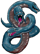
Isn't he cute!!?
As you might tell, I modded the RTP hydra, removing the extra heads that seemed to come from nowhere, removed his acne problem, changed his colour scheme, and made him look a little slick with water.
--------------------------------------------------------------------------------------------------------------
Tessalatorian Royal Guardsman
Yeah, I actually made several new guardsman. These are the elite ones that guard King Harper, Queen Leila, Prince Elijah, Princess Hecate, et al. and the palace; and appear in Chapter IV of the game. (Hence the gilded armour)
--------------------------------------------------------------------------------------------------------------
Triela
Yup, if you've watched the promo video; you will have seen Triela. So I decided to post her battler here too. She appears in the new revised prologue, during the tutorial: some of the other recruits are badmouthing Risa for being late, and she defends Risa when she starts an argument with them. Then of course, Triela pops up to aid Risa against the Jeveneerian soldiers who storm the gatehouse (seen in the video). She also becomes Risa's squad sergeant, so now she'll be helping now during the troop management section of Chapter III (replacing the generic guy who was there before).
Jeveneerian Soldier
And to complete the prologue package, here's the battler for the Jeveneerian Troops; a modified soldier 1 sprite now with a spear, cape, better colouring et al.
--------------------------------------------------------------------------------------------------------------
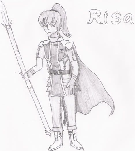
The Sketches from the Manual
You can already see these in the project topic, but whatever. My preliminary character sketches for Risa, Tomlyn, Fortinbras and Jeanette. Though each was made in like 20 minutes, I still think they're pretty good. (But then I'm always biased considering my own pencil sketches, LOL)
Added 6/6/08, And to finish: Princess Hecate's Sketch:
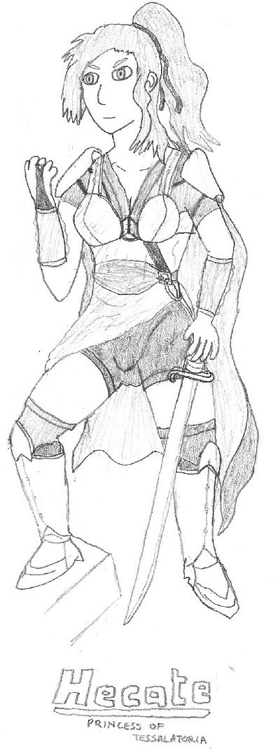
Isn't it amazing what you can do when you're bored at work?
--------------------------------------------------------------------------------------------------------------
I know its anal, but its got to be said: The graphics here are PROTOTYPES for my game; The Enemy Within, and are created or edited by me.
So Please DON'T Leech/Use without asking me first! Thanks :thumb:
--------------------------------------------------------------------------------------------------------------
I'm sure you can tell that my so called 'style' is heavily influenced by Naramura; and that I often use parts of his excellent work in contributing to my sprites, except that I use alot more outlining. So he deserves the credit just as much as me for creating sprites for T.E.W.
--------------------------------------------------------------------------------------------------------------
Yeah, I suppose I'll take requests. But I'm a terribly busy guy with semi-active internet habits (sometimes I'll just dissappear), so if you do request, please don't expect thats its 100% certain that the jobs gonna be done. Sorry... :dead:
--------------------------------------------------------------------------------------------------------------
--------------------------------------------------------------------------------------------------------------
Hey guys; as I noted (without reply... :'( ) on my project topic, I've finally got back into the swing of things for The Enemy Within. As part of the features of the new version ( 0.8 ), I'll be updating alot of the graphical work even further. However, I am daunted by the prospect of my new battle animation idea; mainly because there's SO much that needs to be done (at least 8 frames of animation x 3 weapons x 4 classes for each character = 96 highly detailed frames...). Therefore, the purpose of this topic is get feedback on my work, and also, hopefully, to act as further inspiration for myself.
Anyhow, firstly, I redid the class change system slightly; allowing 3 potential choices for the player (for each character) once they reach a certain plot point whereupon they can use an artifact of a past hero or accomplishment as a focus for the test of the silvered rose. Of course, this has meant lots of new sprites and battlers, so, I'll ask everyone's opinion on these first. Without further ado, the progression charts:
--------------------------------------------------------------------------------------------------------------
Jeanette
Re-Revised (Again!) 03/04/09. Well, actually, I lost the below sprites of Jeanette in the recent HD crash, so I had to re-do her yet again. However, this has probably benefited her, since I got to rebuild her jawbone (which ~was~ a little odd before), as well as fixing her shirt and knees and her apparent jaundice. I'll do a new prog chart for her soon, but for now heres the newer version (with mace):
Here's the older versions:
Re-Revised 10/09/08. Her base druid sprite got basically recreated from scratch. Because, hey, her face was also squashed before, like Fortinbras', in my opinion. Because of that it was difficult to edit her eyes to match the others. The legs are basically the same, as are bits of hair, but almost everything else is new. The scarf has been made much smaller so you can actually see her chest (saucy!). The shoulderpads of a different design, matching her sketch version. She has shorter, puffier sleeves, again to match the sketch. The hanging decorative waist thing has also reduced in size. The cape is less billowing. Her face is bigger with less hair covering it. So alot of alterations...really...
The other class sprites were also updated with the new head, face and shoulders. I think it makes them look better, but then of course I'm gonna be biased.
--------------------------------------------------------------------------------------------------------------
Tomlyn
Revised 17/06/08. Tomlyn has had much less change, though the Monk sprite is totally new, and the Paladin has gone through a couple of revisions. I'm not entirely sure about the Bishops staff; it might need rotating a bit. Also, since its not keeping with the others, I'm wondering whether or not to give the monk the bronze cross as well. The Sage also doesn't typically wield the staff until later in the game, but I've made him have one here for completeness sake.
--------------------------------------------------------------------------------------------------------------
Risa
Revised 17/06/08. The Guardian sprite was previously the Cavalier, but I made a new, more appropriate Cavalier sprite (seeing as how getting this class ingame requires Risa to become Fortinbras' squire, I used a couple of parts from him and made them female sized). Though its a little smaller than the others, I do still like it, especially with the casual poleax slung over the shoulder look shes sporting. I redid the Ranger. This is her bow armed pose, as can be seen, but she can also continue to use spears and javelins as a ranger.
--------------------------------------------------------------------------------------------------------------
Fortinbras
Revised 17/06/08. Fortinbras has had a total facelift, since I always thought had a weird crunched face before. I also no longer have to get irate about him not holding his shield up. The Knight Paragon properly looks like a 'knight in shining armour' stereotype now, mind, ROFL. But that forms an excellent contrast to the dark looking Duelist, so its all good. Speaking of the Duelist, I totally modified that too, and gave him a Katana by default (since that vicious looking Scimitar he had before is now used by Triela, and hey, being a Duelist means he gets trained by the Samurai of Tuskuru, so its correct.)
--------------------------------------------------------------------------------------------------------------
Also recently done include:
The new portraits for the status screen
Risa, Jeanette and Hecate:
Fortinbras and Tomlyn:
I put a heck of alot of work into these. They're to go with my newly reshuffled and reprogrammed status screen in the menu. The old element wheel has gone, but it looks much nicer in general. Still need to do Prince Elijah.
Skeleton Battler
A new skelly- I didn't like how blasted big the previous skeleton battler was before- he looked like the skeleton of a troll or something.
Skeleton Charset
Resized and Retouched Skelly Characterset to make him human-sized. To be used with the above.
--------------------------------------------------------------------------------------------------------------
Prince Elijah & Princess Hecate
If you'd played the demo to the end, you'll know this is Prince Elijah and Princess Hecate. They're also some of Naramura's most popular characters, it seems; so I retouched them to make them slightly more unique for TEW.
--------------------------------------------------------------------------------------------------------------
Slime Battler
Another one I got annoyed with. The base slime is too bouncy, and has that silly looking sword stuck in the middle. Reduced the elasticity, made it a sicklier colour, emphasised the outline, etc. A fairly minor, but important edit.
Aqua Hydra
Isn't he cute!!?
As you might tell, I modded the RTP hydra, removing the extra heads that seemed to come from nowhere, removed his acne problem, changed his colour scheme, and made him look a little slick with water.
--------------------------------------------------------------------------------------------------------------
Tessalatorian Royal Guardsman
Yeah, I actually made several new guardsman. These are the elite ones that guard King Harper, Queen Leila, Prince Elijah, Princess Hecate, et al. and the palace; and appear in Chapter IV of the game. (Hence the gilded armour)
--------------------------------------------------------------------------------------------------------------
Triela
Yup, if you've watched the promo video; you will have seen Triela. So I decided to post her battler here too. She appears in the new revised prologue, during the tutorial: some of the other recruits are badmouthing Risa for being late, and she defends Risa when she starts an argument with them. Then of course, Triela pops up to aid Risa against the Jeveneerian soldiers who storm the gatehouse (seen in the video). She also becomes Risa's squad sergeant, so now she'll be helping now during the troop management section of Chapter III (replacing the generic guy who was there before).
Jeveneerian Soldier
And to complete the prologue package, here's the battler for the Jeveneerian Troops; a modified soldier 1 sprite now with a spear, cape, better colouring et al.
--------------------------------------------------------------------------------------------------------------
The Sketches from the Manual
You can already see these in the project topic, but whatever. My preliminary character sketches for Risa, Tomlyn, Fortinbras and Jeanette. Though each was made in like 20 minutes, I still think they're pretty good. (But then I'm always biased considering my own pencil sketches, LOL)
Added 6/6/08, And to finish: Princess Hecate's Sketch:
Isn't it amazing what you can do when you're bored at work?
 Sure theres a chunk of frankenspriting going on; I've never claimed otherwise, but its not like my original work is catmeat. I'm no awesome artist; so I have to take advantage of the fact that I AM alright at using Photoshop for image manipulation. I do alot of touching up and that takes me quite some time, and if I people want to use them, thats fine, and I'd just like to know about it. Its not like I've just recoloured a sprites hair and suddenly claimed it as my own. Its not sheer plagerism or a set of two minute click jobs(I wouldn't post if it was), so it is "heavy influence". What other connotations express this as clearly?