
You are using an out of date browser. It may not display this or other websites correctly.
You should upgrade or use an alternative browser.
You should upgrade or use an alternative browser.
Egyptian chick (WIP)
- Thread starter Perihelion
- Start date
Perihelion
Sponsor
Silver-wind: I actually do all of my dithering by hand, but it doesn't take THAT long to do. I spend for-fucking-EVER on my pixel art anyway, so I don't really notice the increased time expenditure. I really do think I like the dithering more than not having it there, though. I could theoretically add another intermediate shade, but I don't really think it's necessary, and I'd just dither that too. D:
Boon: It is pretty empty right now. If I leave it like that, I'm cropping it or adding more stuff, probably. She has a distinctive staff I could add.

Boon: It is pretty empty right now. If I leave it like that, I'm cropping it or adding more stuff, probably. She has a distinctive staff I could add.
That can be fixed! Also, yeah, Egyptian vultures are cool. :3Venetia":2hiydhc5 said:Plus egyptian vultures are cool :3
(i'd comment on the piece but as you know i can't see photobucket at work D")
Perihelion
Sponsor
Yeah, I figured that was the problem and fixed it already. :3 It's just not in an uploaded version yet.
Perihelion
Sponsor
EpE, I have no idea what you're trying to say, but uh, thanks, I think.
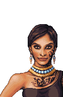
I kind of hate the necklace. Also, again, holyshitdithering: overkill?
I kind of hate the necklace. Also, again, holyshitdithering: overkill?
the dithering is getting a little heavy, yeah. but the palette is nice enough to make it a lesser issue. i don't hate the necklace but its palette is weak. i think it's the contrast, there's not enough of it, it stands out too hard/bright.
when you're getting toward completion you could up the "cool" factor of it significantly by adding in a couple of shades of blue or purple or something around the highlighted areas to add some "mood lighting".
and good lord thank you the eyes are no longer creepy :O~
when you're getting toward completion you could up the "cool" factor of it significantly by adding in a couple of shades of blue or purple or something around the highlighted areas to add some "mood lighting".
and good lord thank you the eyes are no longer creepy :O~
Perihelion
Sponsor
There's not enough contrast but it's too hard/bright? I'm confused. @_@ Elaborate? Also, the palette is mostly recycled from elsewhere in the piece, but I can tweak it. (edit: and by mostly I mean like half (yay I can count))
I'll try reducing some of the dithering. I don't really like it on the arm, but I can't have the chest dithered to hell and the arm not, and I felt the need to dither the chest, so... I dunno, I guess I can mess with it more later.
I'll try reducing some of the dithering. I don't really like it on the arm, but I can't have the chest dithered to hell and the arm not, and I felt the need to dither the chest, so... I dunno, I guess I can mess with it more later.
Perihelion
Sponsor
Ohhh, I get it now! Yeah, you're totally right. How's this?
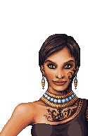
I reduced some of the dithering too.
I reduced some of the dithering too.
Perihelion
Sponsor
I have come to despise dithering, but this robe dress thing doesn't look detailed enough, and the texture is sort of jarring next to the uberdetailed skin that has like a bazillion colors in it (like the skin looks really rough now), so I feel like I should add more intermediate shades and possibly dither it or something. It looks unfinished. Fuck, I really wanted to avoid adding a ton of extra colors, but it looked weird dithered with the current palette, so I think I'm gonna have to.

id say its looking pretty fuckin amazing. and i am actually a fan of dithery (<---new word) work.
do you think that its odd that i kinda suck at making palettes, yet with paint, pastels, or prisma markers im very very good with color? maybe i try to take too many shortcuts. photoshop makes me lazy and i just lighten my colors rather than add the proper warmth as i lighten my colors. laziness is probably it. i just asked a question and then answered it didnt i? why did i go off on such a long tengent that has nothing to do with this thread?
keep up the good work i like where its going
silver wind
Member
what he said (minus the spammy part)
Try using more of the middle color on the hand, the shading extends too far into the middle of the hand. About the robe's edges, can't you make a solid outline?
Try using more of the middle color on the hand, the shading extends too far into the middle of the hand. About the robe's edges, can't you make a solid outline?
Perihelion
Sponsor
Er...hand? And there was a solid border before I aa'd it. It's a lot smoother this way. Still tweaking the aa.
Gulch, take time making your palettes. It's worth the effort. Shortcuts make for a poor final product.
Gulch, take time making your palettes. It's worth the effort. Shortcuts make for a poor final product.
silver wind
Member
Oh, I see what you mean with the border, it does look better.
and sorry, I meant the arm. ^^;
and sorry, I meant the arm. ^^;
TheInquisitor
Sponsor
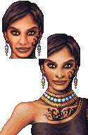
Following on from our IRC convo, I went on and recreated the nose )along with the chin, lips and up around the cheek that you'd already seen) and a bit more of her left cheek for you. What I've changed from your own latest version is:
* I've pretty much cut out the dithering in the area I've done.
* Simplified the shapes, reducing all of the unnecessary crammed details - for example it's impossible to pixel the texture of the lips onto such a small canvas!
* Given the skin more colour, it now looks more vibrant
* Given the shades more contrast, especially around the darker areas.
* Given her more natural cheek shapes. She looked more gaunt than Peter Cushing on your version.
* Smoothed the lines and anti-aliasing.
These were the areas where you were going wrong. Some of your linework was a bit messy. Choosing a good palette and having good linework are the two most important aspects of pixel art (and any art for that matter), they are the basic essentials. You must, above everything else, make sure that your curves are smooth and the anti-aliasing has a smooth blend between shades. There's one point, which I pointed out to you in the IRC, near the hair where it is criminally pillow shaded. You must avoid this at all costs!
The structure of the face around the cheeks and side of the lips was very inaccurate. There was far too much immediate, very dark shade there. The only way to really understand this is to study people's faces and use reference pictures.
Perihelion
Sponsor

I pretty much only changed the face. I'll mess with the palette later, but yours is a bit red for my tastes. Anyway, thanks for the edit and the thorough critique! It was very helpful.
Thank you for viewing
HBGames is a leading amateur video game development forum and Discord server open to all ability levels. Feel free to have a nosey around!
Discord
Join our growing and active Discord server to discuss all aspects of game making in a relaxed environment.
Join Us