Envision, Create, Share

Welcome to HBGames, a leading amateur game development forum and Discord server. All are welcome, and amongst our ranks you will find experts in their field from all aspects of video game design and development.

Egyptian chick (WIP)


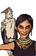
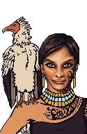
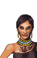
I'm probably gonna redraw the shoulders so they're actually the right proportion and the bird can sit on the shoulder instead of the arm. Critique gogogogogogo.
 
Nova: Yes.
hanan_turk_egyptian_actress.jpg


And for fixing the anatomy, I'm using these:
400_F_5265466_Tfe5LR8Aep9wbZGqMNq4QQ9nnr7sxkZH.jpg

42-16547494.jpg

Thanks for the tip, 006! I'll keep that in mind when I redraw the legs.
 
I say lose the bird, or have clothing on her shoulder cause that would kill. And is her hand resting on her hip? It just seems with the weight of the bird and the position of the arm.
 
The idea was that her hand is on her hip, yes. And I like the bird, although it really should be a lot bigger. She'll deal with it. >_>; Or I'll get rid of it if I'm bored of pixeling by then.
 
Yeah, I dunno, I think I'll either redraw it or get rid of it. Lots of people are complaining about it, and it looks pretty weird as it is now. And Spooky, no, it's my D&D character. xD I needed a picture for the sheet.
 
hi peri ilu ~~~<3 heartballoon~

the torso and head of the bird look fine, it's the rest that looks stiff.

the bird would fluff a little more and it wouldnt stand erect on such an unstable surface as a shoulder. and the talons are too small for a bird that large. ex: http://www.backyardchickens.com/images/ ... _hawk3.jpg

also some things about the chick's face looks off. her "muzzle" looks too sunken, and her lower lip is too thin. she looks old/infirm. let me show you what i mean.

perihelp.png

actually the wing at the far left would go down a lot lower/be longer than i'd depicted it there. obv it'd go down to the tail in length.

an extremely quick example of what i mean, how you can alter the shaping and shading a little.
 
:O!!!! Ventia, that edit is amazing! I was hoping you'd post; your input is always fantastic. <3 Thanks! I'll work on that. :D Yeah, the bird's pose is kinda weird because I just blindly copied it from a ref (I'm still hopeless without refs--I should really just DRAW more instead of relying on them so much :sad:). The chick is actually supposed to be middle-aged, except I sort of fudged that because I can't make people look middle-aged. I'll poke at it tomorrow, at any rate.

Just fyi, this is the reference I used for the bird:
WEB-Egyptian-Vulture.jpg

btw ilu2~~~~~ :cute: :3 <3
 
Looking better after the shoulder fix. Venetia, nice edit. I would only make the lips thinner. I'm not fond of the dithering on the face, usually in pictures they smoothen the woman's face in photoshop to make her look pretty, grainy face is considered to be not aesthetic. Not saying you shouldn't shade, maybe use only some of the palette colors on the face?
 
if youre going for middle aged then you were on the right track to deepen her nasal>cheek lines, but they're just a little too hard.
with men, you can pile on lines like nobody's business and it just adds detail.
with women, every faint tiny line or shade of darkness you add, you're piling on 10 years.

its the wonderful double-standard of perception D:

and the egyptian vulture you got there in the ref, see here's why it looks off. it's a different angle (the camera is peering up at the bird, when your depiction is head-on, to a little higher than the subject). and the bird is on a stable branch--not something fleshy, moving, and hard-to-grip like the shoulder. and the bird's talons are a little larger than theyre seen there because like i said you're seeing them at an odd angle (they're partially obscured and shortened due to POV).

anyway youre an amazing pixelator so dont worry i have nothing but faith :D
 

Tattoos are coming back once I'm done shading the chest. The bird is gone for now, but I might redraw it as per Ven's suggestions if I'm not bored of pixeling by then. If not, the arm will probably go away, so I'm not shading that for now.
 
shading on the face looks way better. the upper lip still looks too large in comparison to the lower lip--though i think that's the shading in the philtrum (groove under the nose).

something else i just noticed--do her eyes look a liiiittle like they're pointed in different directions? does anyone else see this?
 

Erm, how about now? I changed the shading on the eyes a little and tweaked the lips. Having trouble making the upper lip smaller than this. Also, are the colors on the chest about in the right place? Hmm, it might be easier to see if I started shading the shirt too.

Edit: I see what you mean about the eyes, and I can't decide if I'm imagining it or not... @_@

Edit 2:
 
oh yeah, sooo much better. and the chest is freakin excellent, i really have nothing to add on it.

god though now all i can look at are the eyes. i really can't put my finger on it but i swear one's lazy.
 
Uh, forgot to mess with the eye, and I'm going to bed now. I'll do it tomorrow.


Why do I always put a metric fuckton of dithering on everything when I know I'm just going to delete it when people tell me how ugly it is? Dammit, it's not my fault the colors blend better. D: It looked unfinished before! Whine!

Arm is obviously not done.
 

boon

Sponsor

silver wind":1jinb7wd said:
Big improvement! keep it up.
Don't say it's ugly :( 
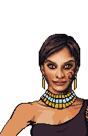
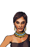
cause it's not. But is all the dithering really needed? it looks so hard to do.

with some programs it's as easy as filling in with a pencil tool.

Anyway yeah, looking nicer peri. I think the bird needs to come back -- it looks a little empty without it.
 

Thank you for viewing

HBGames is a leading amateur video game development forum and Discord server open to all ability levels. Feel free to have a nosey around!

Discord

Join our growing and active Discord server to discuss all aspects of game making in a relaxed environment. Join Us

Content

  • Our Games
  • Games in Development
  • Emoji by Twemoji.
    Top