Envision, Create, Share

Welcome to HBGames, a leading amateur game development forum and Discord server. All are welcome, and amongst our ranks you will find experts in their field from all aspects of video game design and development.

character sketchins

moxie

Sponsor

i'm an inconsistent floozie and the appearances of my characters are changing constantly because i'm never happy with them - i'm finally a little bit content, so what better course of action than posting them so they can be ripped apart for critique? i could use any and all critique ya'll could give me, involving both anatomy/technical stuff and character design in general.

they're blue and sketchy and (some of them)terribly colored because I'm trying to sketch out their outfits, plan their colors, etc before I start putting effort in the lineart and getting frustrated because it turns out I don't like it.

angelica1.jpg

Shay%20color%20base1.jpg

hairstyle settled, color scribbled in :cute: gonna refine it some more but I might not even do anything with the colors like this because I really dig the black outline/flat shading for some reason, maybe it's just me

chuck1.jpg

update; okay surprise i still can't draw dudes
 
The first one's head seems somewhat large compared to the torso area. But that is just me. Also, the perspective seems off in the first one as well. Especially the hip to chest. Again, this could just be me.

I like the second one a lot. To be honest, you should pick which portrait best suits your character's traits that you are trying to portray. The left one seems more shy while the right one seems more rebellious. Ive always admired your color scheme and the shapes of the people especially in the face. If you were to opt for the first one, i would choose a more mild color tone for the clothes.

im not a master artist or anything so im sorry if i am off base with some of this. x:
 

moxie

Sponsor

you're 100% correct bacon, thanks for pointing that out. when you stare at something for too long, it all starts to haze together and it's hard to pick out the faults. I tried to make her more proportionate, and make her hair less poofy. She still seems like she has a weirdly big head, but I think it's on the right track now.

thanks a bunch for the comments :blush:
 
i'm really digging the hairstyle on the right for the second picture but like bacon said, it really depends on what your character is like.

they're cool designs and i love the way you draw them but i'm worried that they might be a bit too generic? i mean, it's really difficult to get characters that look unique and most don't (including literally everything i draw) but they could use maybe something to get them to stand out more. the second girl looks cool to me but the dude in particular gives me that vibe. maybe i'm just really used to seeing people that look like that though.

your guy has some issues with weight and whatnot because he looks like he hasn't eaten in weeks but i am not an anatomy expert so i'll wait for venetia to elaborate.

i am really envious of your ability to draw clothes. everybody i draw ends up wearing a generic t-shirt, or a sweater if they're lucky!
 
IDK why, but the male one looks just a TAD bit feminine/has a feminine body. Maybe it's the way the pelvis is drawn, which sorta brings to mind how a female area such as that is drawn, or the slight curviness in his body, more noticeably at the hips.
Other than that it's a fairly good man drawing. Maybe you should check out more male models.

I'm not sure what's happening with the first girl's hand, but luckily there's no actual problem there, or at least i doesn't feel like it to me. I also feel her head/neck are may be slightly larger than normal. The clothing design up front should be extended down a bit, because right now it's sorta meaningless as anythign but design; she's already got a shirt on, why is that extra bit there if it's doing nothing but breast armor?

The second girl design reminds one of chloe sullivan from that smallville series. That's not necessarily bad; cute, attractive design with spunk. I see few other problems here that can't be blamed on your personal preference and style of design (basically no prob). Although note here the way your style influences your art of men- the curviness, the type of pelvic area drawn, etc. Maybe the design is a bit LESS standing-outish than the others. I mean, take away all the cool clothes and just give her bland shit and you'd have a slightly generic character.

Although honestly I don't have a problem with genericism in your art; in such terms as if it's generic or not, I can honestly feel pretty nice seeing art like this in a webcomic cause we'd be able to tell apart who they are.
 

moxie

Sponsor

eek, thanks for the heads up. I can't stand it when people design a series of characters with radically different clothes/hairstyles that still manage to be perfectly interchangable, so I'll put more effort into making them look less generic. What would you suggest? Should I exaggerate their facial features more, maybe? It probably doesn't help that right now they've all got their soulless/solemn "blank look" goin' on (for the status screen), keep in mind they'll all have a bunch of different expressions later.

I'm also just gonna post my updates 'cause that's easier than editing the op and I'm all about the effort

Shay%20dress%20&%20normal.png

I don't like the way the arms turned out in her dress portrait, but it's a start.

and yeah that dude is pretty weird and stretchy lookin, i'm gonna look through some anatomy books and try again in a couple of days. i'm so much more comfortable drawin' chicks
 
there's nothin' bad bout drawing lots of cute chicks.
umm besides the lack of artistic growth.

I also sorta like how the above hands look. Unless you look at it a bit hard/long, which yeah, gets kinda weird.

And the arm feels something different to me. It wasn't obvious in the original sleeved drawing, but something about the cute new prom look that makes it look like either the elbow should be moved up or something to make it look slightly less jello-y.

either way cool job. Sketchy looking designs are awesome.
 

moxie

Sponsor

chuck1.png


i said i would wait but i lied. i think he's looking a little better now - he doesn't have womanly hips anymore, atleast? that little baby-tie looks pretty lame now that i look at it though, i'll probably lengthen it

e; also pockets are too far down

e2; damnit the more i look the more fucked it is :|:
 
really? shit it good. the tie's stupid, cause it's just sorta there and makes no sense, but everything else is okay. This is one thing that I'm pretty sure the more you look at it, the more effed up it is.

Well, all I can notice are if the shoulder's too curve or if the elbow is located too far down.
 
Daxis":168vcrem said:
really? shit it good. the tie's stupid, cause it's just sorta there and makes no sense, but everything else is okay. This is one thing that I'm pretty sure the more you look at it, the more effed up it is.
i see people wearing ties all the time just for the hell of it. i guess it's fashionable now or something? but yeah, lengthen it.

the second girl's clothes look way cooler with colour now. don't worry about genericness, the colour makes them stand out a lot more.
 
:O!

aaaaaaaagh wh
wh ... what artist does this remind me of. ......... ... . .. aaa killing me
this looks spot-on for this one really popular nouveau artist from a few years back ...
i dont have access to ffffound here @ work but i will try to look it up when i have time.
so familiarrrrrrrr tip of my tongueeeee
when i was in highschool in oceanside, he had put up all these murals at the city hall
i did 2 murals for the city hall right after for this community deal and it was like going on after leno tbh
(our city hall back in the day was very cool, they had a very open door policy, and always were getting artists to display their artwork in the courtyard)

anyway very nice, very slick. your strokes and line management is improving vastly.
you are manipulating the illusion of torso elongation--i don't know if it was intentional, but it identifies a lot about the characters. this is actually a style in case you were unaware, and it does not need to be fixed unless you were intending for the subjects to look as natural as possible.
in fashion art, it is a common practice to make a model appear to have a longer distance than natural between the breast and the hip. it makes the subject look more slender, more high-class. it makes them appear taller, and gives off an air of "coolness", or "aloofness". you often see them with upturned chins--which creates the illusion of a longer, more slender neck as well--if you wanted to push it even further.
if your intention was to make them appear that way then you nailed it. if your intention, however, was to make them with a different personality, then you're going to have to demonstrate a pose that reflects that.

the chest-thrust-forward look, with the knees locked, is a dominant pose. it conveys pride, arrogance, strength, or regality.

the chest-sunken, hips-forward look, usu with locked-knees, demonstrates apathy, aloofness, indulgence, or a blasé attitude.

slight forward bends convey shyness, insecurity, "sweetness".

slanted to a side at the torso conveys incredulousness, defiance

your girls look a bit generic because of their stances--very rigid. this conveys very little emotion. it's kind of--neutral.

the list goes on and on. take advantage of poses, gaits, and stances.


on the negative side, you are, as i did, suffering from gender bias in your drawing!

ok check these out side-by side if you will:
http://upload.wikimedia.org/wikipedia/c ... natomy.png
(too large to post).

look at the pelvises. in the female, it's all round, kind of butterfly-shaped. in the male, it's very angular, almost spiky. you will likely feel your own hip bone well below your navel, and a good distance from it off to the side. a man would feel it higher up, slightly more exaggerated, and closer inward to the navel.

on a woman, the bottom portion of an hourglass-curve will be seen as an arc leading to the largest part of the buttocks, just above the thighs. on a man (esp a thin/wiry one) the arc will be far shorter & shallower, higher-up. instead of belling out, it will make an "A" shape as the line flows from the smallest portion of the midsection down to the knee.

there is so much more but i've run out of time! more later <3
 

moxie

Sponsor

thanks vennie :cute:

the posing the really wasn't my intention... well, except that first chick maybe. she's kindof a bitch so I tried to make her look aloof and condescending by giving her really proper posture, chin slightly up, and looking away a little bit. except i don't know what happened with the hand and her head is still elongated, so it looks really huge and yeah. the second girl is supposed to just have a fairly typical chillin' kind of stance, but looking easygoing and friendly at the same time and with the guy i figured making him all slouchy and having his hands in the pockets would make him look closed-off. these are the default portraits too, i'm planning to do way more with different body language for different expressions, like when the dude's smilin' he might stand up a little straighter, the bitchy chick's portrait will turn and face you, etc. (i don't mean animated, jesus, just, like, drawing them in different positions and stuff)

i'll be sure to read up more on posing and body language and the like, because I was hoping for the portraits to be more expressive to help give the dialogue some individual touches, to make up for no voices or prose. anyways i'm rambling so thanks a bunch for all the help so far everyone, should have an update soonish! i really appreciate all the crits so far, you guys have helped me tons.
 
Really? that first chick looks like a nice person to me. The eyes are sorta soft, and I think there's a slight curve in the mouth/lips thing, and the hair seems to not say bitchy.
that's the impression I got anyhoo
 

moxie

Sponsor

chuck2.png

aight, fixed the tie/pockets and tried to make the shoulder and arms a lil broader

what do you think would be a good way to give her more attitude? maybe not bitchy persay, but she generally comes off as being very assertive and intimidating. think a combination of standard high school mean girl(tm) and Paris from Gilmore Girls (although i might be the only one that adores that show here :blush: )

e; aw shucks here's a quick redux of the first girl

angel1.png
 
I think one way to give her attitude is to redo her arms and hands, their position is somewhat neutral at the moment. A hand to hip thing or even a cross arm with a sway in the body can bring this out. Also, in the face, maybe a little bit more pucker in the lips a a tad lower eyebrows might benefit it. Then again, im not a pro artist or anything.

flowergirl-with-attitude.jpg


size8_sindo_314002t.jpg
 
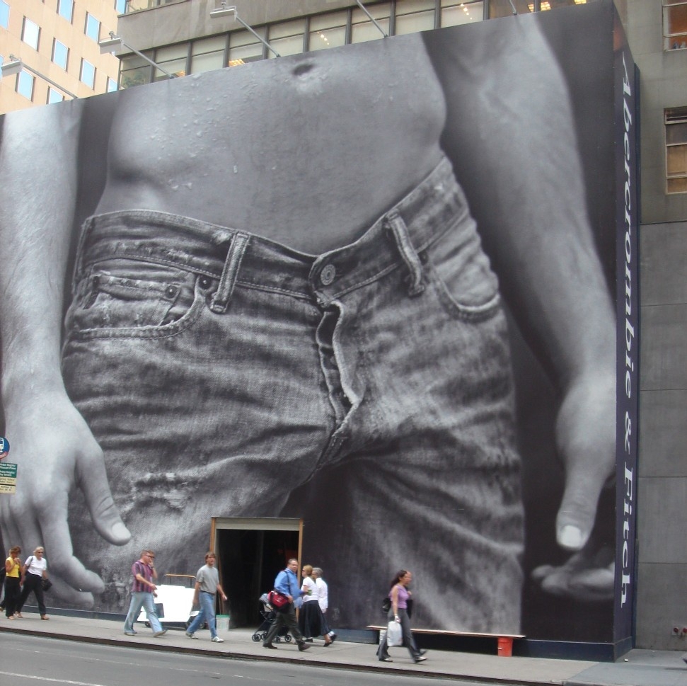
your crotch area is just screaming WOMAN to me
there's no way a dude's pants will be that tight without showing a trace of his dong
you might want to use some reference for that
abercrombie_crotch.jpg
 

moxie

Sponsor

hahaha damn, i even meant for the wrinkles and stuff to show the pants as LOOSE, not tight. clearly i done fucked up

one last sketch before i give it a rest for a while, i've discovered that i love drawin monsters

bravado.gif

it'll sever the gimpy part itself if you take too long to kill it, and beat your ass


e;
angel2.png

angel don't take none of your shit
 
every time i see "e;" i think you're trying to talk to etheon (e) lol


anyway i just noticed your guy's face--it's off in several key ways that i need to illustrate and can't do here but i will try to remember later to show what i mean.

the latest girlie i like the most, she has the most interesting/expressive pose and the best, most distinctive eyes.
few probs:
- hands are too small (cover your face w/ your hand. it should normally run the length of your face, from chin to hairline, compared with base of palm to tip of middle finger).

- while i think the pose of her right hand is possible it looks terribly awkward; might need to relax it some.

- likewise her left hand is too stiffly straight; will need to relax the fingers there, too, as if they naturally bent along the curve of her body--or else it needs to angle a bit differently

- the fold in the sleeve of her left arm doesnt make much sense at the armpit.
this is the closest similar pose i could find at a glance to show what i mean
http://www.istockphoto.com/file_thumbvi ... enting.jpg
folds around the armpits are always hard for me to do b/c they're very difficult to predict.

all i got for now, keep up the good work :kiss:
 

Thank you for viewing

HBGames is a leading amateur video game development forum and Discord server open to all ability levels. Feel free to have a nosey around!

Discord

Join our growing and active Discord server to discuss all aspects of game making in a relaxed environment. Join Us

Content

  • Our Games
  • Games in Development
  • Emoji by Twemoji.
    Top