
You are using an out of date browser. It may not display this or other websites correctly.
You should upgrade or use an alternative browser.
You should upgrade or use an alternative browser.
Character Art/Sprite Work C&C Please!!!
- Thread starter kidd6686
- Start date
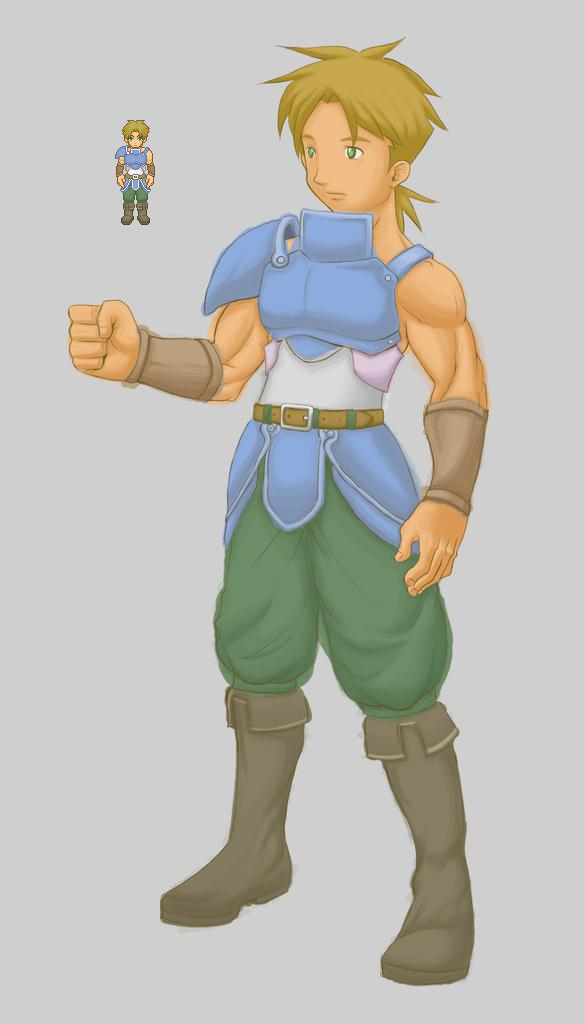
Hey, nice work! On both the sprite, and the drawing.
I only have 2 complaints:
a.) His chest plate (on the sprite) is E-N-O-R-M-O-U-S. Each pec is like, the size of his face. Maye want to shrink that.
b.) The colors on the drawing are good, but sprites generally need more contrast in the palette than that so they don't look washed out.
I only have 2 complaints:
a.) His chest plate (on the sprite) is E-N-O-R-M-O-U-S. Each pec is like, the size of his face. Maye want to shrink that.
b.) The colors on the drawing are good, but sprites generally need more contrast in the palette than that so they don't look washed out.
obsidian desire
Member
He looks a little uncomfortable and as though his head is retracting from the neck part of the chestplate. and It seems a little out of proportion (on the sketch)
There's not much more I can add to this C&C but it seems to be pretty good")
If you take our advice on board and alter it slightly you could produce some quality material!
There's not much more I can add to this C&C but it seems to be pretty good
If you take our advice on board and alter it slightly you could produce some quality material!
nohmaan":331o9fzj said:I like them both, everyone seems to criticize the shading on everyone's sprites but- if the rest of your sprites are going to match that same style of low contrast I don't see what the problem is. Unless people like everyone's games to look the same.
I never said he should adopt someone else's palette, I'm saying his current palette is hurting the character because it's washing out the features with its incredibly low contrast. I don't have the best eyesight and I have a hard time making out the features as it is, which means to me it needs more contrast.
bashful crobat
Sponsor
Those are some damn nice arms, kid.
Hey those are really cool. I really like that template you're going with... Is that the Jonny template? Right now like Ven said the pallet should be tweaked a bit. Up the contrast. I think you used the same colors for the character and the template but on a sprite that's so small it's harder to see the shading so you gotta up that contrast just a tad so it's not too away from your art especially if you are going to use it in game.
Venetia":3g4d40r2 said:"sprites generally need more contrast in the palette than that so they don't look washed out."
Trying to use a new palette as we speak. Will post with updated version.
Raven The Dark Angel":3g4d40r2 said:"I really like that template you're going with... Is that the Jonny template?"
Yes I edit it a bit - here is what i did. . .
http://i75.photobucket.com/albums/i297/ ... 6/tana.png[/img]
Holly":3g4d40r2 said:"Those are some damn nice arms, kid."
I will relay that to my artist
The sprite was my creation. (not the template all credit to tana)obsidian desire":3g4d40r2 said:"He looks a little uncomfortable and as though his head is retracting from the neck part of the chestplate. and It seems a little out of proportion (on the sketch)
There's not much more I can add to this C&C but it seems to be pretty good
If you take our advice on board and alter it slightly you could produce some quality material!"
I certainly will
and thanks!JakeyZombie
Member
I agree with Venetia on the sprite, the breastplate looks a bit awkward when compared to the size of his face. The drawing though ... I really like your style. It actually kind of reminds me of the artistic direction that was encompassed in 'Breath of Fire IV', which I really loved. You should probably take the route that many other artists have taken, and whore yourself out.
Trying to use the C&C to better the sprite but the palette seems still a bit dull. . .
http://i75.photobucket.com/albums/i297/ ... /new-8.png[/img]
NEW - OLD
http://i75.photobucket.com/albums/i297/ ... /new-8.png[/img]
NEW - OLD
ZephyrSkye
Member
I like the new one. I do have two little bits of advice. 1. There is coloring outside of the lines on the character art that I think would be better if they were gone. 2. Add some brighter highlights to the armor and hair and the palette wouldn't look as "dull."
I think you've got something with this guy and the new template. Besides, what did ankles ever do for anybody... apart from... moving our... feet... helping us stand and walk...
I think you've got something with this guy and the new template. Besides, what did ankles ever do for anybody... apart from... moving our... feet... helping us stand and walk...
ZephyrSkye":3lyr2voc said:Besides, what did ankles ever do for anybody... apart from... moving our... feet... helping us stand and walk...
hah...hah........ha....h.... wtf? man really?
ok I think i got it looking better, I'm still having trouble however with the bracers. . .
http://img517.imageshack.us/img517/2963 ... sedjg8.png[/img]
1- OLD 2- REVISED 3- SOMEWHAT FINAL (BRACERS)
http://img517.imageshack.us/img517/2963 ... sedjg8.png[/img]
1- OLD 2- REVISED 3- SOMEWHAT FINAL (BRACERS)
Thank you for viewing
HBGames is a leading amateur video game development forum and Discord server open to all ability levels. Feel free to have a nosey around!
Discord
Join our growing and active Discord server to discuss all aspects of game making in a relaxed environment.
Join Us