
You are using an out of date browser. It may not display this or other websites correctly.
You should upgrade or use an alternative browser.
You should upgrade or use an alternative browser.
C&C on my crappy title screen?
- Thread starter Nickster
- Start date
the only thing i like, is the New Game, Continue, Shut Down, not so much the way its laid out, or the font, but the fact its not a standard crappy box.
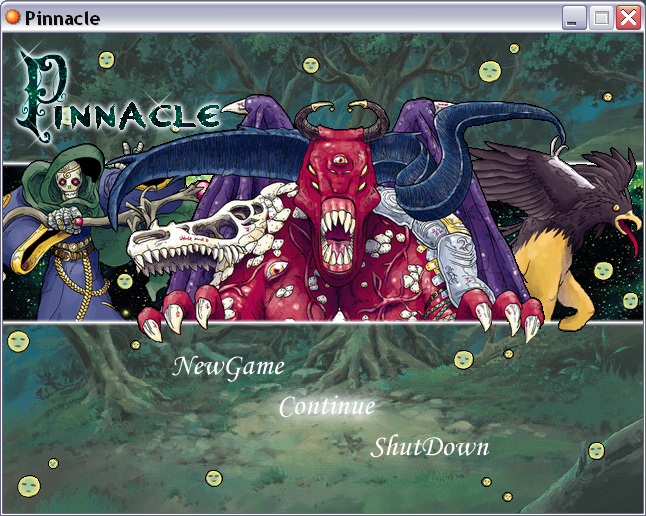
the title is too small, its drowned out by the cheesy battlers.
on to the battlers, it makes me think its some kind of pokemon/monster fan game, using bad art (boo enterbrain artists for rmxp, the VX ones are actually pretty nice) and whats with the little faces all over?
the title is too small, its drowned out by the cheesy battlers.
on to the battlers, it makes me think its some kind of pokemon/monster fan game, using bad art (boo enterbrain artists for rmxp, the VX ones are actually pretty nice) and whats with the little faces all over?
I have no quarrels. The line accross is a little confusing. It would make more sense if the backgrounds changed and that was separating them.
I think your title is a little attention seeking. I'm fairly sure you know fair well that it isn't crappy. Don't do that, it's really annoying.
I think your title is a little attention seeking. I'm fairly sure you know fair well that it isn't crappy. Don't do that, it's really annoying.
ZephyrSkye
Member
What is the game about?
Brewmeister
Sponsor
I like it. I would bold the game commands, and lose the smileys.
@ Calibre: honestly, when most people actually do try to use original art, it turns out looking bad aynways. if you feel like it, think of this as a concept or a work in progress. im honestly not happy with most of it either. but it would be nice to at least NOT get a "uncreative piece of crap" from people. im not saying you did that, but when people do that, it comes off as rude, and tacky. i can take serious constructive cristism, in fact i asked for it, i want to the best that im possibly capable of. but to other people im sure it would be thoroughly and completely discouraging. isnt the point to help people turn into the best they can be, not drive them away?
whheewww... after speaking my mind, i guess im ready for the flames. :\
whheewww... after speaking my mind, i guess im ready for the flames. :\
Flames!!!
Burn you Whore!!! ^_^
-------
Good Idea for a title, although I would lose the smileys and possibly try and make all the pictures have a kinds... same lighting effect to it (some of them look dark, some of them look light... they all kinda contrast to each other, and if you made them all the same kinda contrast, brightness and meddle with the colors, it would look awesome.
~Kraft
I agree with Kraft it looks great so far don't listen to the others. Lose the smiley faces they annoy me xD
As for the rest try and make their contrast look the same and maybe add a shadow somewhere and you might actually get an awesome title screen. I love the way you put the title "Pinnacle" it looks awesome.
As for the rest try and make their contrast look the same and maybe add a shadow somewhere and you might actually get an awesome title screen. I love the way you put the title "Pinnacle" it looks awesome.
I cleaned up the hijacking/needless argument in this thread, it went to the black hole of dev/null never to be seen again. I'm sorry if this seems heavy handed. RA is for Analyzing Resources, please provide critiques of the OP's original artwork, not of eachother's attitudes, biases, or criticisms except in honest discussion of the artwork itself. If you want to argue do it elsewhere.
Thanks, N.
That said, I think you did a great job arranging the RTP battlers around a title menu. I'm not sold on your game title text, personally. It looks aliased (i.e. jaggy) and doesn't mesh well with the soft, blended look of the RTP battlers and background screen. The background has somehow become a little muddy as well. Oh, personally I like the little smileys, they strike me as little animistic nature spirits, reminiscent of Princess Mononoke for example.
Thank you for viewing
HBGames is a leading amateur video game development forum and Discord server open to all ability levels. Feel free to have a nosey around!
Discord
Join our growing and active Discord server to discuss all aspects of game making in a relaxed environment.
Join Us