Kain Nobel
Member
Good day everybody!
After a good 2.5 years of neglecting the little bit of artistic talent I do have, I recently started spriting stuff again! Below was more of an excersize than actually making something, I didn't expect myself to get this far in one sitting. I figured maybe this could improve and work later on, but I would like some C&C on it! I'll probably post updates to this set if I continue with it.


What I really need advice on is shading the bricks. I've tried shading the bottom right corner and lightening the upper-left corner but it didn't turn out too well, and neither did 'dithering'. I also know the shadow casted in the second example needs correction, but I think that'll be an easier fix, I'm just not sure about shading.
Also, the windows are too blue but for the life of me I can't quite adjust the color to look good. I've tried grayscaling the actual glass part of the windows and messing with the RGB scales, but for the life of me they either look horrible and the blue sticks out way too much. What can I do to fix it? Can it be a simple color adjust or do I just need to start over with them?
If anybody else has any other advice, please drop a line! I might be inspired to work on this some more.
After a good 2.5 years of neglecting the little bit of artistic talent I do have, I recently started spriting stuff again! Below was more of an excersize than actually making something, I didn't expect myself to get this far in one sitting. I figured maybe this could improve and work later on, but I would like some C&C on it! I'll probably post updates to this set if I continue with it.
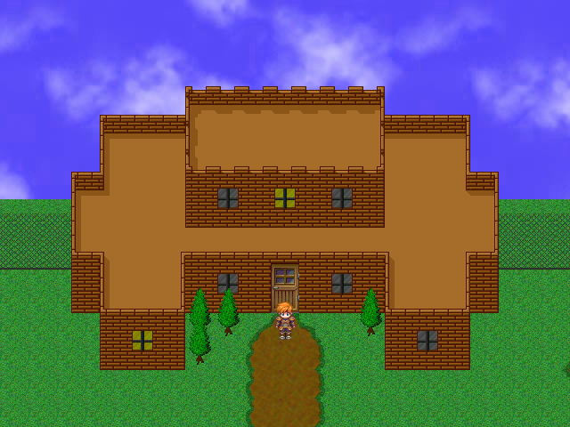
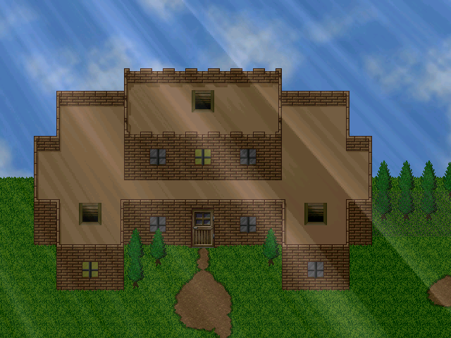
This first one just showcases the normal style, with a little bit of the jagged edge ones being used on the top. There isn't much bad about the shadows with this one, but they'll be adjusted accordingly later.

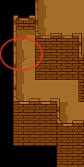
This second one showcases the jagged brick layout (castle-style, if you may). It actually took alot of small fine tuning being at my novice level, as far as the bricks layered. On the other hand, the shadows really need to be tweaked with because as you can see, the side panels display a little bit of the shadow for the next tile up.

This second one showcases the jagged brick layout (castle-style, if you may). It actually took alot of small fine tuning being at my novice level, as far as the bricks layered. On the other hand, the shadows really need to be tweaked with because as you can see, the side panels display a little bit of the shadow for the next tile up.
What I really need advice on is shading the bricks. I've tried shading the bottom right corner and lightening the upper-left corner but it didn't turn out too well, and neither did 'dithering'. I also know the shadow casted in the second example needs correction, but I think that'll be an easier fix, I'm just not sure about shading.
Also, the windows are too blue but for the life of me I can't quite adjust the color to look good. I've tried grayscaling the actual glass part of the windows and messing with the RGB scales, but for the life of me they either look horrible and the blue sticks out way too much. What can I do to fix it? Can it be a simple color adjust or do I just need to start over with them?
If anybody else has any other advice, please drop a line! I might be inspired to work on this some more.