Well to start off , the first problem is in your palette. Off the bat I can see that the darker values are way too dark in comparison to the lighter ones. In fact, your darkest color is dangerously close to being black. You may want to lighten them up Just a bit, in order to see the detail.
Here are a few other tips.
This is your palette:http://img292.imageshack.us/img292/9027/origpallettema8.png[/img]
These two colors are far too similar:
http://img244.imageshack.us/img244/8299 ... twoqv1.png[/img]
Either omit one, or change the other.
These four seem to skip into an extreme of dark unnecessarily:http://img99.imageshack.us/img99/1129/fourextremett5.png[/img]
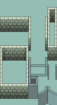
The palette itself could use a little work. However I'm not certain what you're going for. If this structure is supposed to be made of ice, then the cold, monotonous palette could work. Let me know what you're aiming for and I'll comment further on this.
Oddly enough however, the biggest flaw is not in your color palette, but your use of it. While it has some contrast issues, The palette, for the most part, gets lighter in the reasonable increments necessary to provide adequate contrast. Unfortunately, you haven't included the actual shape of the structure in your shading technique.
If the light is coming from the top, there should be a definite transition between the lighting of the top of the structure and the "wall - level" Portion.
In other words , your color distribution looks some thing like this :
http://img137.imageshack.us/img137/4296 ... ongko4.png[/img]
When it should look more like this :
http://img142.imageshack.us/img142/8402 ... ghtkl9.png[/img]
*NOTE* this is NOT shading, just a diagram of how the light should hit the structure.
A good rule of thumb I use (And implemented in my example) Is cutting up the palette into a section of lighter shades and darker shades. For example : this is your palette:http://img292.imageshack.us/img292/9027/origpallettema8.png[/img]
In the correction I showed you I used the
first seven colors (darker set)
ONLY for the "Wall level" portion:http://img98.imageshack.us/img98/1707/firstsevensd5.png[/img]
For the top (The area where the light is hitting, I used colors 5 through 11:http://img221.imageshack.us/img221/7776/lastsevenam2.png[/img]
When put together, they make up your 11 color palette you used.
http://img516.imageshack.us/img516/2458/togetherrf8.png[/img]
*NOTE* I did not comment on the shading of the outlines because you're smart, and seem to have a good grasp of it already
So basically you have four for light , four for shadow, and three transition colors.
Lastly, unless you're going for a smooth, sandy grain to your bricks, I really suggest easing up on the dithering. Over dithering can yield the same results as using too many colors. It blurs the details and contrast of the sprite dramatically if used too heavily.
Hope that helps! ^_^


 ...
...