Envision, Create, Share

Welcome to HBGames, a leading amateur game development forum and Discord server. All are welcome, and amongst our ranks you will find experts in their field from all aspects of video game design and development.

Beginning of a simple comic strip

Cait

Member

Okay, I am not good at art, but I am hoping to get a little bit better as time goes on. I've created two comics which I know there are much better things and I know people will likely rip it apart. Just let me know what I might do to create a style of comics. It's about two bunnies named Happy and Angry. I will let the characters speak for themselves.

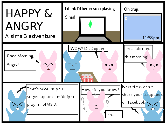
Comic #1 is a Sims related comic
Happy_Angry_Comic.png


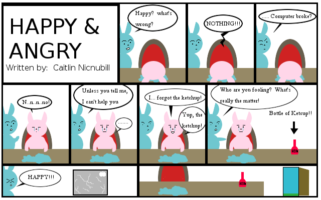
Comic #2 is a spur of the moment kind of joke which wrote itself
Happy_andangry2.png


I hope to continue to do those and get better as time goes on. (o.o) Anyway, I'm not good with risk so I'm taking a huge leap. ((o.o)) I know rejection is apart of life, but I hope even if the artwork could be a lot better, that the joke is interesting. (_ _)
 
Well er


Cool beans


Anyways, I really don't get the jokes myself. The joke in the first one, as far as i can see, is that he/she/it shared the fact that he was playing the sims till late night and dumbly posted that fact online.

Second one.... Er, in actuality, the comp broke, but he/she/it didn;t want to reveal that/was sad couldn't play sims anymore, and then, in the last 2 panels, ragedquitted outta the house?

Didn't really get the jokes that much/find them funny. Anyways


some advice

Center the text in the bubbles, and try your best to make them seem awkward or out of place. When i see text with the left margin all line up and the right margin ending at different spots, it reeks of amateur or a lack of care about presentation. (I see a lot of it in scanlated manga, although those usual accompany horrid scans, so w/e)
I'm not sure if times new roman is the coolest font to be use dhere. Somethign sans or more informal would prolly work.
A general increase in presentation? It is a comic, which means art is just as important, even the type of art shown here. The sims logo icon thing int he second panel, for example, doesn't really seem equal, and unless you play sims, you're not gonna recognize that too well (well that;s just me :P). The comp screen in the followign panel as well. The different in the title panels for both comics, for example, vary a bit in the captions, creating less consistency.
The copy paste feel could be done a bit better somehow, but i'm not too sure, and it might fit this type of feel. This part i'm sorta meh about
 
you need to expand your gutters bro. your panels are all clumped up on top of each other.

and that same thing could be said for much of this. try making your panels themselves larger. everything seems all clunched up together. you need a lot of whitespace especially aound your text.

try thinking about where the text is going to be when you're working on the layouts of the panels. think about balance and fit. it seems like you're drawing the art and only adding in the text as an afterthought.

also if you have to label the pieces of the art then you're doing something wrong. :wink:
 

Cait

Member

Thank you very much for the advice! I'll take everything you said and really try to improve the next one I do. The computer is his "IPAD" that's broke and she likely dropped it. (o.o) Which if you know apple, isn't covered by their warranty.... She was upset about it, and didn't really want to tell Angry as per his reaction, you can see why. (Me, I wouldn't have been there when he found it). The first joke was thought of before and the second was a spur of the moment had no already thought of joke. I wrote it as I drew the comic, which I usually have the joke, wishing I could draw better. But now, I am making a better attempt at drawing, because some of my jokes are kind of funny. Of course, not everyone gets that and some people might understand, while not finding it funny. Thank you for your suggestions!

It's more situational humor, two rabbits named Happy and Angry. Happy is laid back, simple to please, but has a slight temper, but normally she's really calm, and then, you have her boyfriend, Angry, whose has been described as the forever angry one, slightly naive and gets himself into trouble by trying to protect Happy from trouble (You'd think he'd put more time into keeping himself out of trouble).

I'll make it bigger and plan out my jokes on paper before creating them. Here's to hoping that next weeks has improved a great deal. This is going to be a lot of work long time.
 
A lot of your expressions are pretty generic, anime-style stuff. They're easy to draw but once you see the same expressions plastered onto half the characters on the internet, it gets very boring.

Tracy Butler made an awesome tutorial on expressions that should help out. I know your characters are simplistic and don't have a lot of detail on their faces, but the same principles apply.

Above all, though, continue having fun with your comic! That's the most important thing to remember. :)
 

Thank you for viewing

HBGames is a leading amateur video game development forum and Discord server open to all ability levels. Feel free to have a nosey around!

Discord

Join our growing and active Discord server to discuss all aspects of game making in a relaxed environment. Join Us

Content

  • Our Games
  • Games in Development
  • Emoji by Twemoji.
    Top