
You are using an out of date browser. It may not display this or other websites correctly.
You should upgrade or use an alternative browser.
You should upgrade or use an alternative browser.
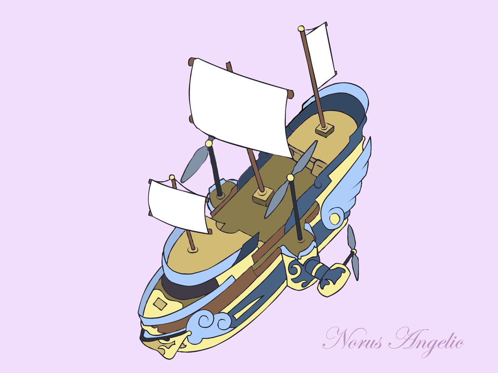
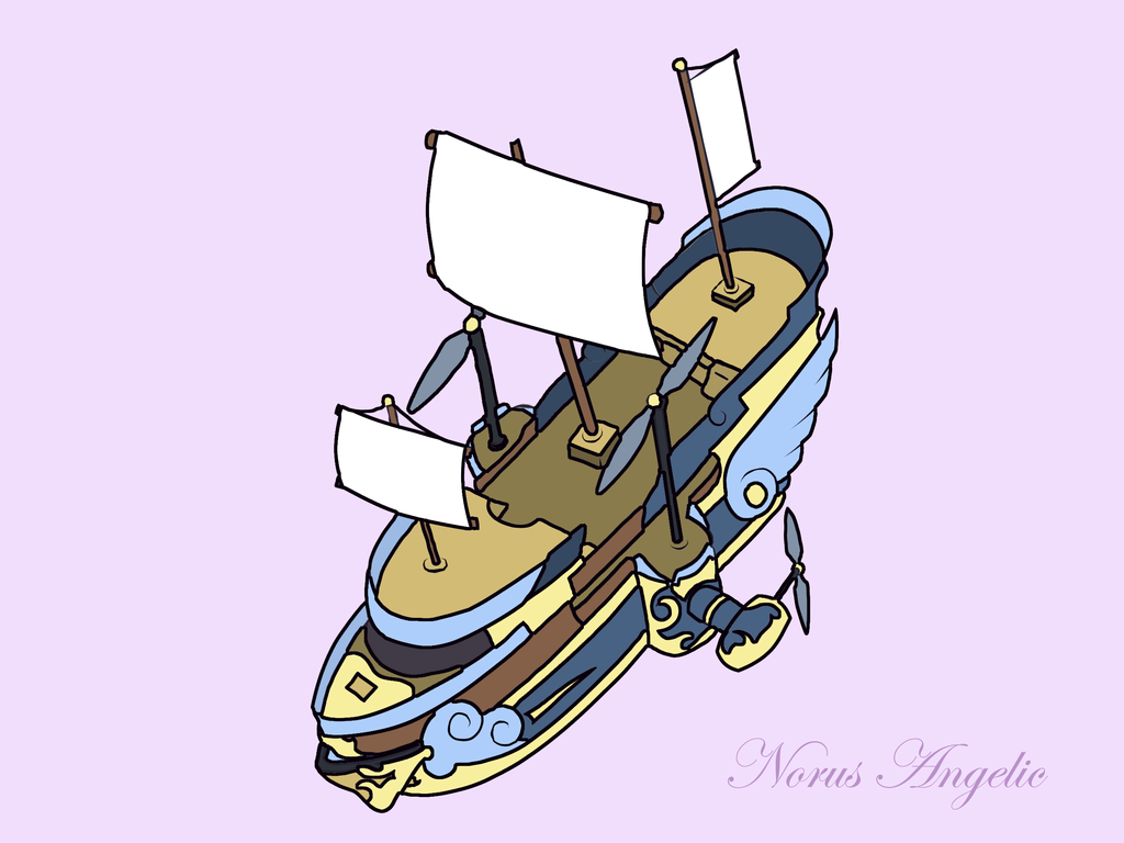
Art Dump - C&C please!
- Thread starter kidd6686
- Start date
Mascarpone
Member
How old are you?(That'll determine how i talk about this stuff)
Mascarpone
Member
Wow thank you for actually saying so.
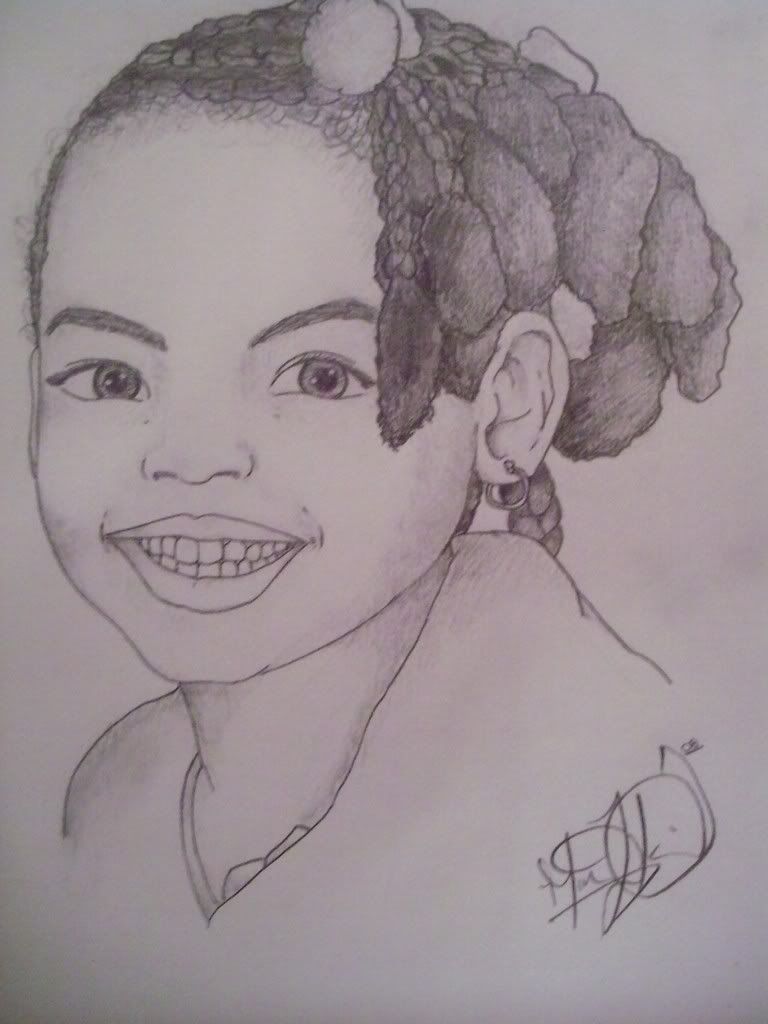
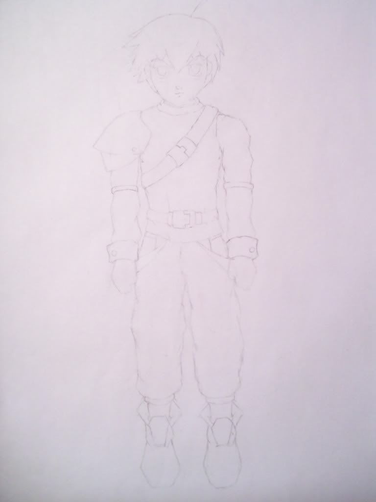
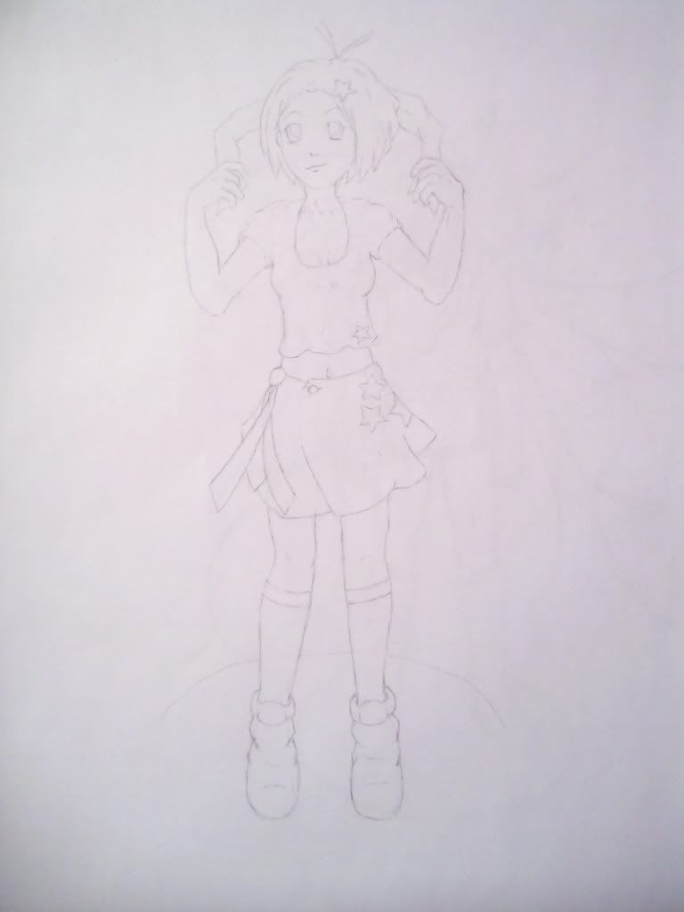
Lets start with the realism. Lines are too hard in soem places but particularly around the lips, and they feel like they're sorta .. Mr Potato-headed onto her face. Also when u do mouths, don't pay so much attention to the details in the shape of the teeth. No one likes to know just how crooked their incisors may be, and if u can imply teeth without drawing each idevidual outline you'll both flatter the subject more, and save yourself some unnesecary work. Eyes are shaped well but i think the larges problem with the face as a whole is that you over-render some areas and the areas u leave to line art look too harsh.
Th biggest issue here is that the hair is all kinds of o_O around the forhead. That is another areas where details are best kept sparse, and in general u should never render hair as a bunch of pencil lines.
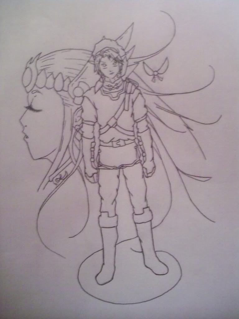
Not a bad base but needs some more polishing. Also i may want to play with line weight some more.
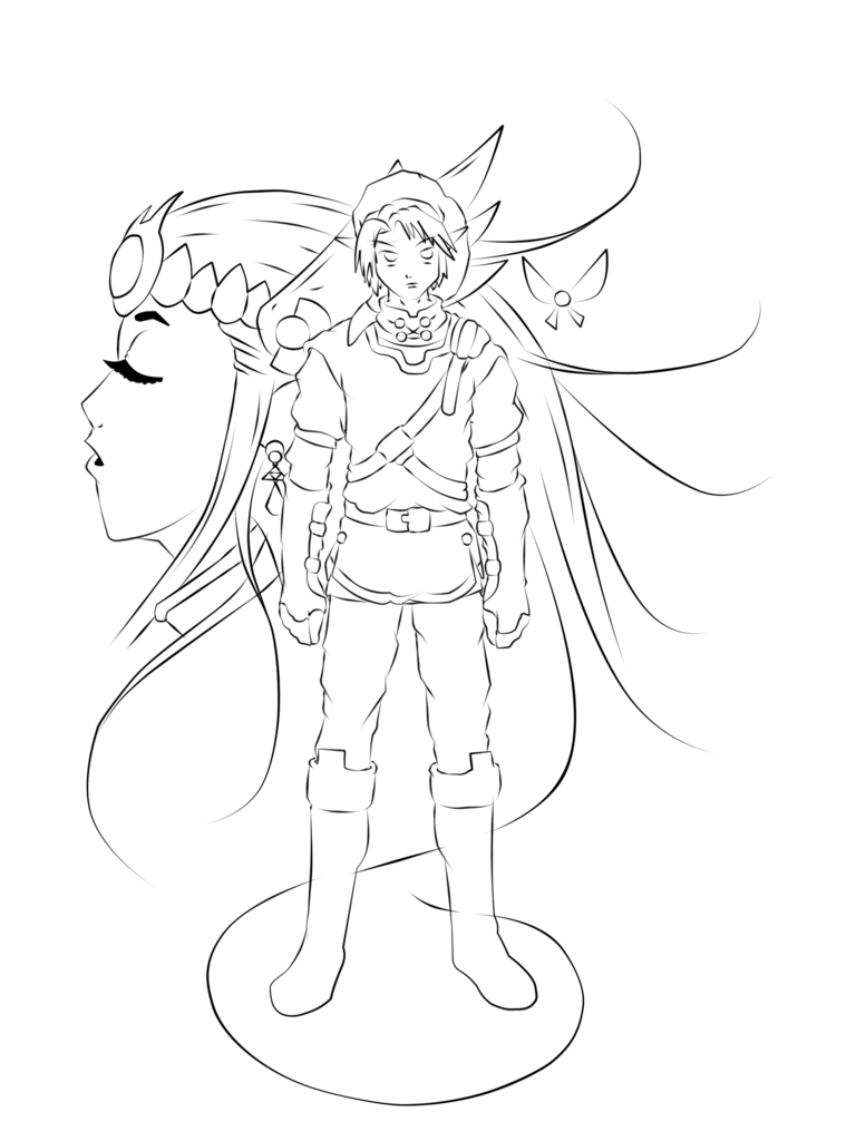
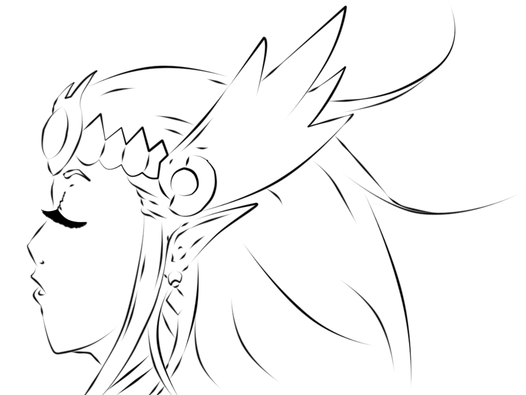
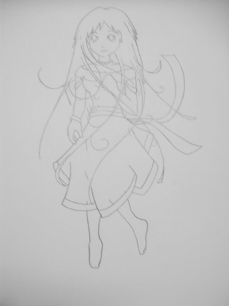
And then we come to the zelda stuff... This bothers me because i have a funny feeling you may have used Illustrator for the line art. I'll leave my thoughts on this allone until u answer this question: Did u use illustrator or a vector art program to do the digital line art?
Lets start with the realism. Lines are too hard in soem places but particularly around the lips, and they feel like they're sorta .. Mr Potato-headed onto her face. Also when u do mouths, don't pay so much attention to the details in the shape of the teeth. No one likes to know just how crooked their incisors may be, and if u can imply teeth without drawing each idevidual outline you'll both flatter the subject more, and save yourself some unnesecary work. Eyes are shaped well but i think the larges problem with the face as a whole is that you over-render some areas and the areas u leave to line art look too harsh.
Th biggest issue here is that the hair is all kinds of o_O around the forhead. That is another areas where details are best kept sparse, and in general u should never render hair as a bunch of pencil lines.
Not a bad base but needs some more polishing. Also i may want to play with line weight some more.
And then we come to the zelda stuff... This bothers me because i have a funny feeling you may have used Illustrator for the line art. I'll leave my thoughts on this allone until u answer this question: Did u use illustrator or a vector art program to do the digital line art?
I see what you mean with the lines being too hard with the lips and also the teeth, sometimes I try to hard to get the details i get the unwanted ones as well lol, The hair is braided to the head so it leaves hair parting from where its pulled. Again, another detail that could have been left out to clear up the image. The hair was detailed by shading to kinda balance the picture. It is not intended for line art.
The Zelda and Link images was done with Photoshop CS4 it was my first attempts with any program to create line art.") so hopefully that helps you.
so hopefully that helps you.
The Zelda and Link images was done with Photoshop CS4 it was my first attempts with any program to create line art.
so hopefully that helps you.Mascarpone
Member
Did u use a pen tool or the brush. those strokes are all very ... they seem like vector shapes but idk
Mascarpone
Member
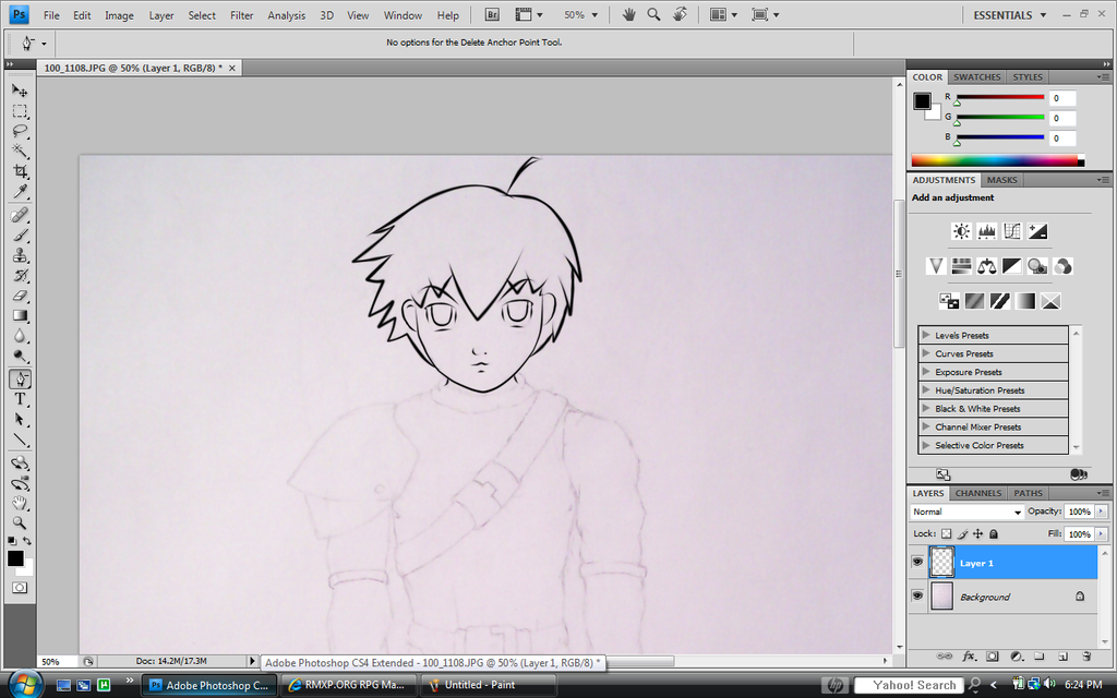
Well in any case, all the the line weights seem arbitrary. Like they just kinda go with no real rhyme or reason and it doesn't enhance the drawing very much. Most notably, the Chin on link kind of just vanishes into his neck because the lines get so thin.
As for the drawings themselves they're.. decent. They aren't fabulous but they aren't awful. Keep working at it, and really pay atention to your lines and what you want them to express. Being Arbitrary is a sure fire way to make ur line art very uninteresting.
As for the drawings themselves they're.. decent. They aren't fabulous but they aren't awful. Keep working at it, and really pay atention to your lines and what you want them to express. Being Arbitrary is a sure fire way to make ur line art very uninteresting.
Mascarpone
Member

I hate using my own work as an example, but try to a.) Have smoother more solid lines (Not in small pieces and parts) and b.) make sure that they get thicker in places u want to feel more solid, or call more attention too, and taper in places where they are less important.
Mascarpone
Member
Line art's much more expressive. Now i'de recomend getting some life drawing classes in. Nothing better for learnign how to draw humans and they're super fun. Even when u do have to draw the 56 year old man in a purple beach thong.. bleah memories...
anyways. Life drawing classes. Awesome tool, find some in ur locale area
(I should find some more myself. i'm so insanely rusty)
anyways. Life drawing classes. Awesome tool, find some in ur locale area
(I should find some more myself. i'm so insanely rusty)
Thank you for viewing
HBGames is a leading amateur video game development forum and Discord server open to all ability levels. Feel free to have a nosey around!
Discord
Join our growing and active Discord server to discuss all aspects of game making in a relaxed environment.
Join Us