Envision, Create, Share

Welcome to HBGames, a leading amateur game development forum and Discord server. All are welcome, and amongst our ranks you will find experts in their field from all aspects of video game design and development.

A logo for my game

A logo i made for a new game i'm working on, called Whispered Winds.
It's meant to be a calm game so i made the logo pretty calm as well..

i didn't touch photoshop for a long time, but i think it turned out alright..

the white background of the forum ruins it a little, but it's meant to be on a picture.
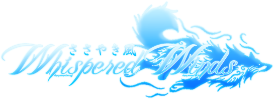
WhisperedWindsLogo2.png

Let me know what you think.

(and i know the wolf is a little pixeled)
 

candle

Sponsor

I'll tell you this right now; it's very hard to read. he most important thing about a logo with text is readability. How can you tell people about your product if they can tell what it's called?

the symbol is OK, but i would want something a little wider so it doesn't look like "Whispered" is off on its own. As for the Asian text, Are you releasing this in an Asian language of some sort? If not, that is a bad thing to put on there. It might fare better if your game is set in Asia.

A minor note, it's better to do logos in a vector-based program like Illustrator, instead of a raster-based like Photoshop. However, if you absolutely need to make it in Photoshop or a similar program, keep your master at a massive size and re-size a copy as needed.
 
candle":2cqr98zb said:
I'll tell you this right now; it's very hard to read. he most important thing about a logo with text is readability. How can you tell people about your product if they can tell what it's called?

the symbol is OK, but i would want something a little wider so it doesn't look like "Whispered" is off on its own. As for the Asian text, Are you releasing this in an Asian language of some sort? If not, that is a bad thing to put on there. It might fare better if your game is set in Asia.

A minor note, it's better to do logos in a vector-based program like Illustrator, instead of a raster-based like Photoshop. However, if you absolutely need to make it in Photoshop or a similar program, keep your master at a massive size and re-size a copy as needed.

Well, it wont be as hard to read on the title picture as it is on the white background in the forum.
And i just like the japanese there, im not going to release a japanese version, but those arent random characters, its the name of the game in japanese.

About the wider symbol, i'll try to find a better one, but this is my problem, i never find any symbols that fit, so it might take a while to find..
I find many but can never make up my mind about the right one..
 
  • its not that is is on a white background it is that it is still hard to read. Putting blue on more blue is going to make the text hard to read.
  • The Japanese characters are rather silly, as they have no purpose. Unless your game is set in Japan and the setting oozes this, there is no point to them. Saying that it is the name in japanese still brings no value to the table. I wouldnt make an english title with spanish in it if my setting was located in the Artic.
  • Some parts of the logo seem blurry.
 
I made three different ones, with new symbols, but i can't decide if they look good...
I guess i will lose the japanese, and i can't think of any other color to fit the game, and ideas?

1)
WhisperedPoo1.png

2)
WhisperedPoo2.png

3)
WhisperedPoo3.png

(I know that the lower part of the first one is cut, i have it's psd, so it's not a problem.)

And which parts look blurry to you?
 
I like the second on the best. What I might do is try getting rid of the left picture and extending the trunk of the right picture so that it is a simple curved line.

Yeah itll be better off without the japanese.


Well the third one looks blurry as well. Usually you want crispness and the logo is foggy. The dragon one for example is foggy overall. The fox one is foggy at the top.
 
Oh, i see what you mean by blurry, its the result of a bright outer glow and stroke, thats why i used small shadow on the others, but it just didn't look right on the third one..
 

Thank you for viewing

HBGames is a leading amateur video game development forum and Discord server open to all ability levels. Feel free to have a nosey around!

Discord

Join our growing and active Discord server to discuss all aspects of game making in a relaxed environment. Join Us

Content

  • Our Games
  • Games in Development
  • Emoji by Twemoji.
    Top