
You are using an out of date browser. It may not display this or other websites correctly.
You should upgrade or use an alternative browser.
You should upgrade or use an alternative browser.
Mapping Improvement Thread 4
- Thread starter Æ№∞₧
- Start date
Zekallinos
Sponsor
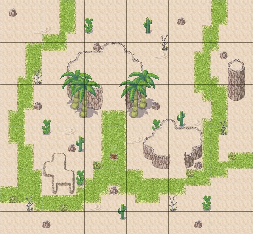
The map lacks a bit of logic. You are in a dry, barren desert, yet some grass (and a lot of it!), plus some palm trees grow out of nowhere. I suggest putting a oasis nearby, otherwise you should try to avoid the green stuff (aside from the cacti). You're not using the slopes correctly - it should be one tile lower, and connected to the cliff with the thing you use for the corners. The grass autotile isn't used correctly either - it looks blocky like that. You should be used the other autotile, the one with grass less dense and inside it put the dense grass. And don't just randomly put cliffs and obstacle around the place and call it mapping - mapping is also a lot of design.

But that doesn't justify it being in the middle of the desert. You would look for a more sheltered place when setting up camp. I would move it to such a place.teengamer":13nqtvzo said:@Dalton - that is where you start
Teengamer: I'll say this plainly: the grass bits look terrible. Definitely use less squares. Squares can and do work for games like Mario, but with the RTP graphics, it simply does not look right. I also suggest using shift tiles (autotile + shift) to make it look more interesting as applicable. The areas you made it also make no sense - why would grass grow in a circle around sand when there is no water source in sight? I also agree that the campfire is a bit nonsensical, but I'll assume that you were out in the desert and just camped wherever you stopped. But then I beg the question: Why stop on grass? Wouldn't you rather build a fire on sand, which has little to no chance of catching? But more to the point: Your map is pretty boring. There's nothing terribly interesting about it, and when I'm playing a map I like there to always be at least one point of interest. I'd add more cliffs if I were you - a single plateau in the desert isn't unheard of, but it's not very aesthetically pleasing.
dylan: Definitely take those doors down one more tile. Not only do they not look good like that, but that's not the way the sprite was designed. I'd also use less of that shadow floor tile - it doesn't make too much sense in the doorway and most everywhere else it just sticks out. And then I ask: Is that second room just a storage room? If so, why is the player given access to it from the hallway?
dylan: Definitely take those doors down one more tile. Not only do they not look good like that, but that's not the way the sprite was designed. I'd also use less of that shadow floor tile - it doesn't make too much sense in the doorway and most everywhere else it just sticks out. And then I ask: Is that second room just a storage room? If so, why is the player given access to it from the hallway?
dylanf3":xa1xndby said:isnt there supposed to be shadow at the sides of a wall?
...No? Not unless it's outside and there's a light source coming from the upper left.
I got one gripe with that blacksmith besides the things already said - the work space he has is devoid of usefulness for a blacksmith. Optimally, he would opt for a stonework workshop with a furnace. That wooden floor and wallpapered wall are too liable to catch fire in case there was one around.
A blacksmith doesn't usually run the shop, but he rather makes the weapons.
In closure - I think you should give the store a salesperson front and produce a worthy workshop for the blacksmith (which, between you and I, should be outside).
A blacksmith doesn't usually run the shop, but he rather makes the weapons.
In closure - I think you should give the store a salesperson front and produce a worthy workshop for the blacksmith (which, between you and I, should be outside).
kingo'mountain1
Member
dylan, is the bottom room really neccesary, i'd lose it and make a direct passage between the two main rooms, not a visible corridor... 1 door between the rooms
other than that, maybe make the rooms a bit bigger, maybe like 2 squares wider all around, my 2.2222222 cents")
other than that, maybe make the rooms a bit bigger, maybe like 2 squares wider all around, my 2.2222222 cents
silver wind
Member
dylanf3
remove the boxes behind the blacksmith, it looks like he has no room to move.
I'd use a stone floor, and add a fire-place for him to use.
remove the boxes behind the blacksmith, it looks like he has no room to move.
I'd use a stone floor, and add a fire-place for him to use.
cordynasty
Member
Yeah. When I saw that map, I said one thing: fire hazard.
becoolioman":31tlyer8 said:my only gripe is the doors. Try lowering tthem one tile. Also, that autotile tou have for the borders dont match the walls. Go for a brown.
Other than that, its a pretty decent map.
If i lower the doors one tile, ther is a gap between the upper part of the door, and the lower part of the autotile, so this looks better then that cuz of that
Thank you for viewing
HBGames is a leading amateur video game development forum and Discord server open to all ability levels. Feel free to have a nosey around!
Discord
Join our growing and active Discord server to discuss all aspects of game making in a relaxed environment.
Join Us