Envision, Create, Share

Welcome to HBGames, a leading amateur game development forum and Discord server. All are welcome, and amongst our ranks you will find experts in their field from all aspects of video game design and development.

WIP Original battlers for my upcoming game.

I'll be putting in this space the battlers for my upcoming game Shooting Star Story. Along with the battler I'll be posting the character set so you all can see both the sprite and the battler drawn. All drawings are by me, hand drawn and inked then badly colored in Photoshop (Wish I had the hand eye coord. to do good shading.)

So ...

Alex (the main hero - Fighter:

Alex.png
alextestbattle.png


All opinions welcomed.
 

Puffy

Member

Ditto for the hair color; I think the nuclear red makes it worse off than it should be.

Also noticed that the black outlining has some white/gray artifacts, especially in the hair and crotch area. I'm taking a wild guess on your process, so I'm probably assuming too much: If you scanned in the inks in grayscale, and you don't plan on retracing them, you're going to maybe want to go into Image -> Adjustments -> Threshold and b/w them before you magic wand out the whites. That'll get you clean lines, at the price of some detail, depending on how you do things.
 
Hmm, nice. I got the same opinion for the hair color.

As for the blade of the fighter-sprite, I think the blade needs a very small line in the middle to indicate that it's a blade and not a flat, pointy piece of iron.
The eyes of the fighter-sprite are in my opinion a bit too... "sharp" towards the nose. They could be rounder.
The shading is good, I got no photoshop and normally I have to do it with paint pixelwork (Dammit annoying!) so it becomes crappy.
Good job!

General I got not much knowledge about sprites, more about "row" or "big" pixel-art. So I look better at the figther.


~Axules
 
Hmmm ... thanks for the feedback, I'm glad you all like him for the most part. I think, however, that I'm going to have to redraw him ... I'm just not happy with the style I used when placed on the other 6 original battlers I needed to make.
 

Puffy

Member

(Spoiler tags for the big images, please?)

First one: Hair casts way too much a shadow on his face, doesn't match the shape, either.
Second: Zappy hand is a bit too small. (She looks nice to me, but that's assuming she's supposed to look very thin/sickly, and sorta gothy.)
 
I think Alex leans a bit too much backward. Again the same for the sword: a line in the middle. And the eye in the back is a bit too small if you look at the front eye. The shading is well done, except for the hair.

For Gina: the characterset is great. The shaiding is realistic ; it could be right in the RTP of RMXP.
Boah, that battler got a small taille. But I think the fingers are a bit strange on the hand most in front. I don't think you can pull your finger without help backwards. :biggrin:
The shading of her is great again: I see no points. Well done!

~Axules
 
Thanks for the comments everyone, I'll take the advice under ... umm ... advice(?).

Here's the sprite set for the final party member in the game, her name's Tao ... I'm still working on a battler graphic for her and the party's third member, Dog.

 
Very good shading on the hair, but I think the red hair color is a bit too common in your characters. Also I think the jeans are a bit too straight. I'd like to see your battler of that character ; shes original.
 
Here we go, the battler and the the larger picture for Tao are in the spoiler tags ... just 1 more party battler to go and then I need to attempt to make 3 full size ones for enemies.

tao1v2small.png
tao1v2large.png
 

Puffy

Member

Yeah. The shape of her trunk is pleasingly-shaped, if a little short (I don't think it can accommodate a stomach with her crotch that high), but her actual rack is bad. Relative to my perspective, righty has a lot more volume than lefty, and sags much more. It's still the more realistic-looking breast, mind you, since that top doesn't look very supportive and cans that obey the laws of physics are nice. In the same vein, you don't get much boobage above and to the side of the armpits, unless you've got something squishing them up there.

Even though breasts aren't 100% symmetrical, you'd want a little more normalization, in terms of their size and placement on the chest. Don't feel ashamed to draw them on first, then the shirt~ But this one's definitely my favorite of the three.

(Oh, and I noticed the disembodied trigger-finger...)
 
But will you notice it when it's tiny and battler sized?

Anyway, here's a new one ... I tried something different in order to keep enemies closer to RTP:

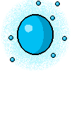
In the spoilers tags is a Ghostly Light/Death Light/Will-o-wisp, Spirit Orb/Death Guide battler (still trying to figure out how to make a character set, although I may just use Light 2) depending on the hue.


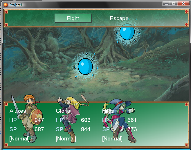
and in game:

willowisptestingame.png
 
The out lines are very jagged and messy. The dithering around the orb is very bad too, it doesn't go with the rest of the image.
 

Thank you for viewing

HBGames is a leading amateur video game development forum and Discord server open to all ability levels. Feel free to have a nosey around!

Discord

Join our growing and active Discord server to discuss all aspects of game making in a relaxed environment. Join Us

Content

  • Our Games
  • Games in Development
  • Emoji by Twemoji.
    Top