Envision, Create, Share

Welcome to HBGames, a leading amateur game development forum and Discord server. All are welcome, and amongst our ranks you will find experts in their field from all aspects of video game design and development.

What's missing?

Hey,
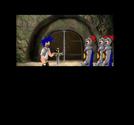
Somebody please critique the background in this picture
-what should i fix
-what should I add
-What should I remove

for some reason it seems like its missing something. Oh and dont worry about the characters in the front, im not finished with them.
[Edit]: Im thinking of maybe putting some torches somewhere.... but im not sure where would look best. Im also considering making it foggy and rainy (thought that would require alot of work on my part). And I think i need to put something above the doors...any ideas?

Storypic3-3.png
 

Tim.

Member

Well, a couple things..

1. Make the Knight's armor more.. plated. Know what I mean? If that armor is solid, how should they move thier arms? Look at the shoulder plate on the blue haired guy. That looks more realistic.

2. Add a bit more shading to the sword-guy's blue hair, the red bits on the guard helmets, and guard capes. Might also want to make the darker parts of the sword dues skin a tad darker- that way the muscle is more visible.

3. The guard eyes look a bit odd...

4. The guards look a bit too similar. I dunno, maybe make them standing from different perspectives. And the two to the far right side look odd, standing right next to eachother. Makes it easier to notice they were copied and pasted.

5. Maybe make the guards hair visible through the right sides of thier helmet, unless they've all been shaved.

6. Maybe dim all the characters in that pic down a notch, to fit better with the background.
 
Erichermit is right, i didnt want character critique. However some of it was helpful all the same.
I was gonna make thier armore more plated- and give it the metallic effect.
I wasnt done shading the guys hair, and im gonna redo the feathers on the guards. Those guards in the picture are just a placeholder really.

However I do see your point about darkening them to blend into the background. And you're right, that guy should look like hes on steroids- it'd make him alot more hero like. So thanks all the same.
 
It looks a bit like a screenshot of an early playstation1 polygon character (the hero and the backdrop). A style like that would fit in nice with the photo-y backdrop. Since I'm crazy, Id say go for a deliberate polygon like style for uniqueness. The cartoony style has been way overdone :) Search for screens of Granstream Saga to know what I mean :)

http://spacemul.emu-france.com/images/P ... /16694.png[/img]
 

Thank you for viewing

HBGames is a leading amateur video game development forum and Discord server open to all ability levels. Feel free to have a nosey around!

Discord

Join our growing and active Discord server to discuss all aspects of game making in a relaxed environment. Join Us

Content

  • Our Games
  • Games in Development
  • Emoji by Twemoji.
    Top