
You are using an out of date browser. It may not display this or other websites correctly.
You should upgrade or use an alternative browser.
You should upgrade or use an alternative browser.
What do you think of my title screen.
- Thread starter Gulch666
- Start date
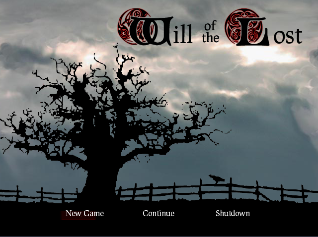
If the foreground is a silhouette, why the crappy effects. It looks like you've added every layer option there is when you should have added none. As for which panorama, only you should know. It's a title screen, it should reflect the mood of your game. Is your game warm? Is your game light hearted? Is your game dark? Is your game set at night? Is your game set on Mars?
ditch the drop shadow, ditch the "stroke" if you have it on, and get rid of the Bevel and Emboss one also. That is what makes it stand out (look 3D) and look weird.
Nice though! Except I dont quite understand the sun... it looks kinda weird also, what with it having a shadow ^_^
Nice though! Except I dont quite understand the sun... it looks kinda weird also, what with it having a shadow ^_^
all there is is a drop shadow, you probably assume theres bevel/emboss because i havent cleaned up the random pixels on the silhouette yet (good ol photoshop and making random pixels when you resize stuff), the text has an outer glow and drop shadow. only blending options i applied, and i think im just gonna take the sun out, doesnt make much sense for it to be in front of the clouds now does it. working on it now, ill post a redone one shortly
Heh, I forgot I even made that script. Sorry if it didn't work or anything, I think it's one of the first scripts I ever made, good to see someone making use of it.
Personally, I prefer the third panorama background. It seems to work well with the logo, for some reason, and doesn't make the tree stand out as much as a brighter or (more) coloured background (i.e. the first and second).
One thing I would say, is that the silhouette seems to have more than one colour in it, perhaps editting it to make it just plain black might improve it. (You can do this in Paint, by saving it as a monochrome bitmap, but there's probably way easier ways in whatever graphical program you are using).
yeah i updated it with some changes, i just need to clean up a few gray pixels on the silhouette.
and yeah there was a small problem with your script, but someone posted a fix for it some posts down, had to do with like 11 of the static image script.
like
something
something
end
needed another end at the bottom or something simple like that
Edit: Spoiler up to has current wip
and yeah there was a small problem with your script, but someone posted a fix for it some posts down, had to do with like 11 of the static image script.
like
something
something
end
needed another end at the bottom or something simple like that
Edit: Spoiler up to has current wip
http://i106.photobucket.com/albums/m244/gulch666/odintop_1.gif[/img]
its a low quality image, im not going to spend a lot of effort to clean it up cause when i find my scanner (packed away somewhere)
im going to scan in my concept drawings of the characters and do a completely diff silhouette
said drawings are also going to get colored for character pictures above message windows
OK, well if you're going to change it, it doesnt really matter. I was just thinking it's easy to find tree silhouettes of varying shapes and sizes online simply with google image. With the roughness of the enlarge image it takes a lot of cleaning up. Perhaps using the diffuse filter then turning the layer into a thick black may work but then it may not.
yeah i had the image floating around in my random shit, liked it so decided to toss it in there as a wip, im going to keep the same idea, with the tree and ground, no fence, and add my character silhouettes, probably sitting under the tree (main male & female characters) id like to figure out how to make the silhouette an animated gif, grass blowing etc, havent tried that yet tho.
Mascarpone
Member
when i saw the thread title i said to my self "oh gawd here we go ..." but it's not that tragic surprisingly. u might want to tone down the cloudy backdrop juuust a smidgen (dull it, darken it, just take the edge off it a bit) and smooth up some of the shadowy silhouette in the front but really. not that bad at all.
Thank you for viewing
HBGames is a leading amateur video game development forum and Discord server open to all ability levels. Feel free to have a nosey around!
Discord
Join our growing and active Discord server to discuss all aspects of game making in a relaxed environment.
Join Us