Envision, Create, Share

Welcome to HBGames, a leading amateur game development forum and Discord server. All are welcome, and amongst our ranks you will find experts in their field from all aspects of video game design and development.

Walking in a Winter WonderMap001 Contest Character WIPs

http://bb.xieke.com/files/xmascast2.PNG[/imgzoom]
because one person wasn't sure if 3 of the males were meant to be female (made me sad :huh:) all female characters are facing left
As I finish up the base steps I'm going to start animating. Each one take's like only a few moments to do, and I for once doubt that animation will be harder.

But, I wanted to know the opinions on the bases at the least, and grow this topic with fixes and full on animations and the sort.

And yes. YES. SIDE VIEW. So none of that perspective jump mumbo :p
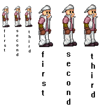
Also no, none are twins they are just different versions, alternates. Bonus point if you know a "mistake" I made with the guy/s in the blue coat - though I made it on deliberately.

upamadate:
God I suck at animating walks D:<...


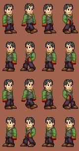
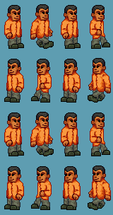
Yes I'm aware of errors with the first one - god I don't care anymore how many times I upload the wrong file. As long as the missing part in the lower frames is there in the top - since it's just reversed, I really don't care anymore. I can't seem to get organized- sorry.

Also this:


mawk

Sponsor

bb.xieke.com is a free hosting website. I don't know who owns it, but they're very generous.

And please stop posting just to make stupid off-topic comments and observations like that! If I see much more "HEY IM GONNA CORRECT YOUR GRAMMAR" and that kind of thing I will give you a formal warning!
 
Barack Uboa":1p6vjyx1 said:
bb.xieke.com is a free hosting website. I don't know who owns it, but they're very generous.

And please stop posting just to make stupid off-topic comments and observations like that! If I see much more "HEY IM GONNA CORRECT YOUR GRAMMAR" and that kind of thing I will warn you!

It was a simple question! Geez, take a chill pill and stop following every post I make *-.-.
 

mawk

Sponsor

These look pretty good, sixty, but some things are a little messy -- the dude's toque, for instance. And the lady third from the left seems a little too pronounced boobswise (or I dunno how many people do you know who get that kind of definition through a sweater? I don't know many but!)

And Map Helper I'm serious!
 

Anonymous

Guest

Map Helper, cookie, it is sort of out of order. If someone's trying to steal resources then they'd probably think to upload it to their own site anyway. Besides, just checking the link would tell you it's an upload service.

It was a simple question, yes, but it was not at all relevant to the topic and as such it was still spam.
 
Miek,
That's not supposed to be a tongue D:
Think you could tell me which one is showing?  If it's the red head, that's meant to be lipstick.

Also the boobage thing is a goof up.  I use MSPaint and because of the undo limit I tend to select pieces over to a different part of the canvas step by step, or every few steps, this way if I want to go back to some time ago I can.  I copied the wrong one over (I seem to have done that several times, since I copied from the first group, this being the 4th rendition).

I'll fix that up by putting in the correct one next time, thanks for pointing it out - who knows when I would've caught it!
 

mawk

Sponsor

I didn't say anything about a tongue. :P

Toque. Winter hat. I dunno what you Yankees call it but it's pronounced "two-k" and it's on the guy fourth from the left.
 

Spoo

Sponsor

The Map Helper":2xobdogb said:
Is this your website?
http://bb.xieke.com?

Really, now.  There's no need to interrogate everyone to make sure that their resources are theirs.  Plagiarism isn't generally a bad problem around here.

I didn't really notice it before, but is the first guy from the right supposed to look that tall?  In comparison to the others, he looks pretty big 0_0
 
He's meant to be on the verge of kinda freakishly tall, yes.
His proportions are also a tad more correct - although the style these are done it obviously isn't paying attention to proportions, I thought it was fun to note.

In this game apparently the taller you are the more viable your form becomes D:
 
The New Drew":6x0ph778 said:
The Map Helper":6x0ph778 said:
Is this your website?
http://bb.xieke.com?

Really, now.  There's no need to interrogate everyone to make sure that their resources are theirs.  Plagiarism isn't generally a bad problem around here.

I didn't really notice it before, but is the first guy from the right supposed to look that tall?  In comparison to the others, he looks pretty big 0_0
Don't try to revive a dead horse
 

Anonymous

Guest

THIS THREAD IS NOW ABOUT SIXTY'S SPRITES AND ONLY SIXTY'S SPRITES

Maphelper, don't do it again. Everyone else, let it drop.

Talk about the fucking sprites.
 
Deputy 60":t7krzmn9 said:
  Bonus point if you know a "mistake" I made with the guy/s in the blue coat - though I made it on deliberately.
The hand of the one with the cap is clenched.  Anyyway, these look brilliant sixty!  makes me wanna play the game already
 
you always do this sixty, and it doesnt matter how much despian or i try to pound it into you, you still do it,

you always make dark outlines and then the fills have almost no contrast or hue variation! that always happens on all your pixel art :(
they're not even pillow shaded, but that technique makes them LOOK pillow shaded.

Your outlines are always adorably unique, but you HAVE to work on your palettes, man, you HAVE TO. You owe it to yourself as a burgeoning pixel artist :)
 
Bonus point if you know a "mistake" I made with the guy/s in the blue coat - though I made it on deliberately.
His hat doesn't cast a shadow?
Not sure exactly how side-views are properly shaded so I could be wrong.

These look nice, I love how all of your sprites always look so different and original, but as Ven said you need softer outlines. I was gonna comment saying they were pillow-shaded until I zoomed in because the dark outline makes it seem like that. Just work on the palette's and I'd say you've got some quality stuff here :thumb:
 
Venetia":2hjv67l4 said:
same shit different day
sixty's retort":2hjv67l4 said:
same shit different day
By this point I have nothing left to say about it.

Also many of them have spots big and small pillowshaded.  I'm lazy, I made these all in a day and started rushing because the moment I got line art I had to OMG FINISH IT SO I CAN MAKE ANOTEHR D:<
It was pointed out in a chat and I felt really stupid about that.  That one I totally concede, and have no arguments and it's somethig I NEED to fix.

I keep forgetting to do that when I start to rush - I'm just too impatient.

I'm glad you like at least the line art of it all.

@Panda
Side views are shaded the same as all other sprites.  You pick a light source and go with it.  I could add a touch of shading there, but I didn't like the way it looked.

The mistake is the hat though.  It doesn't "fit" the character.  Some pixels (I believe like 3 or 4) stick out if you over lay the hat sprite over the hatless sprite, the head hat actually apparently makes part of the head disappear :p
And thanks for the comments.
 

Thank you for viewing

HBGames is a leading amateur video game development forum and Discord server open to all ability levels. Feel free to have a nosey around!

Discord

Join our growing and active Discord server to discuss all aspects of game making in a relaxed environment. Join Us

Content

  • Our Games
  • Games in Development
  • Emoji by Twemoji.
    Top